HOME | DD
 PockyMafia — Andrew Breding Color System
Published: 2006-10-17 10:52:30 +0000 UTC; Views: 1821; Favourites: 34; Downloads: 40
Redirect to original
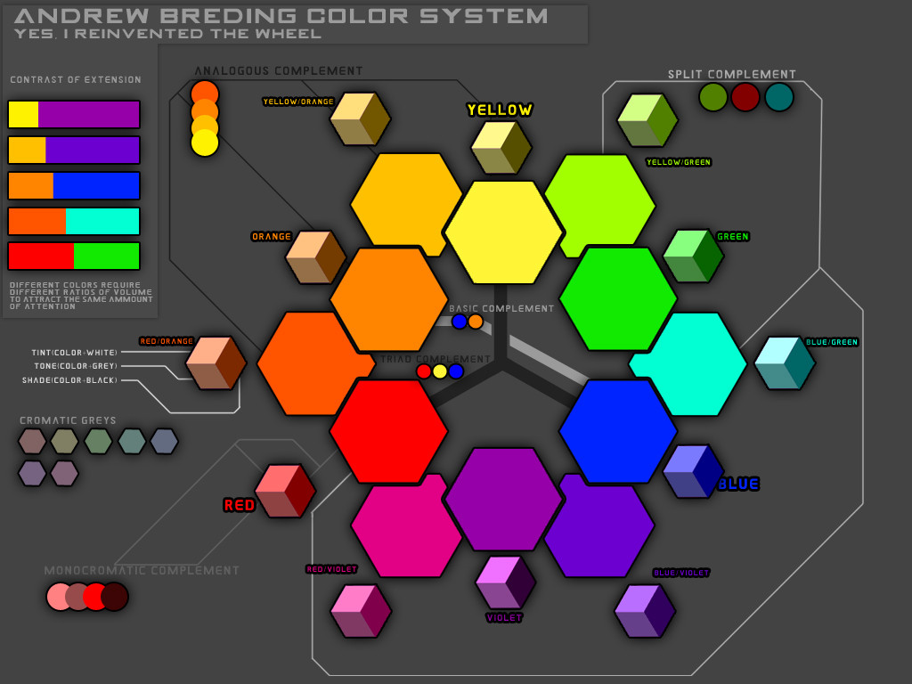
Description
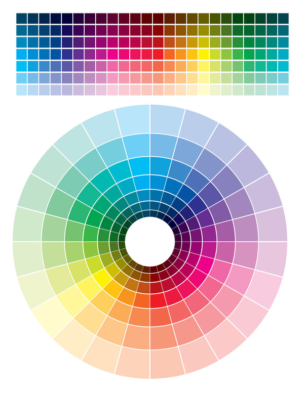
This is a color system that i created for my Basic Design: Color class. I added in a bunch of other goodies aswell. Have fun with it.Related content


Comments: 12

👍: 0 ⏩: 0


")
👍: 0 ⏩: 0

you ROCK  (Smile)")
👍: 0 ⏩: 1
Your welcome! I'm glad you like it! This is perty much just an adaptation of any reductive color system. Red yellow and blue being the primaries for paint and print(Cyan Magenta Yellow actually), but the properties work the same. I'm working on an actuall CMYK version, so you can sample the colors for print. But the colors look better in RGB when viewed on a computer.
Have fun with it. I didnt get the tertiary relation ships in here ")
I will update it soon.
👍: 0 ⏩: 0

Hm... I never thought about the contrast of extension before. That's interesting. And I like the complements - very nice! I think you maybe could have added a complement for each color... Might have made it look too cluttered, though.
Nice!

👍: 0 ⏩: 1
I could do a seperate page with just swatches of color complements. (the colors in the contrast of extension are all of the complementary colors of the primary secondary and tertiary colors) I got the vocab a bit mixed up though. Triad Complement, monocromatic, and analagous, are all "relationships" or "harmonies" not complements.
Contrast of extension happens mostly because of the inherent "color value" Violet is at the end of the visible spectrum so its the darkest, yellow is at the beginning, making it the lightest.
Yes, it is allready quite cluttered. I'm working on a several page print version so I can use it for my portfolio. It will also cover simultanious contrast(how to make the same color appear differnt, or differnt colors look the same) it will be in RGB and CMYK format.
👍: 0 ⏩: 1
Yeah, that'd be nice! Don't worry about the vocab - it's not like I noticed.
Ah, okay. Cool.
Simultaneous contrast sounds interesting... I'd like to see that one of these days.

👍: 0 ⏩: 1
Thanks! I'm busy with cother cool basic design stuff right now, but I'm almost done with it any way.
👍: 0 ⏩: 1
I see them in my devWATCH box - I shall go look at them!
👍: 0 ⏩: 1
Whatever, your lieing to me!
Dont do this to me im to.... to fragile!
whaaaa hahaha

👍: 0 ⏩: 1
