HOME | DD
 PolyMune — Quebec Scene

Published: 2010-02-18 20:13:26 +0000 UTC; Views: 2286; Favourites: 18; Downloads: 67
Redirect to original
Description
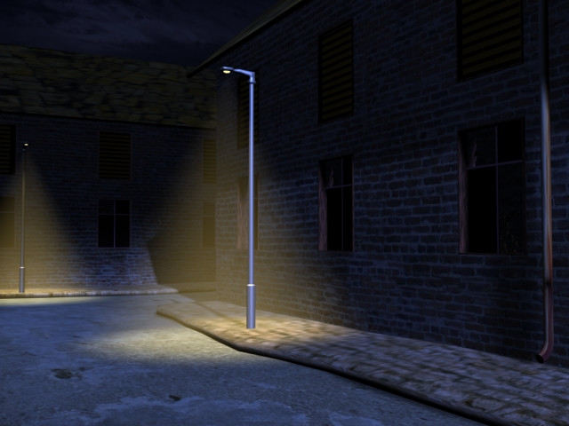
This is a scene I worked on with a partner.I uploaded it to my other gallery, but this is my strict game development gallery and art work associated to my professional side.
It was our second last challenge last semester we did in November. Work in a group to modularly build a city street corner under 27,000 tris. Our scene is only 24,000 tris
The building closest too you (on the left) and most of it's props in front (minus the sign and street lights/parking metters) was designed by my classmate Courtney. The other buildings, street, curb, street lights and props were done by me.
She textured half, i textured half. I set it up in Maya Mental ray and rendered it, lit it and did the sky background and fog.
I rather like how this turned out, however I'm redoing it now with all my own work for my demo reel.
Let me know what you think and what you think i should change.
comments?
Work i said (c) courtney
All other work (c) me
Related content


Comments: 22

Wow ! Une scene du Vieux-Québec !
A DeviantART, les créateurs 3D Québécois sont rares !
Ton image est un peu sombres.
Regarde ce que ca donnerais avec avec des fenêtres vitrées et des
lumières a l'intérieur : danmoore.deviantart.com/art/Ho…
Si tu veux voir un champion de la modélisation : www.3dvf.com/segocarib_7492.ht…
👍: 0 ⏩: 1

merci pour le compliment.
Cependant, j'ai déjà refait cette scène avec un meilleur éclairage et des modèles que mon partenaire pendant le projet ne m'a jamais aidé, je voulais somehting un peu mieux que cela. C'était juste un rendu de test vraiment, et le plus âgé des deux.
quebec city at magic hour time of day - polymune.deviantart.com/art/Qu…
👍: 0 ⏩: 0


Once again, you are really good at 3D game art. You work with textures very well and the perspective and lightning are excellent.
👍: 0 ⏩: 1
thank you ")
👍: 0 ⏩: 0

looks really good. The big buildings dont seem to cast a shadow or am I just missing it? Thats all I saw but looks really good!
👍: 0 ⏩: 1
Thank you.  (Smile)")
[link] this is the one i did completely on my own however.
this one you're replying to is a bit old but im glad you like it nonetheless!
👍: 0 ⏩: 0

I think it looks pretty good!
I just think making it dirtier might add some more realism.
The chimneys could possibly be broken up so they are not the same shape on the three middle buildings.
The texture scale thing has been stated. Lastly, the front building and back building have different scale on the doors. The back three are the same height as the front one and it's 2nd story windows put together.
Keep up the great work though, I can't wait to see it polished up!
👍: 0 ⏩: 1
[link] here is the finished piece. (Well, i should still add dirt and broken textures to that one)
thank you very much for the critiques, i took them into consideration when i re did it
👍: 0 ⏩: 0
Yeah, I think its good, all I see that may be a problem is the texture stuff previously discussed.
But maybe some more damage on the buildings to break up the symmetry in the image. This is a very good low poly scene though!
👍: 0 ⏩: 1
thanks very much adamreno7! i've alread begun to fix all the problems people told me and my new version should be up in a week or so
oh thanks for the idea, i'll put more damage into the buildings! Thanks!
👍: 0 ⏩: 1
NO problem! Cant wait to see the new update!!!
👍: 0 ⏩: 1
it has been updated if you'd like to see the recent version in my gallery now
👍: 0 ⏩: 0

Looks good^^.
But... is the pavement reflecting the buildings ? Oo Straaaaange, I never seen reflective concrete^^. Or it's maybe in marble ?
The other thing which can be better is the lighting, there are not enough shadows, no ambiant occlusion.
And the separation between the walls and the pavement is reaaaally clean, unatural. Some decals maybe ?
Last thing : every building is on the same line. In the reality, it is not.
I hope I helped you.
👍: 0 ⏩: 1
It's supposed to be simulating water, the water on top is reflecting the buildings but you're right i gotta fix that up.
I noticed that too after i rendered it, i'll definitely be adding in more lights!
Thanks for your help, you definitely have!
👍: 0 ⏩: 0

The tiling on the top half of the nearest building is too obvious. There's a shadow in its texture that shouldn't be there.
The roof on that building tiles obviously too. The lamposts are too big. There's no kerb on the pavement. The doors could have steps in front.
Despite all my picking, I think you and Courtney have done well. The textures work well together, it's quite believable as a scene.
If it's going in your portfolio you need to get rid of any obvious flaws. They make it look unfinished. It would be like sending a CV with bad spelling.
👍: 0 ⏩: 1
thank you very much for the critiques, they are very helpful.
You are not being picky at all, i put it up so that i could get critiques before i do my final version of this.
👍: 0 ⏩: 0

Yes, the stones on the road are too big indeed.
As for the rest: sweet pic!
👍: 0 ⏩: 1
thanks very much! yea obvious scaling issue in the road, but i'll be fixing that. I'm glad you like it
👍: 0 ⏩: 0

I like this, modular isn't an easy thing to work with, but when done right, it can look really good, like this does.
I would like to say though, that maybe the road texture it a little too big, only by a few scale portions, though, nothing drastic, it just looks too scaled in, for the size of all the other details.
Other than that, it's pretty good, nice work
Sylk~
👍: 0 ⏩: 1
Thanks man!
Yea it's definitely too big, first thing i'm fixing actually lol.
Thanks a lot sylk!
👍: 0 ⏩: 0