HOME | DD
 poserfan — Profile Directory Layout/Com

Published: 2014-05-09 17:24:23 +0000 UTC; Views: 8900; Favourites: 267; Downloads: 0
Redirect to original
Description
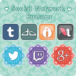
Profile Directory CSS - Layout/ Commissionfor the Favourite Deviation Widget
- No longer available as of may 20, 2020 due to Eclipse -
 Compatibility Chrome, Firefox Features
 - Custom Box Background (useable for all editable widget boxes)
- Profile Directory Image
- 2 Column Style (can be mixed or used alone)
- 3 Column Style (can be mixed or used alone)
- Colors are adjustable
- For Literature deviation Use
- Designed for Firefox, works in Chrome (should work fine in Safari)
Many thanks in advance if you're adding it to your
 s and/or leave a comment!! -- I really appreciate your support!
Related content


Comments: 65

They are similiar like most profile directories with rectangular buttons to a degree; after all most buttons are rectangular, maybe round occasionally (though this is not practical here). I've had read a tutorial (not written by you) about it long ago and then made my own version based on the gained info and my own corresponding profile journal skin (which can be seen on my other accounts --- so, my directory is just a stripped, adjusted version of that skin). I can't give you credit for a design which is based on my own design (and adjusted to my needs depending on the account it is used).
Thank you!
👍: 0 ⏩: 1

I don't think it's so much the rectangular buttons as the two + three column layout, with the three column row at the bottom and of a different color from the two column buttons. Regardless, may I ask which other profile directories you've seen before I created mine? I know Gasara made two template resources for them, but I don't think I came across one before mine.
👍: 0 ⏩: 1
Columns are a commonly used design in skins - like buttons. I needed a three column row due to having three different accounts. Adding that possibility instead of having blank buttons in a two column design looks much better; the darker color visibly shows the difference between links to other accounts/external links vs links on profile/internal ones as I disdain the icon added by dA. I have a whole three column directory at my stock account (which I probably should use in the preview image); and if it were readable (esp. for smaller monitors), I would have gone for four columns.
You know more than me; I didn't know Gasara made directory templates. I may have seen them (can't remember), but I didn't pay attention to them, that's for sure. And you really can't expect I know which directories were made before you created your own, I'm not a database. People tend to change their profiles all the time, so this is pointless.
👍: 0 ⏩: 1
I asked because as far as I know, there weren't any profile directories before I created my creator, except for the one I created on my own page as well as a few that I did as commissions for other deviants. Gasara's templates were quite different (just a basic one and two column layout), I've seen some of cyphervisor's that were clearly completely different designs (3D buttons, circular buttons, etc.). In comparison to how differently those came out (along with all the other profile directory variants I've seen on DA), I have to say that yours is remarkably similar in comparison.
I completely understand that it can be due to mere chance that we happened to create two similar designs. Your's seems a tad too close to mine in my opinion, but I suppose it can happen sometimes.
👍: 0 ⏩: 1
If you go for simplicity, there's more than a mere chance that two designs are resp. get similiar. How many simplistic journal skins by various creators should I show you who are similiar design-wise?? One only can do so much when going for simplicity combined with readability and ease-of-use to make the most out of limited space in this case. Cyphervisors 3d/round buttons are stylish but they are completely impracticable for a big gallery directory (like on my stock account), so columns and rectangular buttons it is. If I want a uniformed but still somewhat stylish look, I had to use the smallest common working thread.
👍: 0 ⏩: 1
I have to say that for all the journal-stalking I do on DA, I've only come across one design (apart from those created from templates, of course) that I thought was a little too similar to another one I've seen. Even the minimalistic skins tend to be different simply because there are so many different elements to customize.
")
👍: 0 ⏩: 0

Would it be possible to get this in silver/grey? I've been slowly revamping my profile to match my username and icon

👍: 0 ⏩: 1
Any color is possible - these are just the colors I use for my profiles. Note me with details and we work something out.
👍: 0 ⏩: 0

Sure, PM me with details what you want reg. colors, fonts, if it should match your current custom background or if you want something else etc
👍: 0 ⏩: 0

woah you are amazing. These are mindblowing =3
👍: 0 ⏩: 1
")

<= Prev |