HOME | DD
 potato-sketch — Crit meh some more plz?
Published: 2004-03-08 03:59:22 +0000 UTC; Views: 68; Favourites: 0; Downloads: 46
Redirect to original
Description
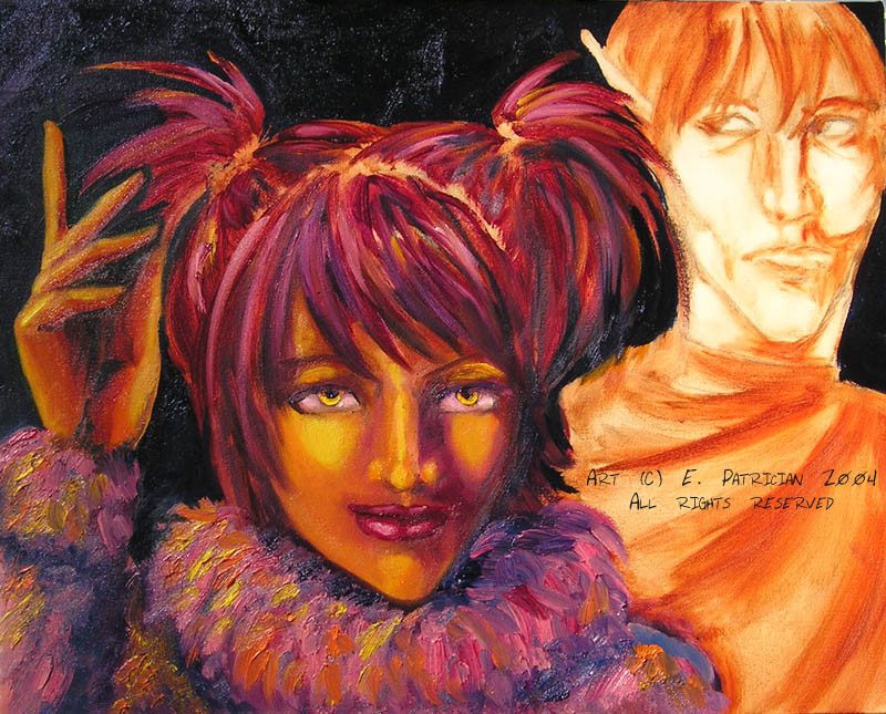
I'm back again, with PROGRESS!! Dammit, I wish I could paint more often...stupid school! >_____<Anyway, I changed a helluva lot with this go-round...(first WIP is here: [link]
As it stands, I don't know what I'm going to do with the background (suggestions?) but the dark blue (yes, it's blue
 ) does look better than the starry crap I had going before. I haven't started on Dah'nan yet (obviously) but I figured on making his cloak green to contrast with her pink. She needs stronger highlights on her hand, and I need to fix up the hair and make its highlights as strong as those on the rest of her head.
 Overall, though, it is looking better than it did. She doesn't look quite so much like a jaundiced crackwhore. X'DDDDD
Any and all suggestions and critiques are welcome for this piece, since I'm trying a new style for my painting and it's really rough around the edges. ^^
Chars (C) ~enerjak (but don't tell her about this please!)
Art (C) Me, *rabid-potato
Related content


Comments: 12

I LOVE the different colours/ Great, bold contrasting colours! exciting  (Smile)")
")
👍: 0 ⏩: 1

OoooooOOooooo...I can't wait to see it!
👍: 0 ⏩: 0

In comparision the fellow looks out of place...
👍: 0 ⏩: 1
He's not done yet...he's an elf in the future, y0.
👍: 0 ⏩: 1

Love the improvements! I have no more critique until the fellow is fleshed out
👍: 0 ⏩: 0

spock. city. i already told you this when i saw the painting inpersonOMGcrazy!
👍: 0 ⏩: 0

My crit would be that the entire right botom side looks off, shadow-wise---like her nostril looks unaturaly round and 3d compared to the rest of it, mainly. Also that I think that there should be a little bit more light shadow from the eyelid.
👍: 0 ⏩: 0

oops... Gally is right. With that kind of direct lighting, that second (our right) nostril would be mostly in shadow... or at least slightly darker that the highlighted skin. (like the color on the {our} left side of her mouth.)
The hand looks a million and one times better! I like it a lot!
I know boi in background isn't done yet, but I agree with Bri- his head is deformed. hehehe From the way it is NOW, it looks like his eyes are too high on his head, but if you round out the top of his head (on our right side), his eyes will look perfect. I like the very thin features of his face.
I don't know what the deal is with the dark blue background, but I think stars could be cool... (Is that what you are going for?)
👍: 0 ⏩: 0

Woo, this doe slook much better. All I can really see to suggest is to put more light in her eyes, they look rather deatish at the moment. The texture you can see on her hair and outfit is just amazing. ... and on a second look it almost liooks like she has a 2nd nose bit to the left of the first. o-o
👍: 0 ⏩: 0

Lookin great hon! I can't suggest much to help, I like the bg, maybe leave it plain like that or do a night sky behind them? With Dah'nan maybe add a little more "weight" to the right side (our right) of his head - where his bangs are? I think that's about as helpful as I can be, Molly will be thrilled to get this!
👍: 0 ⏩: 0

the backround face is distorted if you ask me, its too narrow of cheekbones and the clothes are funky looking on him, its just off a little, but the girl, she is really good, great use of color, i like it.
You changed the direction of the eyes on both of them? I like the change for the girl, maybe its the guys eyes that are throwing everything off...
I like the backround as blue, it brings out the people and their colors ")
I also like the changes you will make, I think the green will do well with the pink...
👍: 0 ⏩: 0