HOME | DD

princepal β€” NoteBook - Another WP Template by-nc-nd

Published: 2010-08-25 05:17:13 +0000 UTC; Views: 55161; Favourites: 295; Downloads: 1476
Redirect to original
Description 
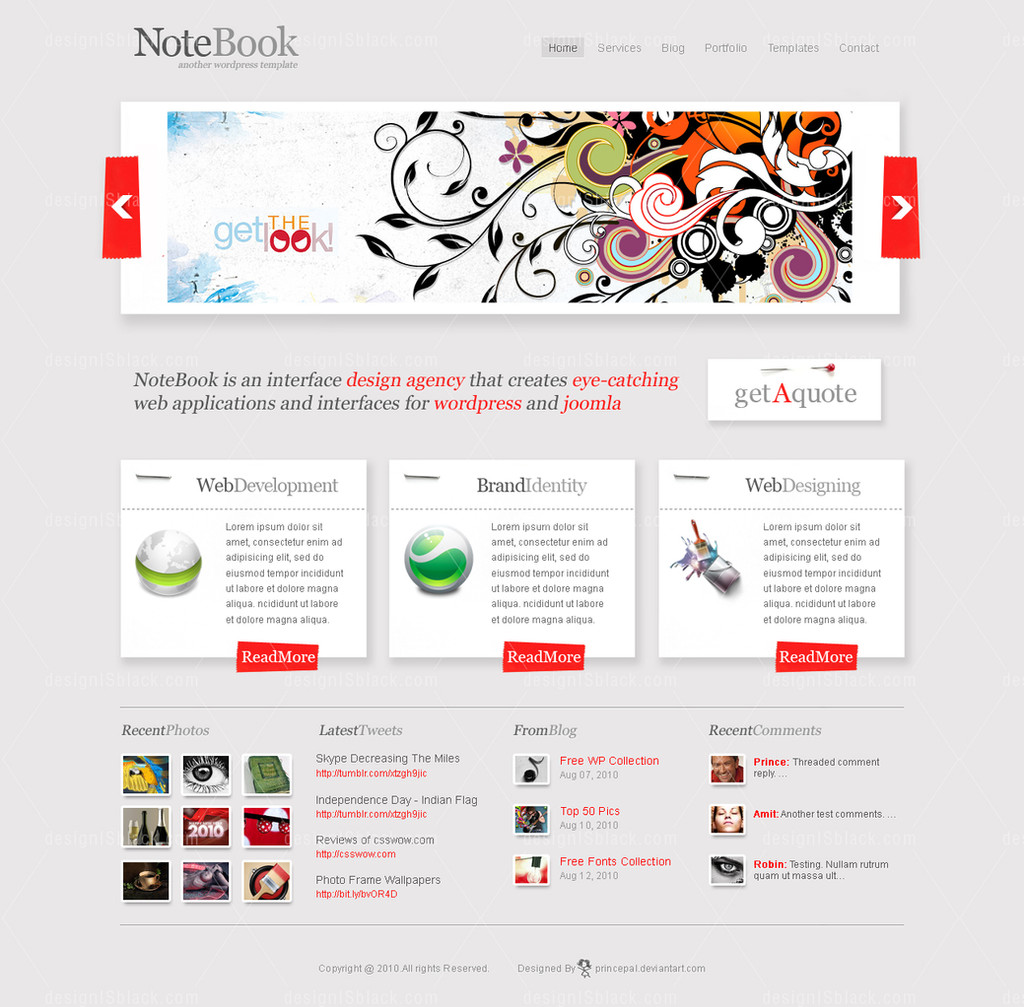
Here is my another wordpress template. Its my humble invitation to a wordpress developer who can convert it into a wp theme and we will sell it on themeforest together.

I am working on the another version of the 'Notebook' with some new creative element, so till now stay tuned!

Credits
Icons from iconFinder

For Design Consultation::
Email me @ palprince@gmail.com
Skype me @ princepal-designer
Related content
Comments: 88

princepal In reply to ??? [2013-05-08 15:59:51 +0000 UTC]

you need to pay. for more info email at palprince@gmail.com

πŸ‘: 0 ⏩: 0

missgally [2012-08-18 12:09:38 +0000 UTC]

It's beautiful thème !! perfect

πŸ‘: 0 ⏩: 1

princepal In reply to missgally [2012-08-18 17:27:20 +0000 UTC]

thanks dear

πŸ‘: 0 ⏩: 0

chiibake [2012-06-05 16:55:30 +0000 UTC]

Very nice ! I love it

πŸ‘: 0 ⏩: 1

princepal In reply to chiibake [2012-06-06 04:47:35 +0000 UTC]

thanks.

πŸ‘: 0 ⏩: 0

julyrains [2011-04-16 03:00:58 +0000 UTC]

Love the design!

πŸ‘: 0 ⏩: 1

princepal In reply to julyrains [2011-04-16 05:29:30 +0000 UTC]

thanks

πŸ‘: 0 ⏩: 0

silent-Princee [2011-03-09 13:47:48 +0000 UTC]

gud

πŸ‘: 0 ⏩: 1

princepal In reply to silent-Princee [2011-03-09 14:01:07 +0000 UTC]

thanks.

πŸ‘: 0 ⏩: 0

loser46 [2010-12-13 08:25:49 +0000 UTC]

nice

πŸ‘: 0 ⏩: 1

princepal In reply to loser46 [2010-12-13 08:39:05 +0000 UTC]

thanks.

πŸ‘: 0 ⏩: 1

loser46 In reply to princepal [2010-12-13 08:52:38 +0000 UTC]

u r welcOme

πŸ‘: 0 ⏩: 0

alabanco [2010-09-13 17:33:57 +0000 UTC]

The design is good and polished but there is no connection to the notebook I think.

πŸ‘: 0 ⏩: 1

princepal In reply to alabanco [2010-09-14 05:46:53 +0000 UTC]

hahha i donot know which note you are talking about lol

πŸ‘: 0 ⏩: 1

alabanco In reply to princepal [2010-09-15 15:12:56 +0000 UTC]

I mean the whole thing. I couldn't find any connection of the design to notebook or notes notions. But the design is good.

πŸ‘: 0 ⏩: 1

princepal In reply to alabanco [2010-09-15 15:18:43 +0000 UTC]

thanks for appriciation.

πŸ‘: 0 ⏩: 0

sufined [2010-09-05 07:28:16 +0000 UTC]

very clean and good design

πŸ‘: 0 ⏩: 1

princepal In reply to sufined [2010-09-05 10:09:23 +0000 UTC]

thanks

πŸ‘: 0 ⏩: 0

an-urb [2010-09-02 06:17:31 +0000 UTC]

πŸ‘: 0 ⏩: 1

princepal In reply to an-urb [2010-09-02 06:29:40 +0000 UTC]

πŸ‘: 0 ⏩: 0

ivocolen [2010-09-01 12:33:47 +0000 UTC]

Nice!

πŸ‘: 0 ⏩: 1

princepal In reply to ivocolen [2010-09-02 06:27:57 +0000 UTC]

thanks

πŸ‘: 0 ⏩: 0

uplabel [2010-08-31 11:51:16 +0000 UTC]

Great one!

πŸ‘: 0 ⏩: 1

princepal In reply to uplabel [2010-08-31 12:42:07 +0000 UTC]

thanks

πŸ‘: 0 ⏩: 0

aurainsert [2010-08-30 01:18:15 +0000 UTC]

I really like this one.

πŸ‘: 0 ⏩: 1

princepal In reply to aurainsert [2010-08-30 06:24:14 +0000 UTC]

thanks

πŸ‘: 0 ⏩: 0

mattnagy [2010-08-29 14:04:36 +0000 UTC]

Top notch work.

πŸ‘: 0 ⏩: 1

princepal In reply to mattnagy [2010-08-30 06:41:00 +0000 UTC]

thanks

πŸ‘: 0 ⏩: 0

blue-nila [2010-08-29 13:41:10 +0000 UTC]

Header is not prominent and looks very small. If there is red color in your logo its look better. Tag line also in some other color. Read more button need to be in the center of the block
These are my views only. Other wise it looks good and simple

πŸ‘: 0 ⏩: 1

princepal In reply to blue-nila [2010-08-30 06:39:40 +0000 UTC]

First of thanks for review my design in detail...

Below i explained why i did it along with your comments:
1. Header is not prominent and looks very small... Because (I did it because i was bored with regular big header thingy... that why i make it wider but small in height.)

2. If there is red color in your logo its look better.... Because (i tried it, actually make 'OO' in red looks like eyes... but its killing the top logo part.)

3. Read more button need to be in the center of the block... Because (Actually read more button is aligned with content... i did not align with white box... Because left side a heavy icon and if i align read more to white box that whole box imbalance, not look awesome as its looking )

πŸ‘: 0 ⏩: 0

blackboxdesign [2010-08-29 11:54:11 +0000 UTC]

great design!

really like it!

i just have one question:

how do you make that effect on the fonts, with that lighter contour? (see the "lastest tweets" content)

thanks

πŸ‘: 0 ⏩: 1

princepal In reply to blackboxdesign [2010-08-30 06:25:42 +0000 UTC]

thanks for comments... i will implement it via

  • technique.

πŸ‘: 0 ⏩: 0

dehog [2010-08-26 21:29:53 +0000 UTC]

This is some sexy shit

πŸ‘: 0 ⏩: 1

princepal In reply to dehog [2010-08-27 02:56:09 +0000 UTC]

this is awesome shitty comment lol

πŸ‘: 0 ⏩: 1

dehog In reply to princepal [2010-08-27 03:34:01 +0000 UTC]

haha

πŸ‘: 0 ⏩: 1

princepal In reply to dehog [2010-08-27 07:55:28 +0000 UTC]

πŸ‘: 0 ⏩: 1

dehog In reply to princepal [2010-08-27 09:01:36 +0000 UTC]

πŸ‘: 0 ⏩: 0

martinleblanc [2010-08-26 17:41:34 +0000 UTC]

Great work - Nice to see that you're using Iconfinder :-D

πŸ‘: 0 ⏩: 1

princepal In reply to martinleblanc [2010-08-26 18:26:50 +0000 UTC]

thanks man.. is this your website?

πŸ‘: 0 ⏩: 1

martinleblanc In reply to princepal [2010-08-27 11:22:59 +0000 UTC]

Yes, it is.

πŸ‘: 0 ⏩: 1

princepal In reply to martinleblanc [2010-08-27 13:59:14 +0000 UTC]

ohh man... ist wonderful resounce of icon.. i m fan of it

πŸ‘: 0 ⏩: 0

aashinya [2010-08-26 09:59:30 +0000 UTC]

gud work..

πŸ‘: 0 ⏩: 1

princepal In reply to aashinya [2010-08-26 12:25:34 +0000 UTC]

thanks my sweetie

πŸ‘: 0 ⏩: 1

aashinya In reply to princepal [2010-08-29 10:27:16 +0000 UTC]

ok taooo ji

πŸ‘: 0 ⏩: 1

princepal In reply to aashinya [2010-08-29 11:24:40 +0000 UTC]

ummmmmaaaahhh

πŸ‘: 0 ⏩: 0

appleandtangerine [2010-08-26 03:06:35 +0000 UTC]

I wanna download and use this for my wp blog though D: This is sooo cool!

πŸ‘: 0 ⏩: 1

princepal In reply to appleandtangerine [2010-08-26 07:45:22 +0000 UTC]

lol.. r u on fb?

πŸ‘: 0 ⏩: 0

waseemarshad [2010-08-25 21:27:50 +0000 UTC]

i like it

πŸ‘: 0 ⏩: 1

princepal In reply to waseemarshad [2010-08-26 02:41:23 +0000 UTC]

thanks

πŸ‘: 0 ⏩: 0

SalubriousDesigns [2010-08-25 18:27:11 +0000 UTC]

I'm loving it, really has this note-book feeling, haha. Great title, great piece.

πŸ‘: 0 ⏩: 1


| Next =>