HOME | DD
 princepoo — Typography Thirteen - Time

Published: 2003-08-12 11:30:41 +0000 UTC; Views: 4484; Favourites: 28; Downloads: 744
Redirect to original
Description
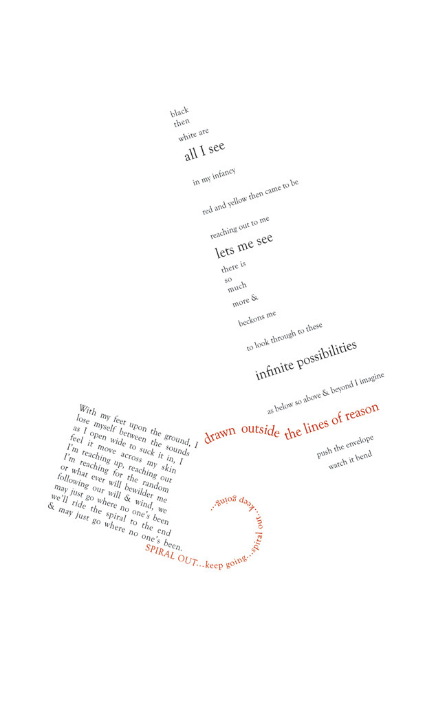
Full view recommended before reading description.typo_13_time.psd
Size : 49.4 MB
Attributes : (Expressive)
Let me think on this description. Let me ramble.
I restrained myself to two major thoughts in this. I didn't let loose like in Eight, or wander like in Seven. I didn't have a particular focus like in Nine, or a battle like in Eleven. Not as many questions as Twelve. Not as beautiful as Six. Not torn apart like Five, or confused like Four. But... in a way it's all of them. All of them wrapped in a bundle -- a bundle of time. And it's funny that way, with enough days left of summer that I'm counting them on my right hand.
Gold and Blue. In less than four days I will be a Golden Bear. Typography has seen me grow up... strange, isn't it? Four was at Cal Day, where I decided on my college. Five was afterwards, after I'd decided. Eight... well.
It's an hourglass. [Slow people have officially just caught up.] It's time... slipping away, yet building up at the same time. It's that equilibrium that's fascinating. What happens when there's no liquid at the top? [did you see the transformation?] Then there's all the sand at the bottom. Funny how time, how life works that way. Nothing ever disappears. It just get's relocated.
It feels so unreal right now. That it's counting down, that it's in the single digits. That sunflower is from Six. That lowercase Arial Black 't' is from Five. It stood for time, before. Before it was shattered. Broken. Now, it's whole again. There are the tentacles, too. And the Palace Script MT '6'. And the same styled border as Eight. I don't really like the 'Thirteen' at the bottom, but it was screaming to be done. At least it doesn't look like I was trying to be l33t or anything.
Anyways. I put a lot of time into this. Get it? 10+ hours. Less than 100 layers, though.
Enjoy.
Time keeps on slipping, slipping, slipping...
into the future...
Related content


Comments: 36

Wow, yeah I love the light colours and just generally all of it
")
👍: 0 ⏩: 0

I like the colors, the swirls, the use of text, very well put together.
I hope you're enjoying Berkeley, can be a wild place, I'm from SF and spent a lot of time there...
👍: 0 ⏩: 0

Beautiful bit of illustration. Love the colors and the typography. The whole pieces has a very polished elegant look to it. Nice work!
👍: 0 ⏩: 0


another wonderful composition of abstract shapes, minimal colors and typography.
eclectic. mmm.
")
👍: 0 ⏩: 0


this is awsome. you work so well with text *cries*
i wish i could do it damnit.... how about i give u all my uni typography assignments ")
damn... worth a try...
peace, great work.
👍: 0 ⏩: 0


i love the concept and the whole message behind this piece...great work as usual
👍: 0 ⏩: 0


You were worried about disappointing me, 
This is proof of that, my friend.
👍: 0 ⏩: 1

thank you. truly, thank you.
👍: 0 ⏩: 0


VERY+nice! Love it. Very expressive, I love how you make me people sit back.... and think for a few with your pieces.
Fantastic job!
👍: 0 ⏩: 0

I like it, the colors rule. And the symbolism is brilliant.
👍: 0 ⏩: 0

Whoa. I'm speechless on this one...really amazing. You have a real gift for typography, don't let those dry engineering profs get to you! Cya soon up @ cal!
👍: 0 ⏩: 0

another great work.
I really like the transformation from water to sand, and it's great how you've incorporated parts of everything else into this one. It's even better that you've given this one a style of its own at the same time.
and as I've said before, it's great how your typography requires the viewer to think as much as you were making it.
👍: 0 ⏩: 0

Great typografy, great description they enhance each other.
Miracle maker? Yes you are...
👍: 0 ⏩: 0

Ack..how did I miss that? :B I've never seen an image on DA that opened like that.
Wow..all that text is great, the way it's placed in the images- sinking, being filled, dancing around in way that still makes you have no trouble reading it. And it is part of the design, not just text on visuals. I especially love how you incorporated the "13" in Thirteen at the bottom left..and I love the intentional slight angle and shadow.
👍: 0 ⏩: 0

 (Wink)")

another great typography! great colors too way to go sha.. lol
.allie
👍: 0 ⏩: 0
*nods to the descriptions and comments* Yes..the hourglass figure... it's lovely, all those curves and interpreted colors on glass. The yellows look amazing against the blues, and I love the bold black and white with the text. I especially love how the text slightly breaks the borders on the top and bottom.
👍: 0 ⏩: 1
click 'download' to view the full version.
👍: 0 ⏩: 0

wow, amazing. you know, you're the one who got me interested in typography, you did an amazing job on this piece.
what an inspiration.
👍: 0 ⏩: 0

ah! You ask questions in this that make me shake!! And with a layout around it that makes it really cool.
Well done, im glad you can put so much time into it and get a good result from it.
I like the colors.
👍: 0 ⏩: 0

One way to see full view is to hit the download button. Works well.
I like this piece; though the colours I'm not sure of. The yellow looks really really pale on my screen, but it could be my screen. A little deeper would be a better compliment to your indigo blue (again.. my screen maybe)
The concept is awesome. An hourglass never looses anything; and in reality... can't even keep track of time correctly. Because it keeps flipping. And every time you flip it, the sand makes a new design (ever seen hourglasses with swirly patterns in them?)
I flip my hourglass as much as possible; it causes me to constantly remember my past without letting me get too grown up.
~Orion
👍: 0 ⏩: 1
maybe it was just my screen, i haven't viewed it on anything except a laptop.
but, no, i've never seen an hourglass with swirly patterns. [Anime Big O uses a lot of hourglass imagery though]
 (Smile)")
👍: 0 ⏩: 0

You've been tempting me and I can't see the full view either!!!!

👍: 0 ⏩: 1
i think you have to click the 'download' button.
👍: 0 ⏩: 1
...ahem...i feel sheepish. lol, in that case...
love the hourglass concept, and the colours work well at least on my screen. i love how "future" is swimming, lost and fragmented and unsure, at the bottom of the hourglass.
you always raise such great questions, and in doing so, such powerfull emotions. but i am getting redundant; i just say the same things for all your pieces.
nice one, as usual.
👍: 0 ⏩: 0

click 'download' to view the full version.
👍: 0 ⏩: 1

i like the shiny colors
i also like the swirls and the border
i wanna make things like that
👍: 0 ⏩: 0

Lol, TIMEEEEEE keeps on slippppping!! INTO THA FUTUREE. I have to say- I hate that song. ^_^ I like the picture though.
👍: 0 ⏩: 0

Wow, this is simply awesome, i love the colors. light and refreshing. the sand clock (or whatever it's called) comes out really good.

👍: 0 ⏩: 0