HOME | DD
 symmetree — typography: lateralus by tool
Published: 2006-11-01 20:37:18 +0000 UTC; Views: 8116; Favourites: 60; Downloads: 116
Redirect to original
Description
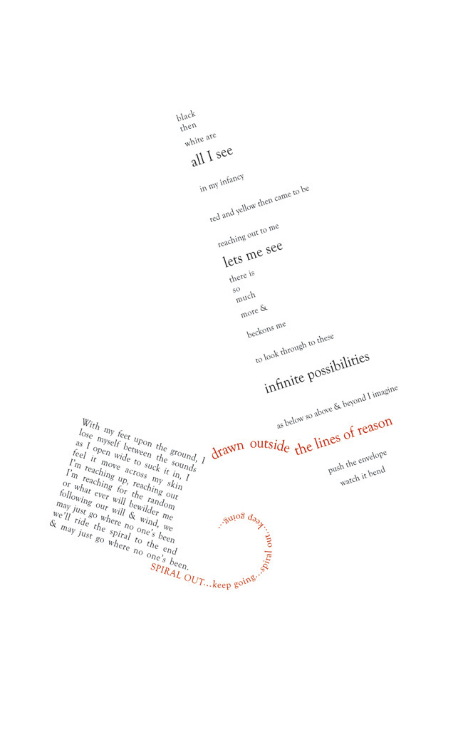
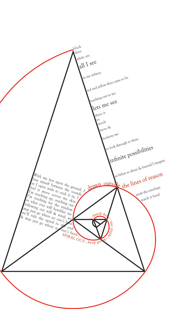
a poster based on tool - lateralus.our first proper project in ravensbourne.
one of the opening verses, trailing into the chorus,
aligned to the golden triangle and the phi ratio 1.618
the line "drawn outside the lines of reason"
breaks away from the narrowed, innocent, 1st perspective,
bridging the gap onto the spiral, and over to the
more enlightened perspective which ends with the
same break away, back onto the
"spiral out...keep going".
the red emphasizes (i hope) those two bridges.
all the kerning and leading phase up and down
the fibonacci sequence, as does the type size.
basically because the guitar riffs, drum rhytmn
and lyrical syllables also follow the same fibonacci
mathimatical pattern. (got an A- for this one!)
 (Smile)")
golden triangle grid layout
(lyrics: maynard james keenan)
Related content


Comments: 22


thanks a lot for your support triple7
👍: 0 ⏩: 0

I admire people who can show text better than usually. Very nice work!
👍: 0 ⏩: 1
cheers for that dude. and thank you for the 

👍: 0 ⏩: 1
No problem - you're talented.
👍: 0 ⏩: 0

well, tool is my absolute all-time favorite band and lateralus their best album
and this picture expresses perfeclty the complexity of the the song and shows with "simple" typography how much just in the lyrics is hidden.
it shows the flow and i really have the song in my ear while reading this.
the mark is well deserved.
i saw them live some time ago... really a mind blowing experience
i just had to 

 (Wink)")
👍: 0 ⏩: 1
i agree 100% with that, i saw them live and it was a beautiful experience. the music with the visuals and lighting, all together creates a surreal atmosphere. and Lateralus is my favourite tool album also. it's the most constructed.
👍: 0 ⏩: 1
yes and you never get fed up listening it because there are still things to discover. even after the 1000th time of listening
👍: 0 ⏩: 0

I can see it playing in my head. This is awesome ")
👍: 0 ⏩: 1
\m/ tool \m/
lateralus is my favourite song and album by them. it blows me away each time. never gets boring.
👍: 0 ⏩: 1
One of the best songs on that album, yes.
👍: 0 ⏩: 0

alright man look at this when you posted it but my message isnt here?? was showing this to someone in work.... they pass on the message that they love 'the approch and format' personaly i like the strategic change in text size....but my only crit. is the use of red, i think its the fact the red line is broken that throws me a little.... hey what do i know!
(congrads on the A)
👍: 0 ⏩: 1
thank you shane!
and that mysterious stranger too
the red colouring was a late suggestion from my lecturer. and the reasoning behind it, i believe is actually very apropriate:
the line "drawn outside the lines of reason" breaks away from the narrowed, innocent, first perspective, and bridges the gap onto the spiral and over to the more enlightened perspective which ends with the same break away, back onto the "spiral out...keep going" bit.
the red emphasizes (i hope) those two bridges.
")
👍: 0 ⏩: 1
ah always good to get an explaination.. cool beans, a class piece...(mysterious stranger=danish architect working beside me)..... ah the mystery is gone!
👍: 0 ⏩: 0

cool, im liking this.
it flows so nicely without the grid in view.
it all just seems to balane perfectly, lovely stuff
👍: 0 ⏩: 2
thank you jimbo!
It's a lot of minute detail work. for instance all the kerning and leading phase up and down the fibonacci sequence, as does the type size.
basically because the guitar riffs, drum rhytmn and lyrical syllables allow follow the same fibonacci mathimatical pattern.
👍: 0 ⏩: 1
sweet, sounds great.
you can see the detail put into the leading and kerning, there's definatly a rhythm there. a nice flow of the content too, well done on the A!
👍: 0 ⏩: 1
