HOME | DD
 ProgressingArtistry — Cyrien the Computer Engineer

#cyrien #icpep #computergraphics #digitalarts #technology
Published: 2017-12-07 06:29:25 +0000 UTC; Views: 448; Favourites: 38; Downloads: 0
Redirect to original
Description
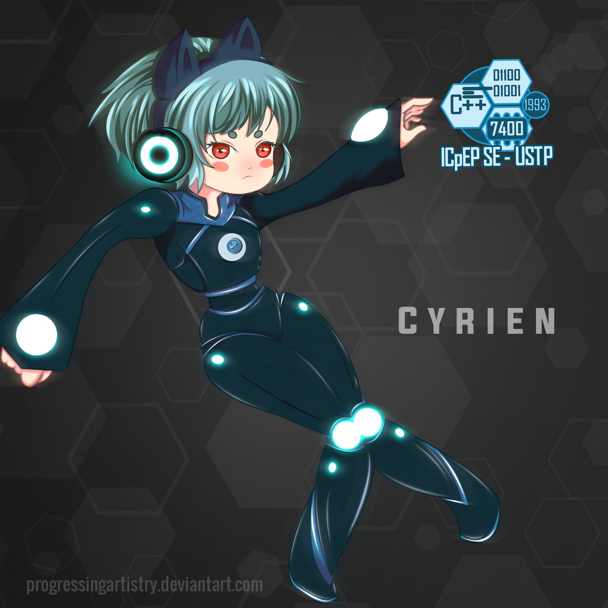
The mascot for our organization (ICpEP - Institute of Computer Engineers of the Philippines Student Edition USTP Chapter).. Just a random media here. xD. Anyway. Have an Ultra instinct day.
Related content
Comments: 15

Wow She looks so good! And I love the colours! It just gives the whole thing a great effect! Amazing job!!
👍: 0 ⏩: 1

Thank you very much I really appreciate the compliment fam
👍: 0 ⏩: 0

Hello, I am a member of ProjectComment , and like any other who was here, my intentions are purely without malice. as part of their "Everything Must Go 2017" contest, I have chosen to select your work to leave a constructive comment on.
The Good: The colors, shades and background do make it feel like the mascot is indeed in cyberspace, and they add a nice flair to an otherwise bland background. The hair and eyes of the character also help indicate that the mascot is supposed to indeed by a cybernetic being, like an AI.
What could be improved: While I do like what you're trying to do here, the proportions are a little wonky to me personally. It feels as if it was a mere rough draft version of the character (though I suppose that only leave room for "upgraded versions" to be introduced over the years). And I do feel like some of the darker grays could be replaced with some shade of blue to help make the character really pop.
Overall: While there are some problems that I have with this particular version of the mascot, it is still a well done drawing that almost makes me want to sign up for college............almost. I would love to see this character get more and more upgrades over the years to show just how as technology evolves, so do people and AI.
👍: 0 ⏩: 0

Hi! It's really nice that I can critique to a fellow Filipino here, and I must say that I love the colors of the mascot. And the fact that she got cat earphone makes her look adorable. It's really amazing that the shading goes well with the style that gives it an easy image to look at. However, I'll suggest that maybe you can have a reference for the losing since I feel random about it, I do prefer the real human posings that don't look floaty, unless the chara could fly. Anyways, I love your work and keep it up ^u^
~ProjectComment
👍: 0 ⏩: 0

Hi from ProjectComment ! I'm commenting as part of the Everything Must Go contest .
It's almost been a year since I last critiqued your art, and you have really improved a lot! Your line art is smoother and more streamlined, and the variations in thickness give your drawing more depth. Your shading has gotten better as well, and your characters look more three-dimensional as a result. Excellent work 
Overall, your character design and coloring is really good. I love the contrast between Cyrien's bright red eyes and warm face and the cooler colors of their outfit, or the organic vs. inorganic parts of the character. It complements what you've written about the character, and makes their occupation clear. The contrast also makes them look life-like, rather than artificial and robotic.
I like how the lights in Cyrien's outfit draw the audience's attention to the character and outfit without being distracting. The only thing I'd suggest about this is to add more illumination to the lights near the hands, since they don't glow with the same intensity as the rest of the lights, and as a result look more like patterns sewn into the clothing.
I also love the crisp, tech-y logo on the right side, and how you've continued the geometric patterns in the background. The shapes add to the technology vibe given by the rest of your drawing, while the brown colors in the background allow the character to stand out more strongly than a more 'artificial' or tech-related (ex. light blue) color would. I think your watermark should be moved a bit, however. The bottom edge of your watermark is closer to the bottom of the drawing, than the left edge is to the left of the drawing (to a lesser degree, I would say the same of the logo). Given how neat the rest of your drawing is, the alignment of your watermark stands out.
Lastly, I find Cyrien's pose a bit confusing and distracting. From the angle of the torso, it seems that they are leaning backwards (or alternatively putting their hips forward), but the head remains level as though they are standing straight. This, coupled with the fact that neither foot looks like it's firmly planted on the ground, and the feet are spread far apart despite the thighs touching, gives the impression of imbalance. I could be wrong about the pose, but I'm getting the sense that Cyrien is about to fall over.
There are a variety of ways to address this, one suggestion is to straighten the right leg while bending the left with the knees facing forward rather than towards the right knee (kind of like this pose - though there's a risk that the pose will look like a dance pose). Another is to put the feet together, so it looks as though Cyrien is floating.
Hope this helps, and keep up the excellent work!
👍: 0 ⏩: 0

Hi, I'm from the Project Comment
I'll start with the positive:
-the proportions of the body are well made, the way they are drawn would put it in an anime mix with a little chibi and cartoon, I really like it, the hands were perfect, that blur in the chest, hands, and cores of light (to name a few) were perfect in style, those loose lines to draw the shadows and lights are really ingenious.
now the negative thing:
-maybe it's my thing but I do not see the point of origin of the light, because some shadows contradict each other slightly but the light nuclei could give an explanation of why.
-this is a tip or idea from me, I think it would have been noticeably better if you had made the nuclei of light the origins of the original shading and darkened a little creating an artificial lighting and with a considerable amount of darkness. I give you a 4 of 5 , I hope you find it useful to my critic
👍: 0 ⏩: 0

WOw! SO CUTE!!! i had seen those headphones in the internet. I LOVE IT!!
👍: 0 ⏩: 1

Eheheheeeeey~ Thank you very much Milimiki. Glad you like it. 😁
👍: 0 ⏩: 1

Thank you very much pal
👍: 0 ⏩: 1

👍: 0 ⏩: 0

OMG the way u colored it simply amazing! ! My eyes are wide open....
And she is damn cute
👍: 0 ⏩: 1

Hii! Thank you very much for the compliment Gudservo sir
👍: 0 ⏩: 1

You are welcome my friend, honestly u deserve every bit of applause for this
👍: 0 ⏩: 0


