HOME | DD
 ProjectComment — Quick Comments
Published: 2016-07-07 15:30:28 +0000 UTC; Views: 74414; Favourites: 159; Downloads: 0
Redirect to original
Description
body div#devskin0 hr { }
Welcome to ProjectComment 's Quick Comments!
If you would like quick feedback on something specific (e.g. a quick answer to a burning question) this is the place for you to do so!
To take part, please reply to this journal with…
- Your quick, specific question (see examples below).
- Your artwork (linked or posted via thumbcode )
Our members and admins will do our best to answer your questions, but we cannot guarantee answers. Answers may vary in length, depending on your questions.
Example Questions
- I know something is wrong with the chin of the person I'm painting, but I don't know what it is exactly and how to fix it. Help please!
- I finished this piece, but now I'm not sure about the colours. Can someone tell me if they work together?
- I don’t think the composition of my photograph is quite right. Is there a way I can crop it to improve it?
- Specific questions about words and grammar, e.g. "Is the use of word x appropriate here?"
- Specific questions about clarity, e.g. "Is what I'm trying to say with my poem clear?"
- Specific questions about flow, e.g. "Is the reading flow disrupted anywhere?"
Related content
Comments: 6315

👍: 0 ⏩: 0

👍: 0 ⏩: 0

How can you find out if your words meets the minimum requirements of said comment? Just keep on typing till you think you’ve reached 300?!
👍: 0 ⏩: 1

👍: 0 ⏩: 1

Greetings again!
I'm recently working on this picture colored with traditional tools.
And I'm asking for some little help from someone who's experienced with using colored pencils like Polychromos or similar brands.
The question is simple: I cannot figure out which colors I should use for having a light skin color tone without looking too much yellow/red.
Before I mess up my picture I'm asking first which colors are recommendable.
P.S.: my apologies that my scanner messed up my picture.

👍: 0 ⏩: 1

I use polychromos. I do not know how many pencils you have (I have the 120 pencil set), so forgive me if you don't have all the pencils I mention.
I would use Light Flesh as a base color, as this is the "standard" light skin tone, especially if you do not push that hard. Cinnamon would be good for shading, with maybe some Bistre for the very darkest shadows.
If you find the shadows too red I might add a thin layer of a light blue (Light Ultramarine for example, or Sky Blue) over them. But I do not think it should be much of a problem, especially with the color scheme you are using.
Hope this helps!
👍: 0 ⏩: 1
Sorry for the late reply ...
I used some colors on a small paper to test which combinations would suit best. And exactly these three colors you mentioned were the best.
It might be late but thanks for the help.
👍: 0 ⏩: 1

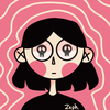
Any changes needed? WIP drawing of a new pony OC I got from a friend! <3
I have a feeling I fucked up the anatomy -_- (I don’t draw ponies much XD )
<3
👍: 1 ⏩: 2

👍: 0 ⏩: 0

I think the wings should be in the same position for starters (unless one is supposed to be broken). It looks a little unnatural for both to be in different places at once.
I’d also suggest bringing the forehooves a bit closer together. They look a little too far apart for her just to be standing normally. Other than that, she looks great!
👍: 0 ⏩: 0


Hello!
If you would like an answer, please include a specific question here in the journal, rather than directing people elsewhere.
Let me know if you have any questions! I'm happy to help.
👍: 0 ⏩: 0

Hello!
If you would like an answer, please include a specific question. Example questions are:
- I know something is wrong with the chin of the person I'm painting, but I don't know what it is exactly and how to fix it?
- I finished this piece, but now I'm not sure about the colours. Can someone tell me if they work together?
- I don’t think the composition of my photograph is quite right. Is there a way I can crop it to improve it?
On the other hand, if you'd like more general feedback, you may be more interested in submitting to our gallery (requires constructive commenting) or our favourites (no comments required).
Let me know if you have any questions! I'm happy to help.
👍: 0 ⏩: 0

Hi there!
So I recently started digitally painting. While it is generally going well I'm having trouble fitting in the eyes and mouth with that style.. any tips or suggestions?
Mature Content
👍: 0 ⏩: 1

If you're having a hard time with painting features on the body, a good thing to do is do a study in gray scale. I like to paint all of my skin the same color first, and then overlay lip color on top of that. Eyes can be a little trickier, but the same applies if you're struggling. Remember that the eyes aren't hard outlined in black and a variety of colors make up the skin around the eye and the eye itself. (Skin around the eye often has your typical fleshy pinks and yellows, but greens, blues, and purples also come into the mix. And the whites of the eyes aren't a hard white--very little you see in life is actually pure white...not that her eye-whites are white-white. I actually think the whites you used work rather well! Maybe a liiittle lighter to contrast against the skin, but not much needed!) If you use hard black and whites to make up the eyes, it's going to look less convincing.)
I encourage doing a few life studies with self portraits and really observe the colors. Don't draw/paint what you think you see, take the time to really observe and break it down.
Also, if it helps, don't be afraid to push your values. So many of your colors, if you turn this into a grey scale piece, are close to the same value of grey. More contrast will help this already gorgeous piece pop!!
I hope that helps! 
👍: 0 ⏩: 1
Thank you so so much for taking the time to type this out and give such great advice 
")
👍: 0 ⏩: 1
You're so welcome! You should be happy with your art now--it's already gorgeous.  (Smile)")
👍: 0 ⏩: 0
Greetings!
I'm still working on this picture. And I'm doing the final details before I color it.
I'm working on the flowery ornament. I have the feeling that it's ready to be colored.
But still .... something is missing. Maybe I could add some more foral elements and if yes, then where I could include them without being overloaded?
👍: 0 ⏩: 1

👍: 0 ⏩: 1
I get it what you mean. I have these thoughts, too that the center point is too much on the right.
Then I'll reduce and move the ornaments more to upright I guess and add more on the left to make the center go more to the character.
The only problem would be that I need to draw them anew as I'm planning to color it with traditional tools.
That helped me a lot where I can work on. Thank you very much for the advice!
👍: 0 ⏩: 1
👍: 0 ⏩: 1
To flip it?. Haven't used this technique before and well I tested it on my sketch and needed to realize that ... .. well, I'm not that mad of my work but I was totally perplexed that it looks flipped not that well than I thought after all these years I'm drawing

👍: 0 ⏩: 1
👍: 0 ⏩: 0
👍: 0 ⏩: 1

👍: 1 ⏩: 0

👍: 0 ⏩: 2

👍: 0 ⏩: 2
👍: 0 ⏩: 0
👍: 0 ⏩: 0
👍: 1 ⏩: 2
👍: 0 ⏩: 0
👍: 0 ⏩: 0
👍: 1 ⏩: 1

👍: 0 ⏩: 1
👍: 0 ⏩: 1
👍: 1 ⏩: 0

i recently made redesigns of characters for my series the imagimons and i'm wondering if i should go with these designs or stick with the old ones. what you guys think? any feedback on these designs would be great
👍: 0 ⏩: 2

It always depends of what you're trying to go with. Remember that te design of a character should reflect at least some part of themselves. You can always research color meanings or shape meanings to include in your drawings if that's what you're going for.
👍: 0 ⏩: 0
👍: 0 ⏩: 0
Hello!
If you would like an answer, please include a specific question. Example questions are:
- I know something is wrong with the chin of the person I'm painting, but I don't know what it is exactly and how to fix it?
- I finished this piece, but now I'm not sure about the colours. Can someone tell me if they work together?
- I don’t think the composition of my photograph is quite right. Is there a way I can crop it to improve it?
On the other hand, if you'd like more general feedback, you may be more interested in submitting to our gallery (requires constructive commenting) or our favourites (no comments required).
Let me know if you have any questions! I'm happy to help.
👍: 1 ⏩: 1

👍: 0 ⏩: 0

Is this guy's right eye looking at the viewer or he is looking diffrent direction? Thank you!
👍: 0 ⏩: 2
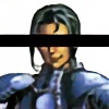
The right eye is looking in viewer's direction, but it seems to be an inward-turned gaze. Like he's too deep in thought.
The eyes do look a bit asymmetrical, mostly the width, left being narrow and right being wide open. The other commenter makes a good point about checking yourself in the mirror to get a fresh perspective
👍: 0 ⏩: 1
<= Prev | | Next =>