HOME | DD
 pseudo-manitou —
PM Shake it
[NSFW]
pseudo-manitou —
PM Shake it
[NSFW]

Published: 2007-09-25 04:48:54 +0000 UTC; Views: 12074; Favourites: 442; Downloads: 263
Redirect to original
Description
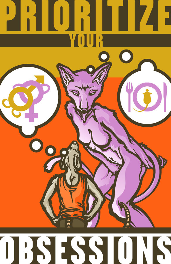
Revision of an older piece I took down. Something with more club appeal, more risky colors.Related content


Comments: 71

Have to admit I like the semi contrast of the simplyfied colour palette,
Reminds me of Kit Mambo from Animalympics
Sweet ={[O.o]}=
 (Smile)")
👍: 0 ⏩: 0

 (Wink)")

The colors on this one or nice. I still prefer the original though.
👍: 0 ⏩: 0


gorgeous pose- the smooth inking is just outstanding.
👍: 0 ⏩: 0

I like the colors and the subject. They are both really funky. Very retro chic.
👍: 0 ⏩: 0

NOICE! In fact, all of your recent uploads rock. When you update, you are serious about it!
👍: 0 ⏩: 0


O_o
Excellent colouring and anatomy job!
I love this one!
must + "tu cartonne" your draw
And keep up the good work!

👍: 0 ⏩: 0

I love this piece! Definitely a club feel. And the musculature on the girl is so strong.
")
👍: 0 ⏩: 0

I've always loved the bold lines you outline your figures with. You did a wonderful job reworking this. :3
👍: 0 ⏩: 0


Your palette risk turned out wonderful! I adore the combination of those slightely earthy oranges and blue/greens. The "in between" of that yellow ties it all in wonderfully. Great use of an analagous colour scheme
👍: 0 ⏩: 0

Do you mean risky as in 'risque' or risky as in if I don't do this right people will go blind."?
👍: 0 ⏩: 3

Wow, I just realised how OLD this comment is, please ignore me :3
👍: 0 ⏩: 0
WRONG!
Risky is "If you do this, people MAY go blind."
👍: 0 ⏩: 0

risky = the 'go blind' part.
👍: 0 ⏩: 1

no no its great! love the coloring
👍: 0 ⏩: 0