HOME | DD
 psilocybin — Equilibrium Press Spread
Published: 2006-03-19 20:47:54 +0000 UTC; Views: 222; Favourites: 0; Downloads: 57
Redirect to original
Description
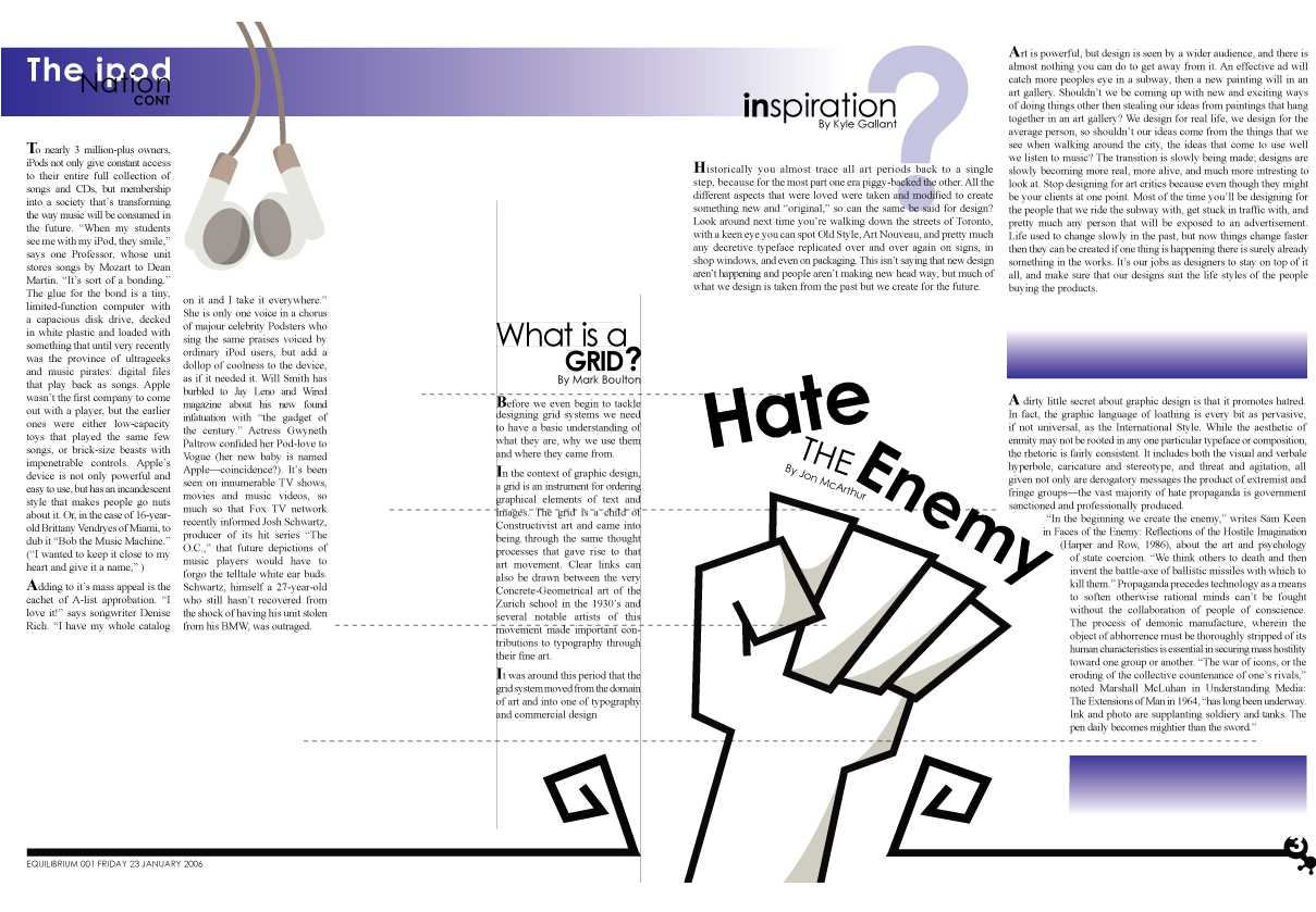
This is the spread for the news letter we had to design for my editoral design class, It's my first time trying to lay things out in a manner that works.There are a few errors with the headings, and I could have spent the time fixing them... this is the first project I really worked on that was worth uploading. I'm goign up load the one with mistakes, so that you can all watch me improve (more for my sake then yours)
Edit:
==============
Full view please... don't mind the fact that the text is light, for some reason I can't change it... I submited mostly because I enjoy the layout.
Related content


Comments: 4

i see rivers ... lots of em .... try ragged right, i know justified is ez , but try to play with ragged right , itll cut back on rivers and easyer to read ... i think
👍: 0 ⏩: 1

I agree with the rivers comment, they aren't overly apparent until you stare at it for too long. I was going to try the rag but to be honest, it really tore the design apart.
👍: 0 ⏩: 0

I like the layout of this. The "What is a grid?" article in particular is very clever.
The only issue I have with it is that with your article, I don't know if the column on the left is a continuation of the column on the right of it. If it is, I don't think a large bolded "A" is neccesary.
I love the drawing of the fist and how it breaks out of it's border. it's very well made and the title being placed with that is really cool. On the first impression though, I wasn't sure if it was the title of the article on the left of it or not. Is there a way to possibly rotate the "the Enemy" part as well as the writer so it is more in line with the "Hate" bit and sticks out into more of the top part of the paragragh? It's a little thing, and it's probably just me, but that might associate it just a little bit more with the article it's a title of.
I love the layout of "iPod Nation" And adore the earphones just hanging there. It provides a very pleasent image and shows that pictures can be used even if it's in a "continued" section which frankly, more magazines should be doing.
All and all I really like this. I like how the images incorporate themselves with the paper and the article itself. Good job!
👍: 0 ⏩: 1
Wow... thanks for your great compliments.
I agree with the bold first letters, they aren't really needed... but I was trying to work with a parapgraph spacing problem, hopefully with the next text/layout pieces I put up you'll notice an improvement.
👍: 0 ⏩: 0