HOME | DD
 Quaenam — Night Sky Tutorial for PaintTool SAI 2
#clouds #dawn #dusk #moonlit #sai2 #sky #tutorial #painttoolsai
Published: 2019-06-04 02:06:53 +0000 UTC; Views: 2329; Favourites: 57; Downloads: 0
Redirect to original
Description
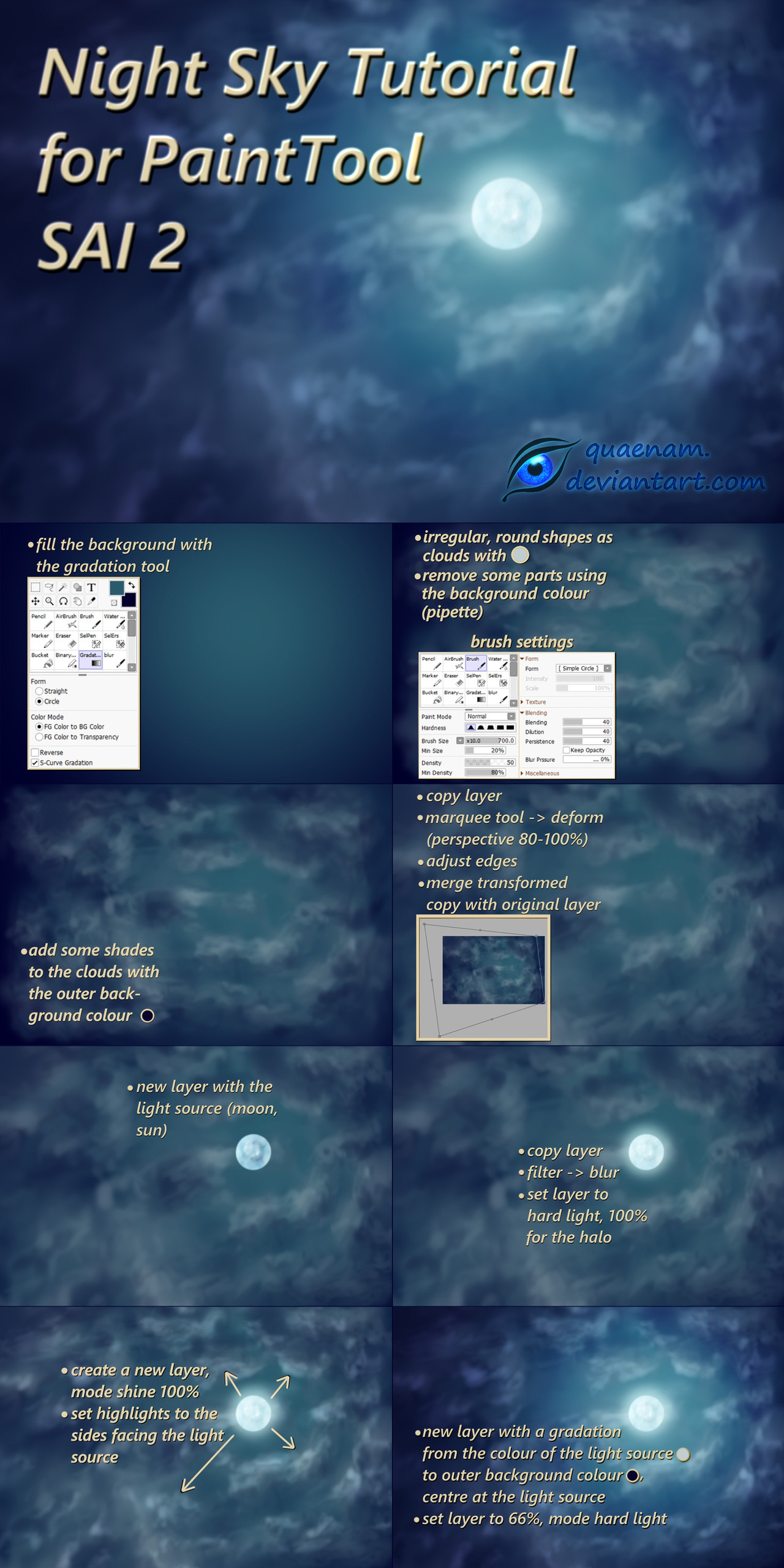
Quick and easy tutorial for a moonlit night sky, also works great for dusk/dawn if you adjust the colours, something I used here .
1. First fill the background with the gradation tool, lightest colour where your light source is going to be, to a darker colour with a slight shift in hue on the outer edges. I used the circular version, but if the sun or moon is outside of the frame a straight gradation works, too.
2. Next come some clouds with a very soft brush directly on the same layer to get that half transparent look. For more variation in shapes and density select the background colour next to the respective cloud with the pipette tool and paint over some nearby areas.
3.Now add some shades to the clouds, same colour as the darkest part of the background, like the rest with roundish, irreglar brush strokes.
4. It is possible to skip this step if you managed to give the clouds some depth and direction while painting them, but the transform is a nice and easy way achieve that if necessary. To avoid gaps, transform a copy of the layer, the whole image or just certain areas, whatever looks best. Then blur or partially remove the edges to get rid of hard lines and merge it with the untransformed original layer.
5.+6. Optional, if you want the light source visible on the image and not outside of the frame. Just create a circle on a new layer as moon or sun, for the moon some darker areas on the surface, in a light yellow/light blue-green colour. For a nice glow effect copy the layer, use Gaussian blur (under filters) on the copy and set the layer to hard light.
7. In the next step add some highlights only to those parts of the clouds facing the light source, so clouds above it get highlights on the parts pointing down, clouds on the right side of it to those the areas that face left and so on.
8. And finally, create a new layer on top of the others again with the gradation tool, basically the same as at the beginning, maybe with some slight shift in hue to get a bit more variation. This darkens the clouds and highlights further away from the light source while makes those close to it seem brighter while giving them more vibrant colours.