Description
A little tutorial I put together to explain how the crystal in this work was made. I am not terribly fond of youtube tutorials, mostly because more often than not people need forever to get to the point. On top of that it's harder to find an answer to a specific problem if you have to watch the whole thing (if even then), that's why I personally prefer written tutorials.
That being said, I tried to keep this as short as possible, hopefully not at the expense of clarity. This is my first attempt at an tutorial, so be lenient.
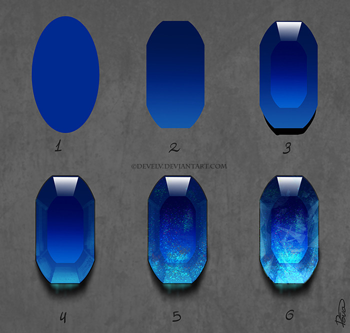
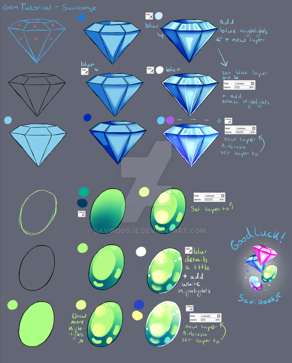
Outline the shape of the crystal with a very small brush on a linework layer.Fill in the partial areas with the base colour, each on a separate layer (9 in this case).On a new layer, use the gradient tool with black->transparent, circular or straight, whatever looks better, set as clipping group with the partial area as base. When possible, use different directions of the gradient in each area for better contrast.For some colour variation create an overlay layer, again with the gradient tool, using two colours close to the base colour, in this case purple and a more greenish blue. The more the area is distorted, the stronger the change of colour.Add some reflections to the surfaces hit by the light source, here from the upper left corner, and some weaker reflections on the opposite side with a light grey-blue colour. You might have guessed it by now, with the gradient tool again, colour->transparent on an layer set to screen.Optional step, but many crystals have cracks and/or inclusions, which can be used to give the object more depth. Any texture that resembles cracks and isn't too regular will do. Use the transform tool with perspective to adjust the texture to the direction of each area.Again, optional step, only for translucent crystals. This is similar to the first two steps, but everything is done on one layer with small variations in colour for each partial area and the edges outlined in a very light colour. Doesn't need to be as detailed because there won't be much left to see after the layer is set to burn/dodge, ~33% opacity. If you feel like it, emphasise the edges with slightly blurred lines on an extra layer set to shine, low opacity.The final result. Small cut-out to show the layer settings using the middle left partial area as example.
 Quaenam — Crystal Tutorial (SAI v2)