HOME | DD
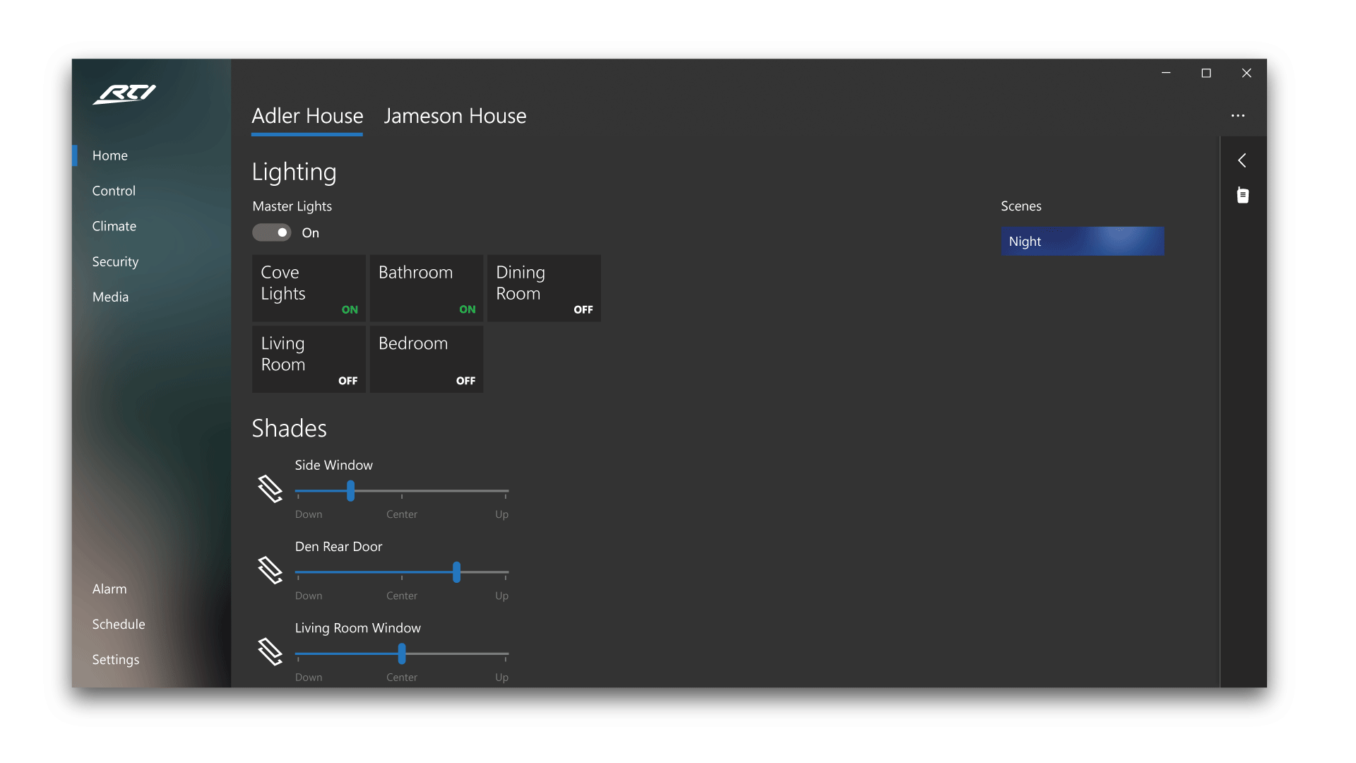
 Quayledant — Project NEON - Task Scheduler in Settings
by-nc
Quayledant — Project NEON - Task Scheduler in Settings
by-nc

#concept #dark #interfacedesign #minimal #windows10
Published: 2017-05-09 05:58:14 +0000 UTC; Views: 1736; Favourites: 3; Downloads: 0
Redirect to original
Description
I moved the Task Scheduler into the Settings App because, well it is meant to be inside of it anyway. If you look closely, I redesigned the Settings UI to be more NEON-like. I also increased the blur intensity of my windows. As always, the wallpaper is taken from Google Earth View .P.S.: this took me longer than expected to materialize it .-.
What do you think? Let me know in the comments!
Related content


Comments: 6

 (Smile)")

Pity you are not in charge of the design of windows 10 as it seems your ideas would make true better in all ways replacement for windows 7 and 8.1
👍: 0 ⏩: 1

I don't deserve this comment at all... I'm just a high-schooler living in a third-world country
")
👍: 0 ⏩: 0

I should've commented on this earlier, but oh well. This is really impressive. I love how well you've matched the style of the settings app and made it look like it truly belongs there. The way everything is laid out just makes sense. I can't find anything else to say about this, it really speaks for itself.
👍: 0 ⏩: 1
Thanks so much for the comment! I tried a few different concepts before choosing this one. I'm glad that you liked it. Now I love it even more
")
👍: 0 ⏩: 0