HOME | DD
 Quelchii — Traditional (mixed media) tutorial
#avengers #coloredpencils #drawing #loki #marvel #portrait #traditional #hiddleston #tomhiddleston #coloredpencil #copicmarkers #markers #mixedmedia #stepbystep #traditionalart #tutorial #mixedmediatraditional
Published: 2015-02-10 18:52:01 +0000 UTC; Views: 17674; Favourites: 394; Downloads: 100
Redirect to original
Description
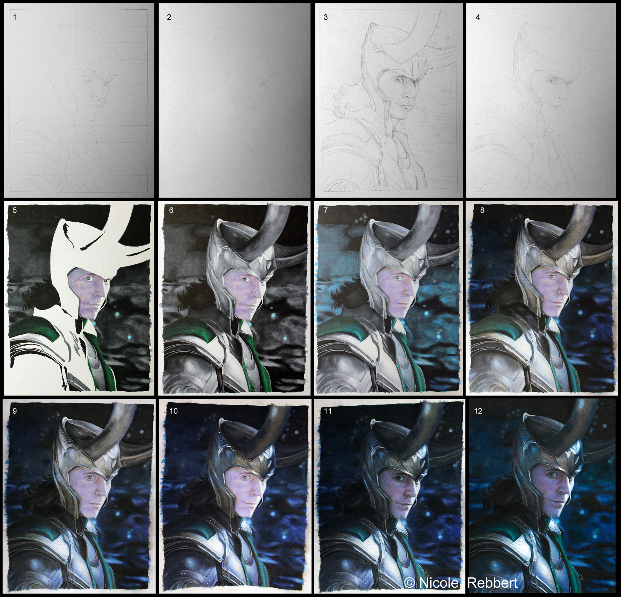
This is a little tutorial (see explanations at the bottom of this description) for my latest traditional mixed media drawing "Loki" (Tom Hiddleston as Loki from the movie The Avengers).I photographed the steps 1-11 with my Canon EOS 600D (EOS Rebel T3i) without flash. I'm sorry for the bad quality, but the light conditions were not very good. Step 12 is the scan.
Please don't upload my pictures somewhere else without my permission. Don't infringe copyright!
Here are some more detailed step by step tutorials/descriptions for colored pencil and mixed media + the finished drawing:
Here is my summarized working process for this drawing:
Sorry in advance for all the mistakes (It would have been much more easier to write this in German!).
First off here my equipment:
- a printed reference picture (edited in photoshop, because screencaps are often too dark!) and laptop to zoom in (details!)
- paper A4 (210x297mm, 190 g/m²)
- Faber-Castell pencil H3 and HB or Faber-Castell grip 1345 HB 0.5
- Faber-Castell Perfection 7056 (eraser pencil), eraser, coloured pencil sharpener, set square or ruler
- Copic Ciao markers
- Faber-Castell Polychromos artists' colour pencils
- uni-ball Signo pigment ink um-153 white
step 1: Grid method for major outlines: Draw a grid on the paper (H3 and don't press too much, because you have to remove it and don't want to get "grooves/furrows"!!!) and on the reference picture. Draw the important outlines with a graphite pencil HB.
step 2: Erase the grid lines completely and the outlines so that you can barely see them.
step 3: Draw all outlines and details properly (you can also "test" a few shadows in order to make sure that the face looks good).
step 4: Erase everything a little bit (especially in bright areas!).
step 5 - 7: Base colouring with markers. I also blended a few colours (works only with thick paper >180g/m², because otherwise it would bleed through and marker paper is not so good for colored pencil!), because I don't have so many Copics. Side note for step 7: There is already a little bit of colored pencil in the face to check the likeness again (eyes, nose, mouth) and too smoothen the skin texture.
step 8: Addition of colored pencil layers to the background (black, different shades of blue, cold grey and white for the stars -> you can apply white colored pencil on a black or very dark marker layer!) + a few colourful highlights for his armour (blue and ochre) and grey.
step 9: Near completion of his armor (black, different shades of blue and cold grey -> start with the colourful details, add dark shadows and/or dark details and blend everything with a lighter colour e.g. light grey or light blue in this case) + some more grey colored pencil layers for his helmet
step 10: Final colouring of the helmet (a bit ochre, differeng shades of grey and blue). Adding of white highlights with a white gel pen.
step 11: Define (/remove parts of) the white gel pen lines/dots with a white or dark colored pencil (depends on area). Colouring of the face. Side note: Is something wrong with face? => turn the reference and the drawing upside down, then it's easier to spot mistakes (sounds strange, but it helps a lot)!
step 12: scan (edit the picture in Photoshop CS5: cut out the border, edit brightness/contrast and colour balance to resemble the original drawing)
More side notes:
- Usually I start with the face, because when it's completely messed up I have to start again (this happened one time so far). But the picture is so dark, that I finished it at the end, because I often draw it too bright in the beginning so that I have to darken it in the end...
- Almost every time I print the reference picture two times, because I don't like to look at a grid the whole time.
- In this example the grid is "everywhere" in the beginning, but most of the time I draw the grid where I need it. You can use a whole grid for a very dark picture like this, but if you use a reference with many white or bright areas it's almost impossible to let the lines or some remains disappear.
- You can also use the grid method without step 2 and just draw everything properly with the grid (I just use it for important outlines and then I try to draw everything else without grid).
- This picture is very dark, so I used a marker base layer almost everywhere. Most of the time I just use it only for a few parts.
Time: maybe something about 25 hours?
Related content


Comments: 94

Nice! A tutorial!
Unfortunely, my skill is too low for good results, but... it's better to have some idea before start a new realistic traditional drawing
👍: 0 ⏩: 1

Thank you!
Just give it a try! It's never too late to improve!
 (Wink)")
👍: 0 ⏩: 1
hehe, thanks.
I'll try someday, when I finish the projects in digital I have in mind
👍: 0 ⏩: 0
I hope your keybord is "drool-proof"!
👍: 0 ⏩: 1

You put so much work into these AMAZING Loki Portraits and it wasn't just my keyboard this time
👍: 0 ⏩: 1


Darks then to lights. You are a rebel!
👍: 0 ⏩: 1
Lol! It was just necessary for this drawing, because I tend to draw some areas too bright. When I do a normal marker drawing I start with the lightest colours (most of the time)! But I always try to adapt my technique/approach to the picture!
👍: 0 ⏩: 1
Whatever works, said the federal employee. And results prove (time and again) it works great when you do it! This was a great tutorial, simple clear and easy to replicate for those willing to try. I have a Nebula I want to try on a sepia paper. When I finally get around t it, I think I am going to try the grid method. I always geek up my balance and ratios.
👍: 0 ⏩: 1

Thanks for sharing this. Really interesting to see your process.
👍: 0 ⏩: 1

So this is how you do it! For the marker layer of the skin do I see a little blue dabbed in there? Strange how even your marker has the texture of pencil . I am so going to have a go at one of these (marker then pencil). Might have to choose a subject with a simpler outfit though...
👍: 0 ⏩: 1
For the skin I used at first light pink, then light purple and also light blue. I had no good colour so I had to mix so much up. It was a bit too much, so the texture of the skin with just marker looks a bit weird (then the "solvent" of the marker bleeds into other parts and lightens it up). But that's what happens if you don't use watercolour or marker paper!
Good luck!

👍: 0 ⏩: 1
Haha. Yeah, I am guilty of working on cheap printer paper when I should be using a half decent sketch pad or something.
Thank you! (gonna need it... my markers hate me).
👍: 0 ⏩: 1
Lol! Yes, print paper is even worse than my mixed media / sketch paper (I recommend at least 180g/m²)!
👍: 0 ⏩: 1
Print paper is indeed evil. There are plenty of shops that sell nice paper near where I live but I am too poor to buy it.
")
👍: 0 ⏩: 1
Don't give up. One day you'll be able to buy better paper!
👍: 0 ⏩: 1
Thank you. I should have a great job after university, provided I can afford to finish.
👍: 0 ⏩: 0

Aaah, that's how the magic happens!
Vielen Dank für's zeigen, sehr interessant!
👍: 0 ⏩: 1
Oh yeah!
Kein Problem! Ich bin froh, dass ich es endlich mal geschafft habe auch die ersten Schritte zu dokumentieren...
👍: 0 ⏩: 0

Thanks a lot for this awesome tutorial. The end result is stunning and the armor and the green part of his clothes look like nothing I've thought was possible with copics/colour pencils. Truly amazing!
👍: 0 ⏩: 1


Wonderful!
I was always interested in one question. HOW should I scan coloured pencils? I do edit the result in Photoshop but it turns to be so much worse than on paper. When I see the difference I literally want to cry. I could use a camera, but my camera is too old and the result is rather bad. May be there are some specific parameters I should use while scanning?
Thanks for your advice ahead.
👍: 0 ⏩: 1
Thank you!
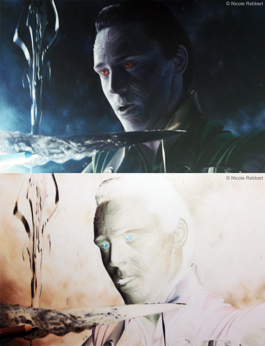
It always depends on the scanner, but I agree with you that most of the scanners are just "evil". When I scan a drawing everything is very bright, all the lighter details are gone, the colours are wrong, there's also a weird blue tint, "hard" lines appear in darker areas and the contrast is destroyed. So yes, my scanner makes me want to cry as well! See for example this comparison (parameters for the scan with my HP scanner: brightness -30, but it still looks very bright...): Scan vs. Photo For this drawing I had no other choice than to take a photo, because the scanner completely destroyed the sky.
For the other drawings I scan the picture and adjust the brightness (make it darker) in the scanning program. Then I edit the picture as good as possible in Photoshop...

👍: 0 ⏩: 1


Your quite welcome! 😃
👍: 0 ⏩: 0

I love watching how drawings are made step by step  (Smile)")

👍: 0 ⏩: 1


Had to add this to my tutorial Fav's. Who knows if I ever get over this horrible block I may have to attempt this type of piece, course I will have to get a few more tools as I don't own any copic markers or signo pigment pen.
Thanks so very much for taking the time, and BTW your English was superb.
👍: 0 ⏩: 1

Yay! I love that you post Wips/Tuts of your art! Very helpful and inspirational! ")
👍: 0 ⏩: 1
<= Prev |