HOME | DD
 QuestingRaven — One Eyed Jack Ink

Published: 2008-12-24 05:12:47 +0000 UTC; Views: 1007; Favourites: 18; Downloads: 20
Redirect to original
Description
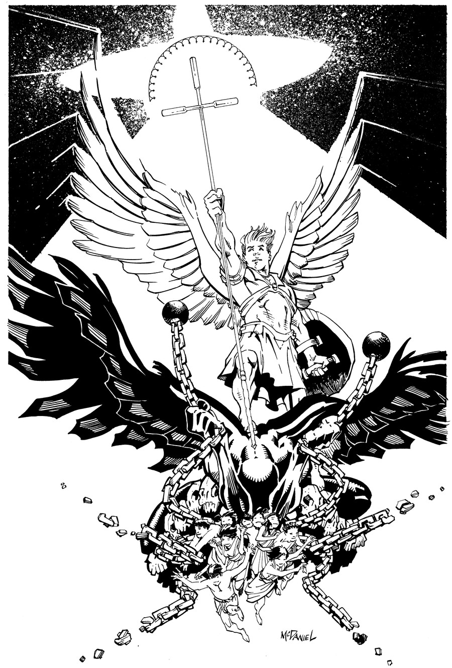
My entry to *Sapoman 's contest. The Inks, anyway. Colors coming.Related content


Comments: 30

 (Cool)")

Thanks  (Smile)")
👍: 0 ⏩: 0

No thank you and thanks for adding me to you watch.!!!
👍: 0 ⏩: 1
")
👍: 0 ⏩: 1

I think it looks great either way.
👍: 0 ⏩: 0

Your style just looks so awesome in the black and white ink media you do! *envy*
👍: 0 ⏩: 1
👍: 0 ⏩: 1
And you you use them so well!
 (Wink)")
👍: 0 ⏩: 0
WOOT! I'm working on getting more motion going through my drawings. Hopefully this is a step in the right direction.
👍: 0 ⏩: 1

I think there's definately more action than usual here
👍: 0 ⏩: 0


VERY nice use of black & white to create space & depth. I especially like how you used line vs shape to set the figure off the background, and I LOVE the value change on the wings to emphasize both the contour of the figure and of the feathers.
If I had to gripe, the details on the guns look a little... organic to me. But that's a tiny thing. This is a triumph, really. Good luck!
👍: 0 ⏩: 1
I agree about the guns. I really should have stopped and gotten a good reference image for them, and worked more with straight edges ... but by the time I got to them (they were the last parts to be done) I guess I was cutting corners ... 'Tis unfortunate, but maybe I can go back and digitally alter them ... or something ...
👍: 0 ⏩: 0

fab composition and inks bro... good luck to you in that contest! 

👍: 0 ⏩: 1
Thanks, I put a lot of thought into the placement of the black areas in this one, and I think it shows. Definitely one of my stronger pieces
👍: 0 ⏩: 0

Thanks
👍: 0 ⏩: 1

👍: 0 ⏩: 0

Thanks
👍: 0 ⏩: 0

Nice contrast in black and white. Everywhere I look there's always something else to look at.
👍: 0 ⏩: 1
Thanks, it was an amazingly fun image to work on
👍: 0 ⏩: 0