HOME | DD
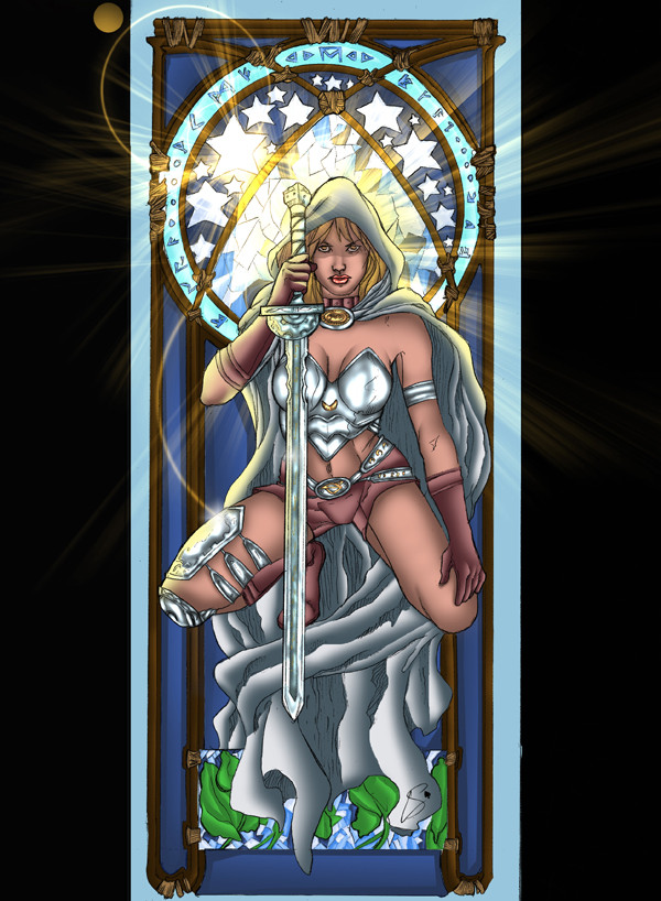
 QuestingRaven — One Winged Angel - Color

Published: 2008-05-01 03:06:11 +0000 UTC; Views: 1110; Favourites: 19; Downloads: 20
Redirect to original
Description
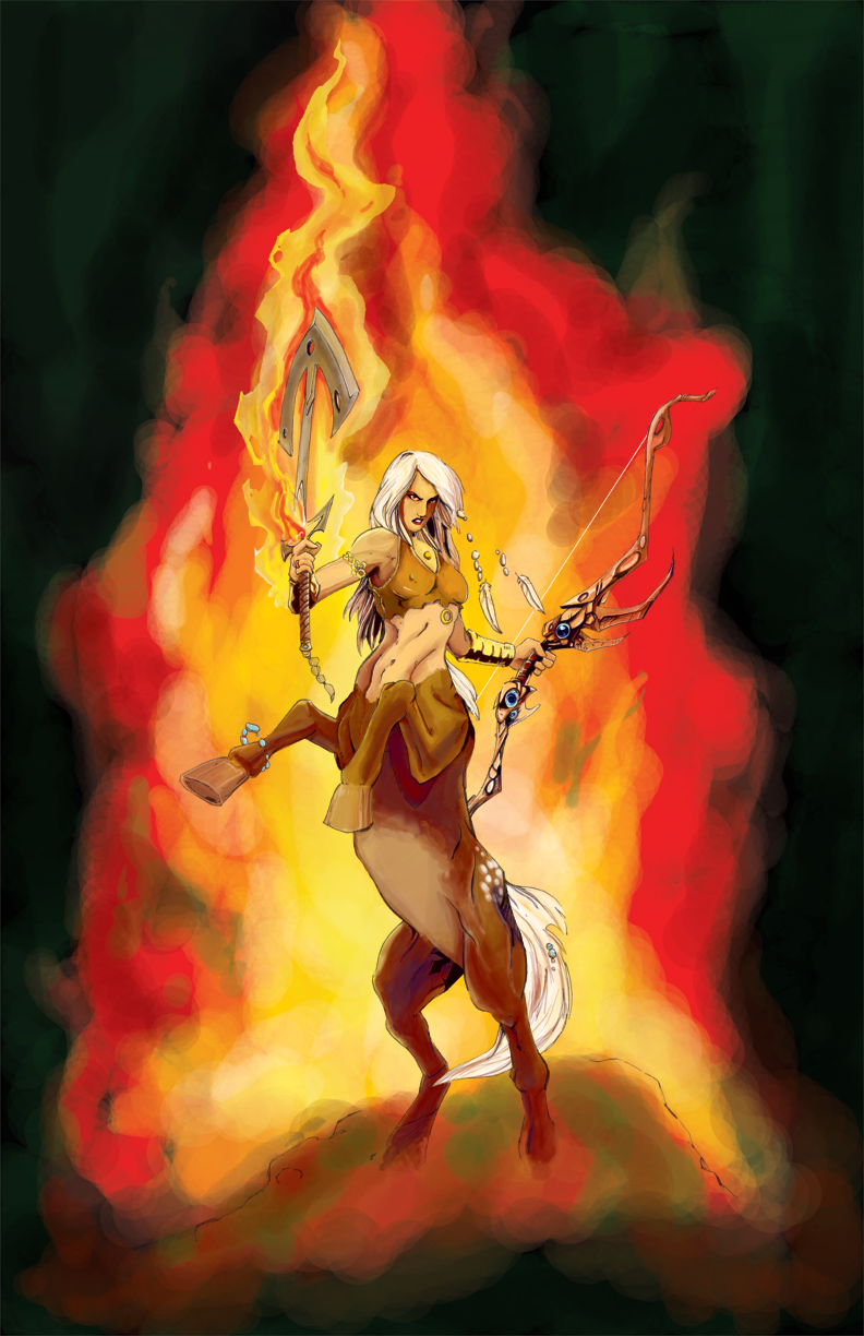
Next attempt at digital colors. This image was inked on copy paper, so until now, colors were not feasible, without damaging the paper and losing the image.Related content


Comments: 31

The character colours are great and I like the colours and idea of the background just not crazy about the big fat digital looking brush strokes.
Shawn
👍: 0 ⏩: 1

I'm having issues with my pen, currently, we're quarreling, I intend to have established dominance soon
 (Wink)")
👍: 0 ⏩: 0

Very cool! I love the color blends on the wings and effects. Nice!
👍: 0 ⏩: 1


You're using RGB aren't you? And yeah, these are deffinitley not flattering on your stuff. The red thingy above her head tells me your coloring in RGB. In a bad way, mate. Try using CMYK, it'll frustrate you at first, but you'll have more balanced colors, and they'll print better. I do like the water colory thing your after, so keep trying.
👍: 0 ⏩: 1


I'm still experimenting, trying to keep things loose and flowing
👍: 0 ⏩: 1

Experimenting is good, and you're doing well so far
👍: 0 ⏩: 1

o_o Looks like a fried chicken wing.
`ut I like the skull :3
👍: 0 ⏩: 0

Not coming from a digital background, I like your use of color. Tying in the background with the foreground by incorporating the same color patterns, as well as your use of warm and cool colors. I do feel like the skin could use a little more shape and tone to give it more dimension. Just my two cents. Nice work buddy!
Gary
👍: 0 ⏩: 1
Thanks for the comment, I'm definitely working on trying to get a better grasp of the digital aspect of the colors. Fortunately, there's a lot more freedom when you don't have to worry about ruining your drawing with an errant stroke.
👍: 0 ⏩: 1
this is true, which is something I'm still trying to get used to. Part of me still feels like it's cheating!
👍: 0 ⏩: 0

It think it's great, your coloring is coming along nicely hun!
👍: 0 ⏩: 1

The guy above me? An ass. Ignore him.
You're doing well - could've lost the colourful background altogether but ah, what does it matter. It's still a great piece
👍: 0 ⏩: 1
Thanks for the confidence  (Smile)")
👍: 0 ⏩: 1
I can tell - and you're getting pretty good at it too! Great work as always, quest
👍: 0 ⏩: 0

")
👍: 0 ⏩: 0


Thanks for the blunt lack of confidence. I'd appreciate if your critique could be a bit more specific. If you could take the time to at least tell me what I've done so horribly wrong with this image, it would help insure that future images are of a more acceptable quality.
👍: 0 ⏩: 0