HOME | DD
 QuestingRaven — The Keeper
Published: 2005-02-16 04:16:40 +0000 UTC; Views: 941; Favourites: 21; Downloads: 129
Redirect to original
Description
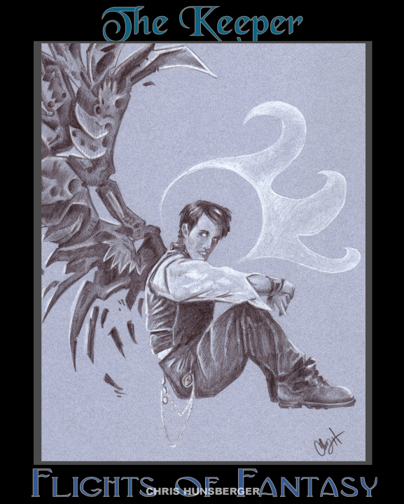
Uriel, Angel of Time ... Keeper of what was, what is, what will be.Done entirely with Dark Umber and White Parisma color
Related content


Comments: 46


I think the keeper iz my fav angel by far.

👍: 0 ⏩: 0

I love this... The wings are so....... *shakes head* I can't think of a word. Other than cool. And that's too lame to describe those wings.
👍: 0 ⏩: 1

 (Smile)")
👍: 0 ⏩: 0

I really like this for some reason, not sure why, the overall feel i guess... not crazy about the border you put on it though... i like how the wings look... kind of mechanical, only... not hahaha.. they aren't you're typical birdlike wings and that's cool... maybe you could have put a bit more texture into the shirt he's wearing, the pants and vest look about right, um... that's all i have to say really
👍: 0 ⏩: 1
Thank you for the wonderful comment.
👍: 0 ⏩: 0

The wings are awesome! I love detailing on them, and the coloring on the whole picture is marvelous. However..something on his head bothers me. I'm not very sure what is it, though.
But otherwise, it is an outstanding pic!
")
👍: 0 ⏩: 1
*kourinthellama pointed out that his head is a tad small, and his feet are a touch big, which might be what's bothering you
")
👍: 0 ⏩: 0


nice stylization of the wings! good design very nicely drawn!

👍: 0 ⏩: 1
Thany you! I take that as high praise
👍: 0 ⏩: 1
we are equal! it is more like kinship
👍: 0 ⏩: 0

SO cool. I love the wings, and the shading is just fabulous. And the little decorative circle thingy is so eye-catching and really balances things out while looking awesome.  (Wink)")

👍: 0 ⏩: 1
👍: 0 ⏩: 0

I really like this piece. I love the coloring, how it all blends together so well. The wings are wonderful too...They grab your attention. Very cool
👍: 0 ⏩: 1

Parisma color? Do you mean Prismacolor?
Anyways, this drawing is wonderful! It's nice that you used different colored paper other than white for this. I've been trying that out myself as well. The wings are great, sharp and jagged, very formidible looking in contrast to the man's somewhat gentle look. I would suggest putting a shadow underneath him. Unless he's floating in midair, but it really does look like he's seated firmly on a surface.
But it's a great piece of artwork overall!
👍: 0 ⏩: 1
Originally I was thinking of having the figure "seated" on a ring of magic ... but I let it fall to the side, thinking that it might have drawn attention away from the wings.
👍: 0 ⏩: 0

very nice... his torso maybe, should be a little longer~ the posse is great and the wing is beautiful~ you are doing so well~ keep up the great work... it is paying off
👍: 0 ⏩: 1

First and only pierce of crits here - unless he's a very small man, his head is unproportionally small to his body. But, as I said, if he's of small posture then the proportions are just fine. Well, no, his feet seem a bit too big. Unless he's wearing boots a few sizes too big, that is.
I adore the wings, though it must be hard to propell yourself into the air with heaps of steel on your back... Then again, I could never understand how the heck planes don't fall to the ground, so I'm in no position to be offering any crit on the matter
Yup, yup. Like it a lot. A lot, I repeat
👍: 0 ⏩: 1
Maybe that's what I thought was "sideways" about this one. Thanks for pointing the proportional problems out to me, my dear Llama. I'm just glad to be making this critiquing thing difficult for you
👍: 0 ⏩: 1
Yeah, you seem to be doing all you can to rid me of my job, darn you... Problem is if criting was my job then it would be my job to find holes in the whole, while I just try to find the places that need improving

👍: 0 ⏩: 0

ooh...so pretty!
I really need to find my white pencil so I can experiment on my new colored paper... Great work bud!
And Uriel.. hee. Special angel that one.
👍: 0 ⏩: 1
White pencil on dark paper is fabulous! I loved working on this one. Especially with using the Dark Umber instead of black for the shade
👍: 0 ⏩: 0

I love how you modernized the angel... Gave him that contemporary 1920s kinda look with the watch chain, but then, you gave him combat boots... *grin* I love it... I love how you represented his halo, as well, making it more the crown you see in early Medevil art for Saints and Jesus....
Really, a great job.
👍: 0 ⏩: 1
Thanks, all I an say is that I was inspired
👍: 0 ⏩: 0


I really like the subtle coloring here. I like the more contemporary clothing, too. The only thing that bothers me is he appears to be sitting on something we can't see.
👍: 0 ⏩: 1
I was torn between having him "sit" on a "ring of magic", or having a clock face in the background ... I copped out and left the background blank ...
👍: 0 ⏩: 0

Holy Schnikies - L.A. Williams, eat yer heart out!
I love this duotone stuff - I'm very impressed with all of the tiny details in his wings. I also really like the modern aspect you gave him - kinda steampunky. Neato!
I think the only critique I can give you is that it might balance out a bit better on the page if there were more space on the right side of the image. It looks left-heavy right now because there's so much going on there. With a bit more open space on the right, I think it might look better balanced.
👍: 0 ⏩: 1
I'll keep the balance in mind next time when I work on something similar. I had a lot of fun with the wings, most of the detail in there was spontanious, kind of like "finding" the layers in the pigment ... or something like that
👍: 0 ⏩: 0

O cool! I really like the unique design for the wings! And the coloring rocks! They looks like uber metalic
👍: 0 ⏩: 1
Thanks, I was hoping for a kind of "mechanical animal" look to the wing.
👍: 0 ⏩: 0

stylistically interesting. More detail in the face would be nice.
👍: 0 ⏩: 1
I'll try harder next time. I think part of the problem is the size of the area I'm working with, the full image is only 8x10, so the face was roughly a half inch by 3/4 inch.
👍: 0 ⏩: 1
understandable. Props on taking the critique so well.
👍: 0 ⏩: 0

I must say, the wing design really catches my attention, awesome work, love the shading
👍: 0 ⏩: 1
Thanks, I was hoping for something eye-catching
👍: 0 ⏩: 0