HOME | DD
 Quinchilla — Abstract Ben
by-nc-nd
Quinchilla — Abstract Ben
by-nc-nd
Published: 2008-10-01 21:03:06 +0000 UTC; Views: 10674; Favourites: 211; Downloads: 0
Redirect to original
Description
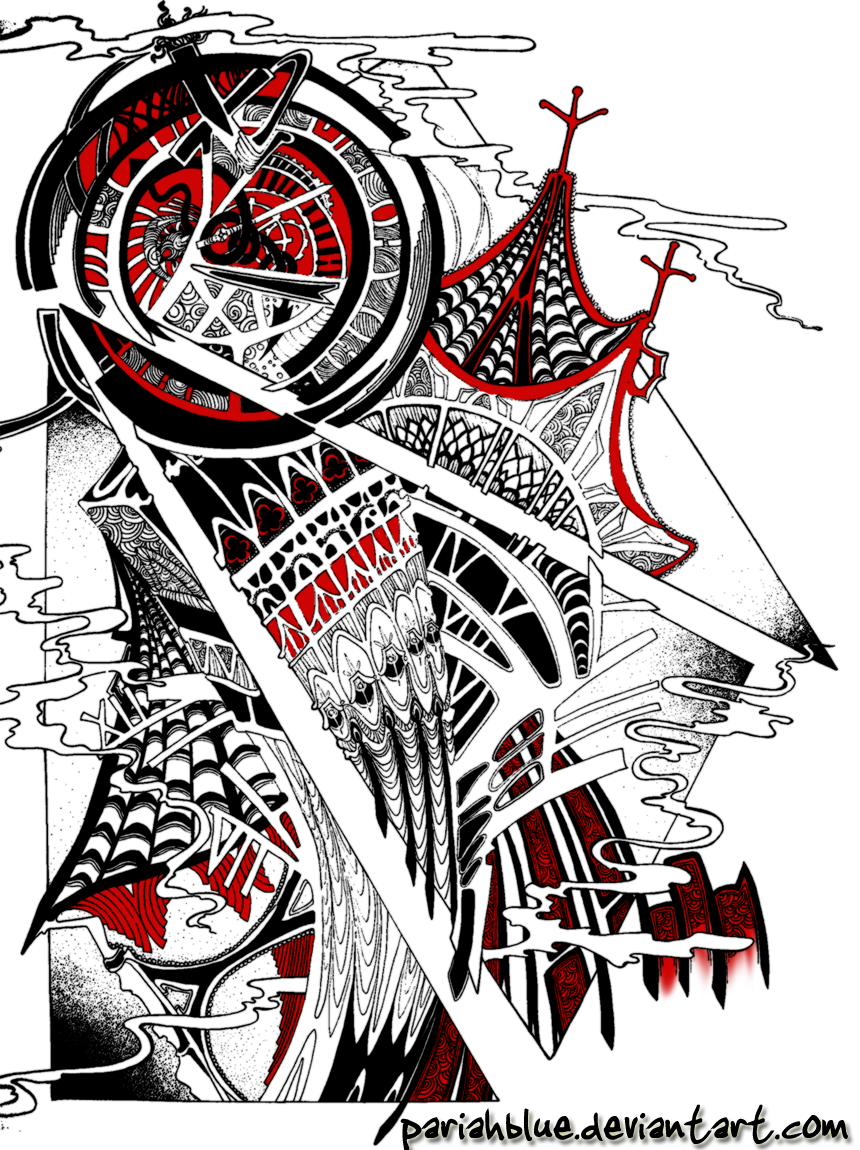
this has been my project in my design II class. we had to take a building, abstract it, and then put in an accent color.sorry about the quality! i used my friend's camera and then played around with it on PS.
it was done on 19"x24" bristol paper with my incredible pigma sakura micron pens. it was colored on photoshop so that i can evaluate whether i like the placement of the accent color or not.
so far, i like it, but i think the red is becoming too much of a secondary color... my teacher said that was OK, but then i would have to choose another color as my accent color on top of what i'm doing already XD
what do you think? :'D
art © me, Quince X3
Related content


Comments: 69

i like it a lot. I used to draw in black and red ink and it was always a fun accent
 (Smile)")
👍: 0 ⏩: 1

thank you! and yes!! those colors + ink are so awesome 8D
👍: 0 ⏩: 0

I love the angles you got the building in and the black and red go together perfectly
👍: 0 ⏩: 1
thank you, i appreciate it C: <3
👍: 0 ⏩: 0

This is truly magnificent!
The detail is uh.... MAZING!!
For some reason this reminded my of Mulan....

👍: 0 ⏩: 1
thank you so much! C:
haha really? Mulan? maybe its the colors?? XD
👍: 0 ⏩: 1
No problem ")
Maybe it is the colours. But it still looks great
👍: 0 ⏩: 1
haha, i love Mulan, so its all good
👍: 0 ⏩: 0

thanks!!! it was so much fun to draw C:
👍: 0 ⏩: 0

i feel this needs more color. maybe some blue?
👍: 0 ⏩: 1
haha, too patriotic for me if i add that color!
👍: 0 ⏩: 1

I found this when I had a couple pieces added to the collection you are also in. Hoooooly craaaap, this is SO detailed! I love the way it looks like you took this building and threw it into a whirlpool. Everything is layered in and out of itself in a very pleasing way. I disagree with your teacher. Yeah, the color red is used heavily, BUT sometimes doing what is right for the image is more important that following the guidelines in making it.
👍: 0 ⏩: 1
thank you so much! whirlpool is a good way to describe it haha i'm glad you like it so much <333
and oh, i highly agree. i hardly ever listen to my teachers advice.. haha it gets me a poor grade, but its so worth it
👍: 0 ⏩: 0

Hello, your work was featured in this article: [link]
👍: 0 ⏩: 1


i don't know about a third colour.
maybe you should make copies and muddle with
them so as not to ruin a
good thing :]
👍: 0 ⏩: 1
haha i wish i didn't have to throw in color, but i was supposed to for the assignment C:
👍: 0 ⏩: 0

this is amazing, you're going places!
i couldn't believe it was in traditional art it's wild n out, AND I LOVE IT!!!!
👍: 0 ⏩: 1
haha thank you mucho, i appreciate the love!! C: <333
👍: 0 ⏩: 0

wow...i luv abstract works...
plus...u used my favorite color combination...
red,black,and white...
👍: 0 ⏩: 1
thank you so much <3
those are my favorite colors as well 8D
👍: 0 ⏩: 1

:thumb119880896:[link]
if u hav spare time to check...u can check this...but i'm notmandating u to do so...i just want to share it...hehehe...
👍: 0 ⏩: 0

Your use of red is nicely controlled - it's not everywhere but it belongs where it is and nowhere else. The dot shading and the linework are of course brilliant and I particularly like the smoke.
👍: 0 ⏩: 1
Definitely! You deserve it.
👍: 0 ⏩: 0

@_@ How long did that take you, it's the most awesome thing I've seen. I see a few roman numeral thingies in there, I see something new every time I look at this XD
👍: 0 ⏩: 1
ohhh man... it was like a weeks worth of work. 3+ hours a day XD
i'm so glad you like it! :"D
👍: 0 ⏩: 0

Hahaha, this is too cool! So much going on, it's overwhelming!
👍: 0 ⏩: 1
hehe thank you! 8DDD
i'm so glad you like it X3
👍: 0 ⏩: 1

Holy Lord, Quince.
This is amazing. I love the steeple and the clock face.
It's all so deliciously surreal and melty.
So very printable. XD
👍: 0 ⏩: 1
D///:
thanks so much, KK. it means so much to hear it from you X//3
👍: 0 ⏩: 0

I love this!!!!!!!!!!!! It almost looks like it is split up in panels like a comic . It is very rich in detail and the lines and circles makes very interesting and gorgeous patterns.
The clock itself almost looks like a portal into a new world. Everything flows together so brilliantly. The fact that some of the numbers move away from the main tower gives it a mysterious, almost dreamlike, but excellent atmosphere.
The red add so much to the artwork. I actually think the amount of red is just perfect. If you add another accent colour, which one will you choose?
Well done and I am sure you'll get top marks. Well, you certainly get top marks from me. 


👍: 0 ⏩: 1
wowowowowowowow~<3333333
yes! i had to split up the piece into three equal shapes which are the triangles.
thank you so much for such a fabulous comment!!!
i've decided to leave it the way it is C: too much color would kill it, methinks.
👍: 0 ⏩: 1
It looks really good!
It is my pleasure, Quince. I enjoy commenting on your artworks, just as much as I looking at them.
I also think that's best.

👍: 0 ⏩: 1
<3333333333333333333333333333333333333333333333333333333333333333333333333333333333333333333333
👍: 0 ⏩: 1


| Next =>