HOME | DD
 Qwuzank — Second Helpings
Published: 2013-05-17 02:56:28 +0000 UTC; Views: 15333; Favourites: 204; Downloads: 45
Redirect to original
Description
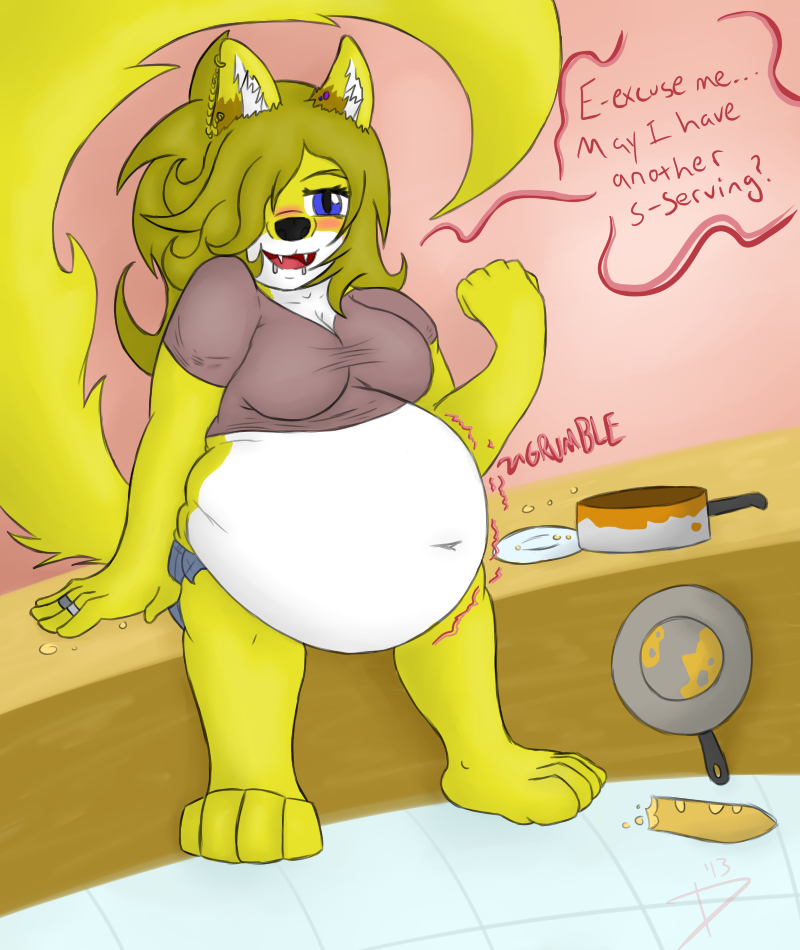
Well shit Marigold, way to be a fat in front of company. Gosh, we can't have anyone over. >:TDespite the fact that she is in the presence of company, this fatty doesn't seem to care~ She wants moar!
Oh god it's been too long since I drew Marigold. ;w; I forgot how much of a treat she was to draw, especially all fats like this~ I can definitely say I had a ton of fun making this one. <3 I also wanted to show that when she isn't hammered, she's actually kind of a soft hearted cutie pie. uvu I can safely say that box is checked~ Though I'm a bit peeved at how chunky her arms and legs look. Of course, that's because she's sitting down, so I can't really help that one. >w> Regardless, this was a fuck of fun, and I think it came out really well! Heck, I had so much fun, I even gave her a new outfit~
Hope y'all enjoy this as much as I enjoyed making it! Lemme know whatcha think~ No, seriously, I wanna hear what y'all have to say about the picture. :3
Art and Marigold ©
Related content


Comments: 30

Quit now and caaake will be served imediatly
👍: 0 ⏩: 0

certainly have some more (hands second helpings) eat up theirs plenty moore where that came from
👍: 0 ⏩: 0

Pretty soon she'll be so stuffed that she'll have to be rolled to bed!
👍: 0 ⏩: 0

I think she's a few bites away from exploding!
👍: 0 ⏩: 1

Oh lord, she can eat way more than this~
👍: 0 ⏩: 1
O_O ... I'm sure she's willing to prove that too.
👍: 0 ⏩: 0

TransDimentroPolitan [2013-05-17 16:32:56 +0000 UTC]
Right. Was too sleepy to do this yesterday, So here we go. the link for the redlines will be at the end.
First perspective on the bench is off. its like we're standing above the subject and looking down, where the perspective on marigold is we're looking on her level. I've drawn over how I think it should look.
Secondly the biggest problem is her lower body, we really need to show the volume for her legs. At the moment we can't really see them, or have any knowledge they're there. This is mainly due to the consistancy of where her features are pointing, her hips and shoulders suggest shes facing us, but her navel and boobs suggest shes facing to (our right). moving the navel to (our) left might help correct it.
I feel the main thing here, is you need to decide what way shes facing, I feel shes facing towards us and have doodled a little to show the small tweaks would be to show it. Though I also feel we should be able to see the top of (her) right foot, as we can see the top of her left one. Also her right foot would need to be turned towards us a little, if we were going with my doodles version of the picture. [link]
Its still adorbs. Her face is very cute and expressive, and the belly is lovely and taut from stuffing. I love her big hair too, the flowing shapes in it are lovely. Though you know I think Dal is more adorbs though :3.
We need more. Produce, draw, create!
👍: 0 ⏩: 1
I seee I seeeeee~ It seems like my perspective does shift a bit, and you are right. The knee on the left does need to become a bit more visible, maybe have the belly squish out over it instead of kinda flopped over it as it is. And I see what you mean about the navel, pointing it towards the direction she's looking makes it seem like she's facing the viewer, and gives it a better sense of direction. Though the bench was meant to look that way. XD I know it looks really wonky, but I did that on purpose, to kinda match the way the floor looked. However, it does look better being put on an upright bench.
Don't you worry, I'll keep making stuff for you to critique~ Thanks for your time and input! <3
👍: 0 ⏩: 0


Very Nice!
Hmm, this sorta looks like a Smallergod pic
")
👍: 0 ⏩: 1
Welll I HAVE been hanging around them quite a bit as of late...~
👍: 0 ⏩: 1

This is super cute and I love Marigold's design. She is such a sweetie pie.
The only thing I don't like is her legs. At first glance it looks like she's standing. What she's sitting on also looks sorta wonky.
👍: 0 ⏩: 1
Bahaha, I know I know, them legs throw everyone off. X3 And the bench was kind of intended to look wonky, but at the same time, it would look better all straightened up.
👍: 0 ⏩: 1
I still thinks the picture looks great overall though.
👍: 0 ⏩: 0

Wowza 0w0! Furries my not be my forte but I can still appreciate the cuteness of a character X3
Well, it's hard to follow up Axl's analysis but I'll do my best to offer my support^^.
I'll first commend you on actually showing full legs and feet for your character, not everyone does and it's good practice for anatomy  (Wink)")

And speaking of cute things, I too think her face has a very alluring quality, mainly due to how her one vissible eye is half closed while her mouth opens in a playful smile ^////^. It reminds me a lot of Roxanne's form A Goofy Movie to the point where I'm wondering if you used that character as a reference/inspiration for this particular look
Of course let's not forget that wonderful belly X3. Even under her fur we can still see the folds of her flesh that flow naturally along the shape of her legs to give that plushy quality >///w///< 
I also like the authentic wrinkles you put into her shirt, if you used an online reference you'll have to send me a link X3. And if it was all you then major kudos ;w;b
Alright that's enough gushing, now I gotta give you some things to improve upon in the future. I'll admit, until I read your description, I didn't even notice that she was sitting down. I actually thought her legs were just stumpy which I doubt is what you wanted. the problem is that, from the way you've drawn her, she doesn't appear to have any knees. Like I can see where her knees might be if they weren't being obscured by her protruding tum-tum, but the fact that her belly doesn't deform around them makes it look as though her knees aren't there. Do you see what I'm saying? Try giving her belly more squished/folded textures, especially on the lower side where her belly is physically touching them.
Next up is shading; while theirs nothing wrong with the shadows you have already established, there simply isn't enough of them. The values are too light to accurately give an illusion of depth and just look like her skin- er, fur. If you accented her frame with darker- and maybe even a warder range of- values, then it would really help this curvy critter pop from the page 
The only other thing I can think of to say is that her ears look kinda off-center to me o.O? She's facing forward, but both her ears are facing to the left as though her head was turned, it's a little confusing.
In any case I hope both my positives and negatives were helpful^^. Let me know if there's anything else in particular you'd like to critique on this piece
👍: 0 ⏩: 1
Oh gosh this is soooo muchhhhh. ;w; Alrighty, let's start with the legs. I didn't mean for them to look so stumpy. XD It just kinda happened... I'll remember to fix that next time I draw a sitting down tummy picture. Secondly, those ears... THey do seem off now that you mention it. ;w; Why I didn't see it earlier, I'll have no clue. Then again, what I was going for with the body was a face forward body angled position. -w-
And the belly. Aye, I was honestly afraid to put too many folds in thereee~ Might ruin the "stuffed" look and give her more of a "flubby" look. Which, there's nothing wrong with that, but it just wasn't what I was trying to do. ;w;
Thanks a million for your input, I'll be sure to work on showing them legs, and working on making the belly squish a bit more fluently~
👍: 0 ⏩: 1
Heh yeah I gathered as much XP. Don't worry, the core elements of your piece are well established, so it's just the minor details in perspective and belly-folding anatomy you have to work on
Daww, that's just what this place is for X//3 . I do hope we might see more of Marigold in the near future ^w^.
👍: 0 ⏩: 0


INCOMING TUMMYCRIT- *KABOOOM* RAINBOESSSS!
...s-sorry, was just trying to convey how trippy your style makes me feel. It's a good thing.
I'll start with the criticisms, as always. The most glaring thing I can see here is the background and how Marigold ( <3 ) interacts with it. The perspective seems really inconsistent, and it doesn't fully match up, so I have a hard time figuring out where the viewer resides spatially. Her arms and legs do seem really thick, but the subject seems pretty thick as a whole, so I wouldn't say it's a bad thing
I do like her hands, but... her left wrist (our right) is bent at an angle that I can't even pull off. I could come close, but I'd have to break my wrist to get my hand in that position. :<
The her right hand is better, but the thumb may be a little too small.
I have no complaints about the chest and belly. They're both nicely drawn and delightfully fluffy. Plus, they're largely stylistic affairs, so I couldn't get too critical of them even if I wanted to
One thing that doesn't look quite right in that area though is the way Marigold's shirt interacts with her belly at the bottom. The way it curves up at the end breaks a bit of the 3D illusion of the piece. I'd work more on making sure the shirt conforms to the curve of the belly next time.
But enough of the mean stuff. Here's what I like about this pic~
Marigold's hair and her tail are both fantastic. The way both curve and taper at points is very expressive, and I haven't seen anything quite like it in this community, which is great. The way her tail directs my gaze to her speech bubble is particularly neat.
Her face is simply beautiful. You draw some great expressions, and this one in particular is well constructed... and strangely alluring >//>
*ahem* the blush is subtle but nice, and the cute little drool she has going somehow manages to be just that: cute. I don't often call drool cute, but you pulled it off~
As an embellishment, the pinkish highlights to her text are great. They draw attention to the words and make them very easy to read, while giving a sense of what she's feeling too. (honk honk amateur colour theorist coming through). All the little details you added (pots and pans, bread, crumbs, etc) are well placed and very telling, so great job on those!
And finally, because it seems like a good place to end this comment, dat navel. So cute and squished, it's just superb <3
Keep it up Qwuuu! 8D
👍: 0 ⏩: 1
Oh gosh, so much comment... I have no idea how to reply to it all. ;w; First off, the shirt is off... I probably should have had it come across with the curve up the belly, not like... However I did it. uwu And do you mean the one hand that's being lifted up? Or do you mean the hand that's resting on the bench? Andandandandand yeaahh, perspectives got a bit fucked up, but honestly it was just so I'd have a background. -w- So I'm not really too worried about them, though I do need to work on them.
Thanks a ton for the critique Axl! And don't you worry, I'll keep on arting~
👍: 0 ⏩: 1
:'3 if you're talking about the wrist critique, the one that's in the air~
no problem man, hope it helped!
👍: 0 ⏩: 0


Sure, and thirds and fourths and umpteenths... @3@
<3
👍: 0 ⏩: 1
