HOME | DD
 RadiusZero — Birth of Space Origin

Published: 2009-07-08 02:42:04 +0000 UTC; Views: 3777; Favourites: 62; Downloads: 48
Redirect to original
Description
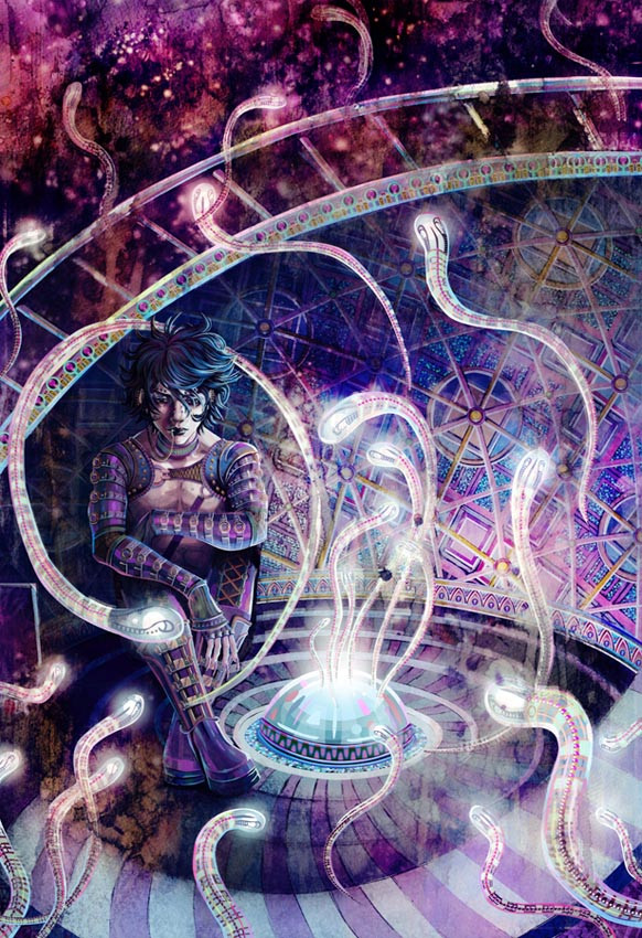
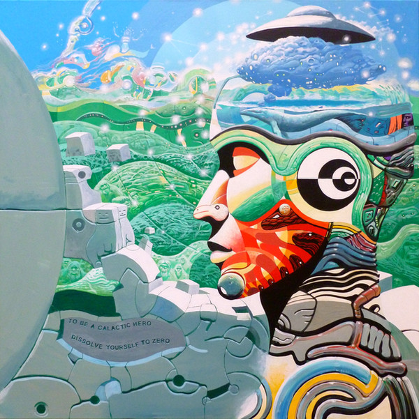
Wow. So I bet you guys didn't see this one coming, right? I had the sketch of the other one, but rarely mentioned this one. This is entitled Birth of Space: Origin, the first image for this series. Here, you see a lonely God/Creator spewing out infant planets, sending them down a funnel, to create the universe.I've always mentioned that God/Creator has been symbolized in my other works as the architect structure. Not only for architect structurs signify shelter, but it also lacks a gender. I didn't want my God/Creator to be given a specific sex, because that would totally destroy the concept of balance, which has often been referred to in my other works.
Speaking of gender... To the close observer those long tubes that curve upward may remind you of 'something'.
") And you wouldn't be far off from thinking that way. This is the act of creation from the Creator's persective, after all. God/Creator has only itself to produce the universe. In this image, God/Creator possess both reproduction organs of the sexes. They come in the mechanical ball structures, each containing an erection. God/Creator also possesses a 'vagina' in the shape of the funnel.
And you wouldn't be far off from thinking that way. This is the act of creation from the Creator's persective, after all. God/Creator has only itself to produce the universe. In this image, God/Creator possess both reproduction organs of the sexes. They come in the mechanical ball structures, each containing an erection. God/Creator also possesses a 'vagina' in the shape of the funnel.So... that's pretty much it in a nutshell. I really wanted this image to be full of life since the previous version I had was too... 'mechanical'. But more importantly, I also wanted to convey isolation, for as powerful as God/Creator is, this entity is still alone in this vast empty space. Hence, he creates humans. the second image, which I haven't started on yet but will soon, will be about God/Creator giving birth to female and male.
BTW... I'll be revisiting my previous BOS images. My latest BOS images visually look different from the other three. Aside from conveying more 'life', I've been experimenting with fusing digital and traditional together, something I aim to do in my quest to create fine digital art as opposed to graphic digital art. I'll be updating this after the last two BOS pics are completed.
Related content


Comments: 45


Thank you so much for the comment! I'm so excited to know people actually view my Birth of Space series here on DA.

👍: 0 ⏩: 1

This balance you've made is extraordinary! Not only does this God/creator of yours have both sexually-reproductive organs, but its a machine/architectural-based one, as well! I would have NEVER thought of something so cunning!
Bravo!
👍: 0 ⏩: 1
Wow, thank you so much for such an ethusiastic comment! *__* This really made me smile, tee.
Yeah, as I explored both feminine/masculine sides of human nature, I wanted God to be represented as an unbiased gender, one who didn't stray either way. But more importantly, I wanted God to serve as the essential architecture that houses all of its creatures. That, in itself, is a powerful role.
Again, thank you for the love and support of this piece. It's comments like this that inspire me to keep producing work like this.

👍: 0 ⏩: 0

wow this is great
it gets me thinking about life
this image has so many levels that even reading the description i cant pick up on some of them, or it takes me a long time to notice.
amazing.
👍: 0 ⏩: 0

wow...this is so awesome...there really isnt much else i can say!
excellent work!
👍: 0 ⏩: 0

This is so beautiful in it's simplicity. I like the idea of The Creator not having a human form. Also I love the textures.
👍: 0 ⏩: 1
Yeah, I really wanted the Creator to not have an easily identified gender. The creator is both, possessing the seed to create life as well as possessing an empty vessel to nurture it. This is definitely one of my more abstract pieces, but I think there's still an air of beauty to it too. You see this structure in the middle of nowhere and feel lonely but enthralled by this scene. At least, that's what I hope viewers come away with.
👍: 0 ⏩: 1
I respect you so much right now for that. So many people can't wrap their heads around the fact that the Creator wouldn't look like us no matter what the Bible says. It would have to be both genders in order to create the world. I like it. It is better than any of the abstract pieces my art teachers tried telling me was art.
👍: 0 ⏩: 0

Awesome piece. I really like the description as well, and the concept of God as an architectural structure, seems very appropiated. The whole piece gives me a sensation of Birth and solitude mixed... I think you should experiment more with those mixed techniques, they work very well!
Can't wait to see more of your series!

👍: 0 ⏩: 1
Thank you! I'm so glad you love my God/metaphysical entity as an architectural structure. It's kinda like saying that this spiritual power is around us, nurturing us. I didn't want to give this Creator a gender because that would already allow people to feel empowered/disempowered. I really wanted to stress how the Creator is powerful, no matter what gender. Here, the Creator possesses both the masculine and feminine qualities, possessing a penis and a vagina. It's like a perfect balance of some sort.
Tee hee, so glad you love my experiements. I'm having lots of fun doing them. I hope you enjoy the others I plan to post.
Anyway, thanks for commenting on this! And sorry for the delay. ")
")
👍: 0 ⏩: 0

I love how much thought you put into the architecture of this piece. Every aspect of it has a purpose. The Creator looks so lonely in the middle of space! Gonna have to make it some humans to keep it company! I really love the style you used with this piece with the combination of digital and traditional. And the process of how you do that which I read before in someone else's comment. That's a really cool idea. The yellow ink splatters on the forward end of the Creator really entertain my attention. Not to mention the background to the side looks so... empty. Sort of like if I stuck my finger in it it'd just keep traveling on forever.
I don't think that it matters at all that there are no people in the picture-- you've gotten the point across extremely well. Can't wait for more!
👍: 0 ⏩: 1
Oh, thank you so much for the wonderful comment! *___* I'm so glad you appreciated my effort in blending the two mediums. It's something I've been trying to do since I started this series. As someone who grew up with traditional, and eventually embraced digital, I'm more concerned with the two medias meeting some sort of compromise than ditching one for the other.
hah, indeed, the creator is such a lonely entity. it's massive, and yet, is surrounded by vast emptiness.
Thanks again and I'll definitely be wrapping up the one I posted the sketch for sometime soon.
👍: 0 ⏩: 1
Ah, I'm always in a constant conflict between loving traditional and digital at the same time, also. Lately however I've been attempting to get back into digital media after a long break that I kind of unconsciously took... Usually it kind of balances out depending on the feel I want the picture to have. Though the thing I am always so antsy about is how clean my digital art ends up looking. I'm more comfortable with the texture that comes naturally from traditional mediums. Which is why I'm in awe when people who draw strictly onto the computer can give their pictures texture, because although some people think that because it is digital it is automatically easier the canvas's lack of any textured 'surface' actually makes it more difficult... But then I always wonder why go through the trouble and not just draw onto paper? So confusing. But it's still brilliant to know you can do something like that, for sure. Hopefully I'll eventually find a happy medium. My portfolio teacher mentioned to me about utilizing both digital and traditional at once sort of like you've done. I might try it out sometime to see where it ends up. :3 It definitely looks like it's getting you somewhere. So gorgeous!
That just reminded me of when I was reading a textbook on Human Geography and it mentioned how people living in vast cities actually feel more lonely than people living in small villages. In a strange way it kind of relates to how the Creator must feel!
Yesssssss!

👍: 0 ⏩: 0

BOS series = fabtastic, i so admire all the creative thought you put into your pieces, rather than just painting pretty pictures for everyone to see there's an interesting, well thought out story behind each one, thats true art!
👍: 0 ⏩: 1
Thank you! Above all, I want people to come away with an experience or something thought-provoking. I want my work to have style and substance, not just style. Many thanks for taking the time to read over my comment on this series and posting your comment here.
👍: 0 ⏩: 0

I don't really have much to say on this like normal, but I am blown away by the colour  (Smile)")
👍: 0 ⏩: 1
Thank you! I'm so glad you love the colors. This piece was such a challenge, as I've been telling everyone else. I mean, there's only so much you could do with something so... abstract. And yet, I'm proud of myself. And I'm glad you were able to still love something about it, despite its abstract nature.
👍: 0 ⏩: 1
Thats excactly why i love it because it is abstract (ignore the spelling mistakes! I've only just woken up LOL)
👍: 0 ⏩: 0

as always it is lovely and i think you got the things you wanted to get across on the mark.
👍: 0 ⏩: 1
tee hee! Thanks! I'm so glad you loved the result. I'm also relieved that you found that I managed to reach my objectives. This piece was... very different to complete.
👍: 0 ⏩: 0

My brain is still partially fried so intelligent comments from me be few and far between. I got to say I really really love how you combined trad and digital together to create this wonderful piece. The one thing I adore about this series is your use of color. You always go bold with them and I like that. (I'm not brave enough to do it so I stay muted XD). I really like the balance and the lighting in this one as well.
Wonderful stuff per usual Missy
Erika
👍: 0 ⏩: 1


👍: 0 ⏩: 1
You did great; heck you always a do a great. You can easily see the mood in this one despite no characters being around
👍: 0 ⏩: 0

Interesting design
👍: 0 ⏩: 2
Ugh... I really hate that smiley face with the tongue. T_T you can't put a single quote next to the p without getting that stupid thing. >.<
👍: 0 ⏩: 1
"production" <-- there, works for me. You typed ";" instead of " that's why you got the smiley face with the tongue.
👍: 0 ⏩: 1
Actually I typed single quotes, which does the same damage. >.< '
it's annoying since I like using single quotes, especially when I want to distinguish a work from a sentence I'm quoting from. Which happens a lot. Bleh. >_>
👍: 0 ⏩: 1
That's why you should always hit "preview" to check on the comment before hitting the "send" button.
👍: 0 ⏩: 1
Gaahh, but I'm lazy... T_T
>_>
I suck. I know. XD
I do wish there was the option to 'edit' comments since I tend not to catch the mistakes, even when previewing. It's like that odd phenomenon that occurs when you read a paper and everything sounds right when you read it in your head. But the moment you say it out loud, you realize how screwed you are. O_O
👍: 0 ⏩: 0
it has to do with my '
This isn't the only iamge I've doe like this, containing gaps or straight edges. Vincentius and You are NOT invited were done the same way. It's my personal process in blending the traditional/digital mediums together, letting people see '
👍: 0 ⏩: 2

wow...that's an interesting process!
Your printer must be really good then...
laser printer perhaps? or ink jet?
👍: 0 ⏩: 1
My printer is a ink jet. And it prints like any normal printer would. In fact, I really want to get this technique out on a fax/xerox machine. I want to get away from the clean-cut coloring look and add nice textures in the mix XD
👍: 0 ⏩: 1
wow...that's really amazing...
makes me want to try it out for myself (but I think it wouldn't be as epic as how you do it)
Oh btw, thank you!
I've been so 'uninspired/procrastinating' these past few days and seeing this work and reading your comment made me breath in some fresh air...though it wouldn't be really air, but still it helped me in a way to make my butt work this weekend or something
It also made me nostalgic of MR where I was surrounded with great artists with their great ideas and opinions and now...*sigh* it wasn't like it in here or in other sites >.>


👍: 0 ⏩: 0
Oh I see. I thought it was a mistake because I seen some digital artworks from people which they didn't check the sides when they placed a color or texture layer on top of an artwork. It ended up with a gap as a mistake which is a major embarrassment
👍: 0 ⏩: 1
Hah, I'm not that careless.
👍: 0 ⏩: 0

I think the main thing that I love about this series is that you completely set aside the aspects of society on this and made it completely balanced (I can imagine that‘s hard. We‘re all so used to the different roles we are all “given“ in contemporary popular-cultured-dominated America). Sure there are atheists and Christians/Hindus/Buddhists/Muslims etc but you sort of put all that aside and at the same time all of those things together and made something that has just as much truth. It is a theme we all wonder about at one point isn’t it? The Birth of Space indeed.
Love this picture. Different from the rest of the series clearly. Not just because it’s in a new style but because of the lack of people representing. Still full of life if you know what I mean. (And who ever knew that architecture could have so much texture. It‘s like Archi-texture. /failpun)
👍: 0 ⏩: 1
Definitely, when I completed this I felt so void. No one, except this living 'machine' is present. And yet, that's exactly how I imagine God/Creator would feel, much like a child playing in her own room, with all these toys but no one to play with.
I've tried to make the series as open to culture as oppose. Granted, I can never accomplish that, but if I can manage to reach at least 30% percent of the population then I'll be satisfied. And whether people agree about this concept or not, it's still worth it. It brings people back to the table. Even those who don't believe in God/Creator can enter the conversation because I've yet to name this powerful 'entity' only God. I also refer it as 'Creator', which can symbolise the essence of life and not some spiritual being.
👍: 0 ⏩: 0
Thank you!
👍: 0 ⏩: 1

You're welcome! I also read what you did below. It's very fascinating, I'd kind of want to try it or something like it, but i don't have any paints currently. :d
👍: 0 ⏩: 0
Thank you!
👍: 0 ⏩: 1

oh of course!! its an AMAZING piece of art!!!
👍: 0 ⏩: 0