HOME | DD
 RadiusZero — Final Performance Pg1

Published: 2009-12-29 05:15:19 +0000 UTC; Views: 1637; Favourites: 20; Downloads: 19
Redirect to original
Description
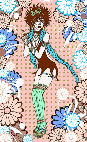
Page 1 | Page 2 | Page 3 | Page 4 | Page 5O__O Golly, this took long only because I had a buncha butterflies in my stomach. This is my first time really experimenting with the comic book format. In fact, my other comic was a failed X-Men/Teenage Mutant Ninja Turtles crossover I did YEARS ago. I never went beyond panel three. =__= This time around, though, i stuck to my guns and actually completed something I started.

Comics have always been a challenge for me, mainly because I tend to overthink things. >_> Please forgive me if I'm violating any rules related to comics. O__O it's my second attempt at it.
This is only 5-pages and it's a complete experiement. I'm glad i got the chance to reveal Seth's cahracter. It's funny how comics can breath life to a character, something that one-shot drawings/portraits can't really do. They can only capture *a* glimpse, or a moment of a character. Comics, on the other hand, can go beyond that. I have a great respect for comic artists because they're able to capture many frames and sides of a character.
Many thanks to for pushing me to do a comic. She's inspirational and has always given me wonderful advice on how to go about this process. If you haven't checked out her work you definitely need to. O__O
Related content


Comments: 2


Really like this opening. In my first read, I did not even notice the bottom portion of that word in panel 3 which I will not spell out here.
Minor critique: I feel like these three panels should be evenly spaced. Not physically. I mean it in this weird almost musical way. You know how each measure has a number of beats, they occur at equal times apart. I think of this page in 3/4 time.
Not that this is a rule, it's just a personal preference and food for thought.
When you start with a close up shot and draw back to a full view, each shot you show of that transition should be equidistant apart in time.
Your first two panels here are closer together in time, and then there's a big pull back to the whole stage.
Like if this were 3/4 time, they're two eight notes, a lagging rest, and a sudden rushed quarter note. It would be smoother if they were three quarter notes.
I feel like this might be best accomplished by having shot #1 be an extreme close up of that middle skull. To the point that the viewer can't immediately distinguish what it is until panel two. Oh that's a skull. Panel three. Oh that's skulls on a stage!
It could also be accomplished by pulling that shot #2 farther out, but I think not even knowing it's a skull in panel 1 might be a neat 1 page metaphor for the whole comic.
I. THINK. TOO. MUCH. ABOUT. COMICS.
This isn't even anything other comic creators are going to agree with me on. XD
Someone will post after me and say "Ignore that bitch, she's just jealous."
")
👍: 0 ⏩: 0