HOME | DD
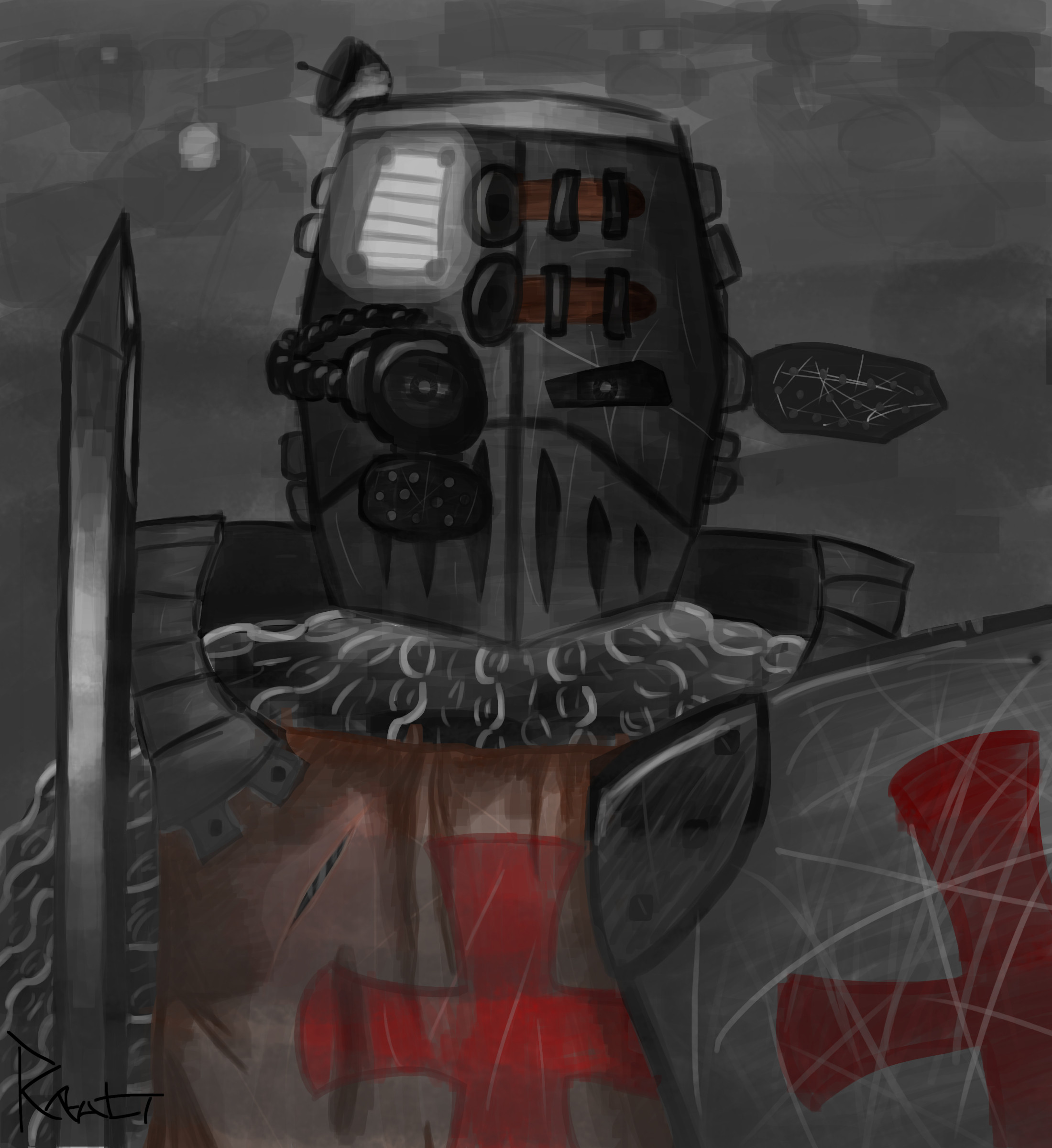
 Random-Derp — Death knight practice

#blood #blooddripping #character #characterconcept #concept #conceptart #corpse #damaged #death #deathknight #decaying #fighter #gravedigger #hat #headgear #knight #magic #shovel #simple #skeleton #skull #soul #souls #suit #thumbnail #thumbnails #tophat #undead #shoulderguard #shoulderpad
Published: 2017-12-10 03:36:57 +0000 UTC; Views: 1172; Favourites: 21; Downloads: 0
Redirect to original
Description
Some random practicing on 's DiscordEach thumbnail took me 5 min to do and rendering took ~2 hours (a bit less, I wasted a bit of that) + around 10 min to add the colors in.
It was meant to be an undead death knight, but I took kind of a stretched path and thus a gravedigger knight was born
")
I hope you like it ^^
Related content


Comments: 6

Well, this looks pretty awesome. Both the idea and design.
👍: 0 ⏩: 1

Thank you kindly! I'm really glad you like it ^^
Any suggestions in terms of what can be done better in my future projects?
👍: 0 ⏩: 1
Don't mention it.
As for suggestions. Well, I'm not really sure that I'm qualified for that, but in my opinion maybe you could make things a bit... sharper perhaps. What I mean is for example the shovel in our knight hands. Before reading the description I thought he ripped out a cemented-down post sign. Also his shoulder plate looks more characterised on the concept art and his left hand would need some detail.
These are just minor things as well. Considering how fast you made it, the splendid quality and the fact that I run the much easier thick-black-linework rag, I doubt I have the credit for these suggestions.
👍: 0 ⏩: 1
Don't feel ashamed to post any suggestions, I really appreciate all of them ^^
I actually didn't realise that it may look similar to a post sign, but now that you said that I think I should have defined it a bit better! I do agree with the shoulderpad, but what happened is that basically I tried to make souls and his head grasp your attention the most, and I had to juggle with other elements, making things less or more noticable. Shoulderpad had to be toned down a bit, but now that I think of it I should have added a bit more character into it.
I actually find lineart really tricky to do. Doing things this, more painting-like, way feels more natural to me and allows my creativity to go a bit wilder. It does require some more shading knowledge though so it's not as easy to pick up though.
I guess that in the end it comes down to preference and what you want to achieve
👍: 0 ⏩: 1
When it comes to art, I always try to tone down my opinion when it comes to my standing. More out of caution. It's easy to fall on your face with an undeserved opinion of yourself on DA.
Well, you achieved that. The souls do grab and lead attention, but I'm the type of guy who looks into the shadowy places checking every detail. As for the shoulderpad, well, maybe making it smaller would've worked as well. The oversized pieces gives it more character and uniqueness, but it almost looks out of place.
As for lines, indeed. Though I suppose this comes down to personality. I'm more of the colour within the line guy - literally - and let the details fill the empty space. Which is why colouring and backgrounds are my weak points. I couldn't pain a proper picture, if my life would've depended on it... or it would look terrible.
👍: 0 ⏩: 1
That's actually not a bad trait, I do agree.
Yes I do think it is a bit too big, but I didn't realise it back when I was doing this piece
👍: 0 ⏩: 0