HOME | DD
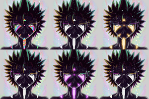
 Randommode — Color Testing (Don't mind me) Read my comments

Published: 2015-08-15 00:41:47 +0000 UTC; Views: 1389; Favourites: 45; Downloads: 45
Redirect to original
Description
This is a test of the colors in Madeline. I know you guys saw this page.(Edit: I think Locke is looking a bit too Orange in the new one I will adjust him personally ) XD
Related content
Comments: 56

Yeah I looked at it on my Playstation and was unhappy with the old ones
👍: 0 ⏩: 0

As with the others, I do agree the colors do look a lot more vibrant here. Just be careful to adjust areas that become affected by the saturation a little too much. However, you seem to have those areas covered already!
👍: 0 ⏩: 1


👍: 0 ⏩: 1

Looking back over 54 and 55, as well as comparing the colors of the earlier pages, I think I can say that the colors are certainly bolder. And while not as saturated as the colors in this test, the recent pages still have a nice palette to them, though sometimes the change can be hard to spot.
You can really see the difference when you examine Kayne's hair in page 54 when compared to her hair in page 47.
👍: 0 ⏩: 1

Thanks so much! Wow you really checked it! Thank you 
👍: 0 ⏩: 0

You're right, it really does make Locke look a tiny bit too orange.
👍: 0 ⏩: 1

LOL It was strange how much but I was trying to get it look good on the phone, and tv
👍: 0 ⏩: 0

I prefer these colours, they look stronger to me...
I am Colourblind though!
👍: 0 ⏩: 1

I like the brighter colors in this... But yes Locke is a bit flamboyant that color.
👍: 0 ⏩: 1

LOL hahahaha I will fix that 
👍: 0 ⏩: 0

You're welcome as always.
👍: 0 ⏩: 0

Like.... more vivid, but yes also a bit
👍: 0 ⏩: 1

you could use the hue stuff
👍: 0 ⏩: 0

Overall I like the brighter, more vibrant color scheme, but I would agree Locke looks too orange (He may want to see a doctor).
👍: 0 ⏩: 1

lol Poor Locke yeah I will change him back, and keep the other new colors XD
👍: 0 ⏩: 0

Thanks man I am trying to make anything better I can
👍: 0 ⏩: 0

You don't think Locke looks a bit too orange? That was kind of the one thing I might leave, what do you think? 
👍: 0 ⏩: 1

Alittle slightly but not too bad. If anything the coloring style adds abit of vibrance overall to the color but I like it ^^
👍: 0 ⏩: 1


👍: 0 ⏩: 1

XD nope was completely on the fly and I worked off of it ^^
I also managed to squeeze Rosalina in
👍: 0 ⏩: 0

The glow effects look nice how'd you do it?
👍: 0 ⏩: 1
| Next =>


