HOME | DD
 Rayn3ll — I want my booty
Published: 2013-01-06 22:56:32 +0000 UTC; Views: 1648; Favourites: 54; Downloads: 0
Redirect to original
Description
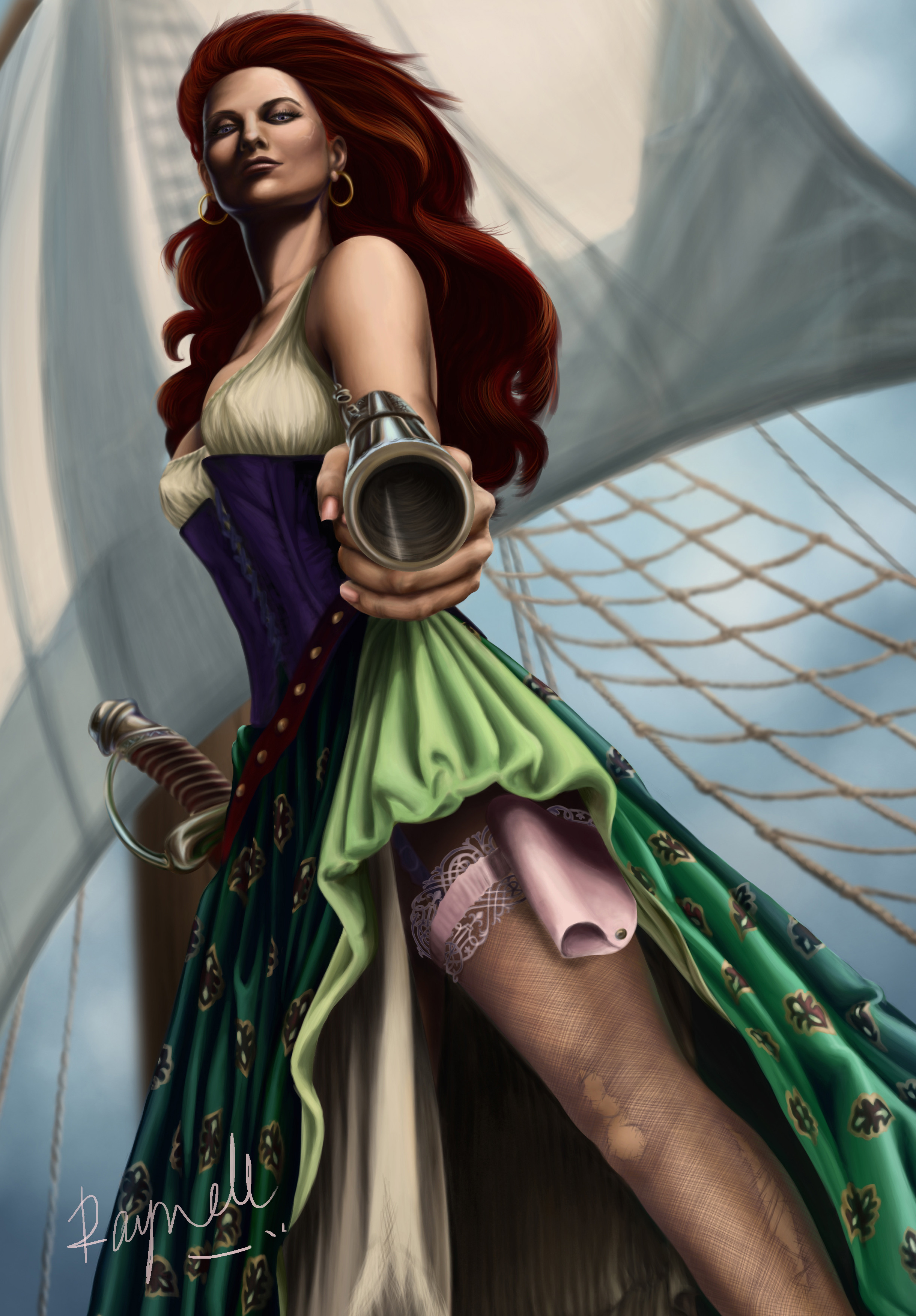
I'm kinda nervous submitting this because it's a perspective piece and god knows, I'm not great at that, especially when the image does not rely on one specific reference. Rather, I relied on many, many references, i.e. myself (I took a crazy number of photos from that angle -- not easy, I tell ya), Mannequin 3D and Wooden Doll apps on my iPad, Google Sketchup and my trusted Artist's doll, who sadly has lost a leg since I dropped her while re-arranging my desk.Sword and gun are based on images from Shutterstock: [link] , [link] and [link] . The ship mast is based on a ship museum I visited in Malaysia.
Done with Photoshop CS5 and Intuos 4 tablet.
EDIT: I reworked the painting to solve a long-standing problem I have with shadows, i.e. they seem to always fade into gray regardless of what color I put in. I think I figured out where I went wrong. Also fixed the torso, gun, lace, tighter crop, etc. Hope this version works better. Thanks for viewing.
Related content


Comments: 20

I think this is amazing!
(To be honest, when I saw this in the thumbnail version from a group that I watch, I thought it was a more realistic version of Ariel...dressed as a pirate. I don't know if that was the intention, but that's what drew my attention first.)
I love the pose and the perspective, and her expression is perfect. Great job with the details like the scar on her face and the windswept hair...and the torn stockings. The background of a ship mast is a wonderful idea. Really, just an amazing picture overall.

👍: 0 ⏩: 1

Ariel never crossed my mind. ")
And thanks for the comment. This piece almost broke my brain with all the math and details so I'm happy if people like it.
 (Smile)")

👍: 0 ⏩: 1
(Red hair is pretty-and I think the green skirt and purple on the top helped with that interpretation too.)
My pleasure!
And I'm glad that your brain didn't break. 
")
👍: 0 ⏩: 1

gah! I... this.. how.. Gah this is great! i'm speachless... again >_<
👍: 0 ⏩: 1
Awwwh, thanks. And thanks for the fave.
👍: 0 ⏩: 1
ok i need to stop clicking on the next picture, its getting kinda late. but just one... more...

👍: 0 ⏩: 1

if i ended up dueling her (omg i'll die) and the camera shot is where i was and i was looking at her like this... I'd be so damn screwed.
👍: 0 ⏩: 1
 (Wink)")
abandon all hope ye landlubbers! XD
👍: 0 ⏩: 0

I'm bad at perspective so honestly, this looks great to me perspective wise. Anatomy looks good, hair texture is great, clothes and weapons textures give off the intended look, everything in order.
Shading is good (I like it on the face), but shading on the folds of the skirts is... not on the level with the rest, color wise and the folds look plastic.
Where I think your work is weak is the details.
Some things look like they're just slapped on like a sticker - the skull tattoo and the dress pattern.
The garter looks weird because of this effect you put on it.. like it has some kind of glow, and for this reason it too looks like it's a sticker.
The sharpness is a bit inconsistent. I'd expect from this position, the corset is closer than the face, but the details on the corset are blurry, whereas the face features are sharp. Then you have sharp skirt edge and pattern detail that starts from below, not at the point closest to the focus of the image - the gun.
You asked this question in the forum, and my advice would be not to use the DOF unless you're sure what has to be sharp, and what doesn't.
👍: 0 ⏩: 1
Thanks so much for the great and above all well-thought out feedback. It really helps me. Before I was just confused when a response I got was "it's blurry" without really detailing how it affects the overall composition. Now I understand and know where and what to work on. Thanks again.
👍: 0 ⏩: 1
You're welcome 
I'd suggest doing some studies from photos that demonstrate DOF well and pay attention to what is going on and why
Also just thought of a tool you could use. When you're doing bold perspective like this and aren't sure about the distances in your head, try sketching the same composition from a side view, and mark the plane of the painting (that would be a straight line in the sketch) and then see how much distance is there between different parts of your character and the plane.
👍: 0 ⏩: 1
Awesome tip. Definitely adding to bag of tricks. Thanks.
👍: 0 ⏩: 0
Thank you. I'm gonna go back and fix some details though so I hope you will check out the painting again in a few days to see the hopefully improved version.

👍: 0 ⏩: 2

Grate improvement. I must say I'm impressed that you go back and improve "done" pieces.
👍: 0 ⏩: 1
It's still a learning experience so it all works out.
👍: 0 ⏩: 0