HOME | DD
 Razley — Once In Outer Space.
by-nc
Razley — Once In Outer Space.
by-nc

Published: 2014-03-03 04:08:03 +0000 UTC; Views: 1154; Favourites: 83; Downloads: 36
Redirect to original
Description
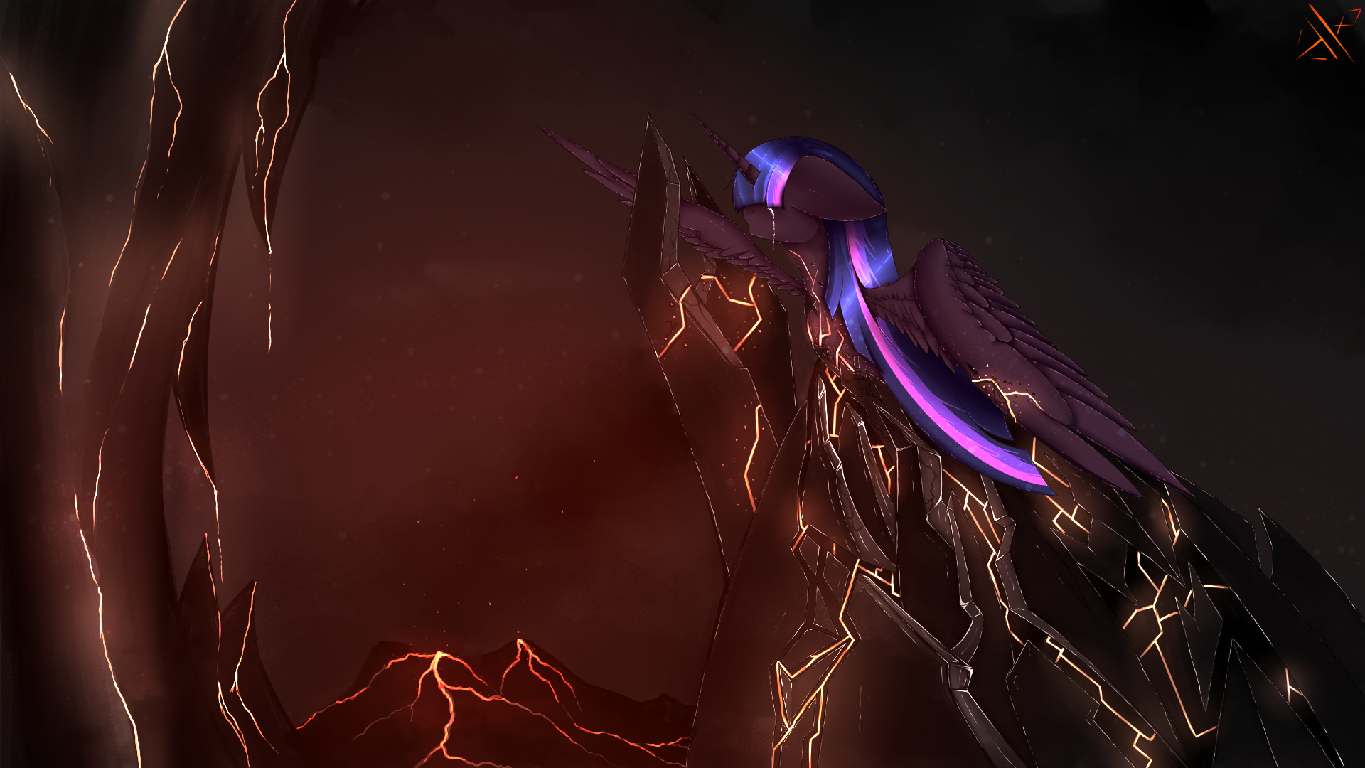
A drawing of Luna. I spent alot of time making this so I hope you like it.I myself believe this is the best I have ever done. I am really proud of myself.
Comment, Fav and Critique please!

Related content


Comments: 27


Originality
Technique
Alright, let's crack down on this.
*Cracks knuckles*
Alright... First, I'd like to say that I'm going to focus much more on the negatives than the positives on this. This is because, as they say, you learn more from a mistake than from a success. And so, even though I generally quite like this picture, I will focus on what I perceive as its problems, as I believe that will help you, as the artist, to improve.
---------
Vision: Not much to talk about here. You did pretty well in this regards. Your making her mane into a crescent moon was quite clever, too.
Originality: Now, I'm not going to lie- this isn't a very original piece. Luna in space, looking down, is a pretty common thing to see in art. That having been said, it still gets the job done, and not all pieces are meant to be very original, so I won't say more on the matter.
Technique: This is where I'll spend the bulk of my critique.
First off, the hair seems a bit too stiff. The tail fares better than the mane, which, to me, looks less like a flowing mane, and more like a cardboard cutout of a flowing mane. It also seems just a mite too shiny, but that might just be me.
Second, the wings, beautiful as they are, seem a bit too shiny and rigid. They looks almost metallic, due to the shine and sharp points you gave them. I feel like I'd get cut by touching the tips of them them.
Third- and this one is a very minor thing- that line that separates the foreleg with the body doesn't seem like it should be there. It makes the foreleg seem like it's not a natural part of her body, but some kind of detachable prosthetic limb.
Fourth, the shading is off. It's well done shading, yes, but it lacks a definitive light source. We have shading in the front of her body, which makes the light source behind her. Only, there's shading on the back of her wings and back legs, too, meaning it can't be there. This leaves the light source to somewhere to her side, but that, too, is impossible, since there are shadows on the side of her face and forelegs. This shading problem is something I've noticed with many of your drawings, and I think it would greatly improve both this piece and others if you could make your shadows more consistent.
Impact: The drawing's execution mixed with Luna's expression invoke many feels, indeed. Well done on that.
---------
Alright, that's what I have to say about the drawing. It's quite well done, and, as such, I quickly faved it when I saw the finished product. It's a good drawing, really, and, despite my long complaints about the technique, it was well-drawn. It;'s just that there are some things that could make it even better. I'd give it a higher technique rating than I have, but, well, THESE are stuff I'd give a technique rating of five to, and you're not quite there yet:
doublewbrothers.deviantart.com…
ziom05.deviantart.com/art/War-…
👍: 0 ⏩: 1

First of all I'd like to thank you for the critique.
So. About the Mane and Tail. The Tail is way more simple than the mane on her head. How you see it as metallic. I dont know. The feathers on the wings looking sharp is because they are. About the shading. There is a lightsource coming from the right. If you look at her forelegs you can see that there is some lightning hitting that. About the chest shading coming from the right is because the shading is from her hair blocking the light. The lighter body color on her center of the chest is to add some depth into it so that it doesnt look like a plain color.
I am aware that the concept of her being in space looking down is pretty... Over used... But that is because this wasnt meant to be Luna to start with. It was going to be my OC but I decided to draw her instead in the middle of the Guidelines. Back to the mane. The hair is not so flowy indeed. I was adding more loose hair flowing around but removed it because it didnt fit in right if the way I started on the mane which was a mistake from me. About the foreleg looking detached was all thanks to poor shading on that part. It had nothing to do with an outline. I simply followed the shading when blending and it got like that and it took me a while to notice.
But once again. Thank you for critiquing and posting your thoughts. It really helps.
👍: 0 ⏩: 0

This is truly a lovely picture. I prefer her S2-onwards color scheme, but it's great to see her in the night with stars in her mane
👍: 0 ⏩: 1
 (Smile)")


You put a lot of work into this, and it shows! This is indeed quite fantastic! I've never seen a mane like that before, it works well for Luna! Very ethereal. I'm getting a sort of wintery/ice vibe overall. The wings kinda remind me of icicles. I'm loving the blue star background too! Subtle, and it compliments Luna nicely. And as always, the eye's awesome! I love how it's placed right in the middle, center of focus! Fantastic work, Razley!
👍: 0 ⏩: 1


WOW! This is one of the most amazing Princess Luna fdanart ever! The background is really amazing!Luna's air is so amazing and so pretty and so shinie! ")
👍: 0 ⏩: 1
Oh god haha. Thank you! I appreciate it!
👍: 0 ⏩: 0


Ah, this is so beautiful!!!!! The feathers are so detailed, and the mane/tail are so lovely.
But what about her cutie mark? o.o
👍: 0 ⏩: 1
Yah I just fixed that haha. I always forget them for some reason.
👍: 0 ⏩: 1
Ah, don't fret about it, i forget sometimes too.
👍: 0 ⏩: 1
Yea well... Its more like Always rather than Sometimes :s
But it gets fixed sooner or later so its not really an issue ^~^
👍: 0 ⏩: 1