HOME | DD
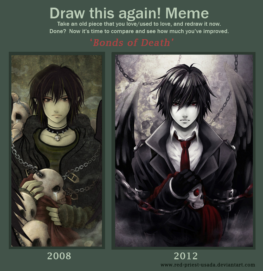
 Red-Priest-Usada — Draw it again - Bonds of Death
Published: 2013-01-03 20:09:48 +0000 UTC; Views: 92213; Favourites: 5714; Downloads: 622
Redirect to original
Description
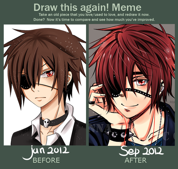
I planned to finish this meme some months ago but I couldn't make the new version look right. To be honest, I spent so many hours drawing and correcting the same parts that my eyes hurt now, seriously X______________X ;;;;.But back to the picture...
Improvement memes are very motivating and inspiring. I love looking at other people's entries. I decided to make a new version f my 'Bonds of Death' pic because I couldn't stand looking at this lame shading and clothes;;;; (not to mention lame skulls). Well, there's still a lot of things for me to learn and improve but I already started enjoying playing with light and colour. I need more practice of course. I just wish my bishies drawing skills improved faster :___:.
Meme base: [link]
Credits for
Related content


Comments: 382

Wow!! *.* That's a really Amazing improvement! Your character looks soo HANDSOME!!
👍: 0 ⏩: 0

The one from 2012 looks so intense and sinister, love it!
")
👍: 0 ⏩: 0

ammm the two are very .... different in style, I like both.
👍: 0 ⏩: 0


this is what i'd imagine nico di angelo from 'percy jackson' to look like ^^
👍: 0 ⏩: 1


i love the new one but the old one is my favorite i say this because its more down to earth to me
👍: 0 ⏩: 0


and i was like OMG? like rally? the 1st one looks like a weird emo dude! and the other one!!!?? well lets just say it looks like what you would expext in 2012
👍: 0 ⏩: 0


This is beyond gorgeous and has inspired me very much. It makes me want to take the time to recreate one of my past works and turn it into something amazing. The picture on the left was amazing enough, but your redraw of it is incredible! Lovely job! :3
👍: 0 ⏩: 1

Thank you very much!
The one who created this meme was a genius  (Smile)")
👍: 0 ⏩: 0

i saw this in the submitting thingy as an example x3 i love it
👍: 0 ⏩: 0


wooow you r amazing i hope one day i can draw like this
👍: 0 ⏩: 0

both of those are amazing......... wish i was as good as you.
👍: 0 ⏩: 0


Gorgeous, really love the color in the newer one.
👍: 0 ⏩: 0

jego twarz wygląda super
starą wersję też uwielbiałam, kupiłam nawet zakładkę... którą zgubiłam ;___;
👍: 0 ⏩: 0


")

I have to say I can't pick a favorite out of either version. I like them both so much lol.
👍: 0 ⏩: 0

Very nice! the 2012 one reminds me of the main character in Deathnote(can't remember his name")
👍: 0 ⏩: 1

How could you? He probably reminds you of either Light or L. Most likely Light Yagami.
👍: 0 ⏩: 2
Yes Light was his name!
👍: 0 ⏩: 0
I usually leave the comments like this without a reply because people tend to write about similarities to their favourite characters and I find it funny  (Wink)")
👍: 0 ⏩: 1
It's a combination of both.
Your character has slightly dishevelled, black hair similar to 'L' of "Death Note", the other main character of the series. At the same time, the dark atmosphere around your character and the "Death" theme make people draw a link between the slight semblance to 'L' and Death. *click* People see Death Note.
Light Yagami is the main, main character who is in possession of the Death Note and as such, some may see Light instead.
Thanks for asking me of all the people who commented!
👍: 0 ⏩: 1
I'm glad I asked because you explained it well. This matter bothered me a little and I was very curious about the resemblance to DN. Thank you
👍: 0 ⏩: 1


great improvement
reminds me of like a light yagami design from death note. like him as a shingami or something. really nice
👍: 0 ⏩: 0


It has definitely become much more dynamic. Hard work over the years certainly shows. Good job!
👍: 0 ⏩: 0


The improvement is so good! I really like your newer one that shading is amazing
👍: 0 ⏩: 0


O.O!!! I like both, but I prefer the 2012!! So nice
👍: 0 ⏩: 0

I like your 2008 version equally to your 2012 version. Very good,
👍: 0 ⏩: 0

I like the first ones color and idea better but you very noticeably improved on the second one.
👍: 0 ⏩: 0
| Next =>