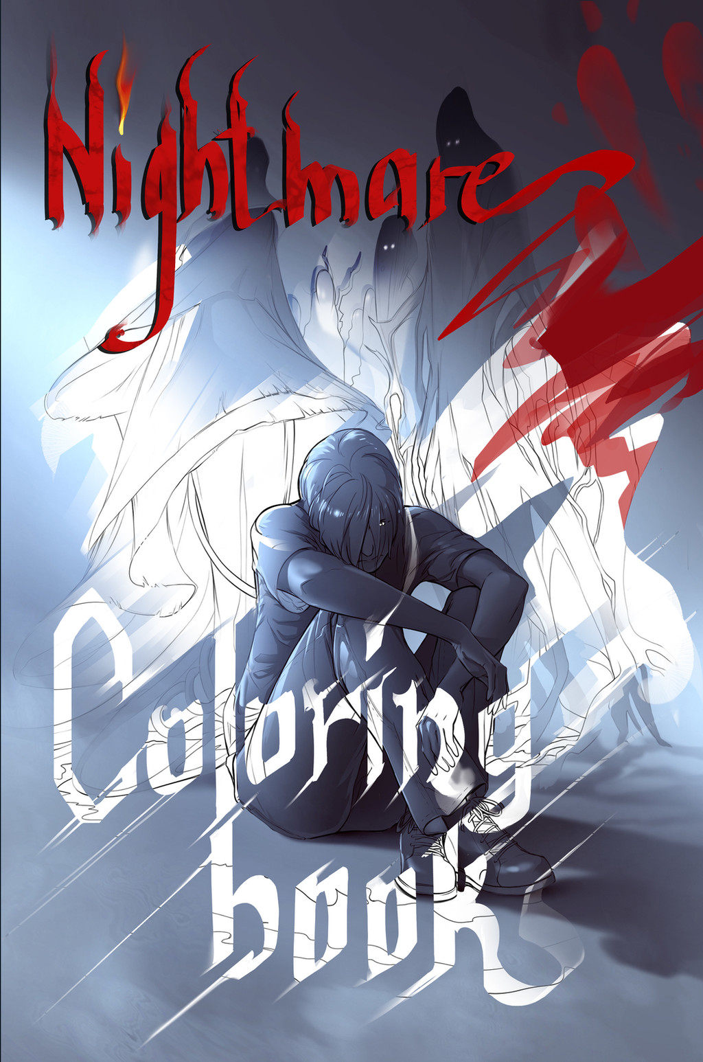
HOME | DD
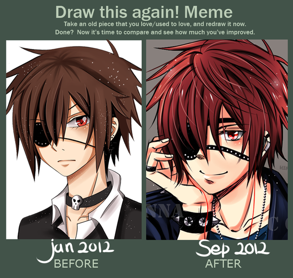
 Red-Priest-Usada — Draw it again - Bonds of Death
Published: 2013-01-03 20:09:48 +0000 UTC; Views: 92212; Favourites: 5714; Downloads: 622
Redirect to original
Description
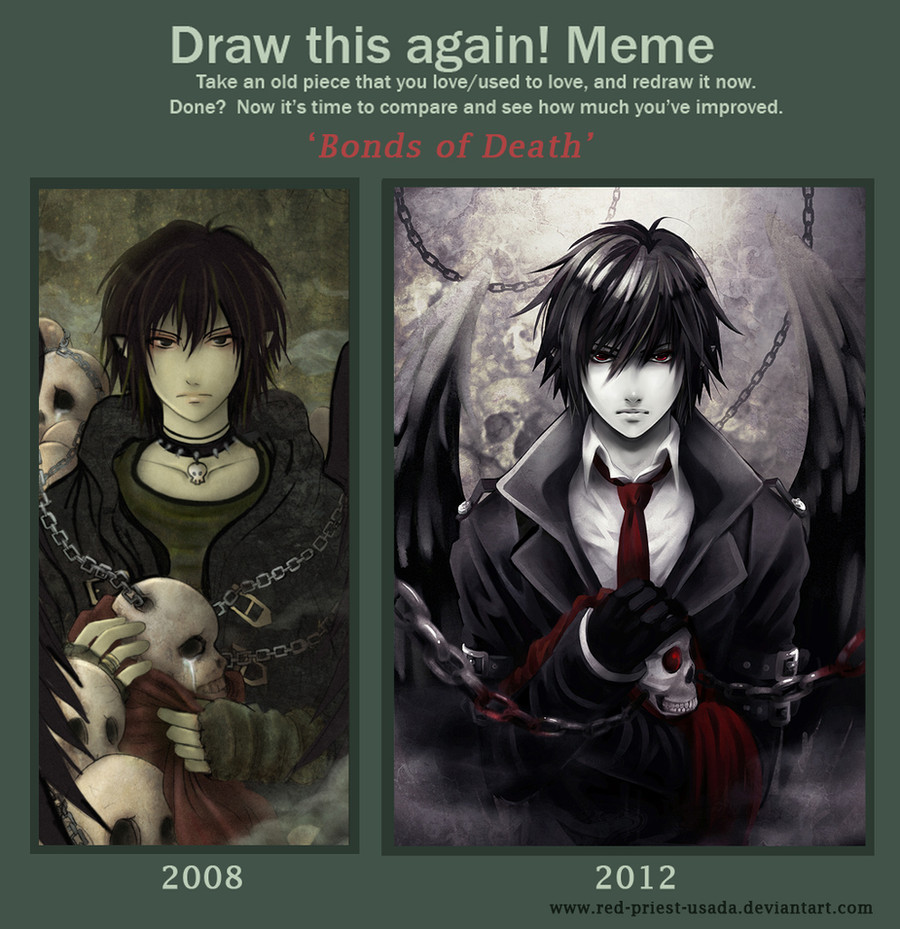
I planned to finish this meme some months ago but I couldn't make the new version look right. To be honest, I spent so many hours drawing and correcting the same parts that my eyes hurt now, seriously X______________X ;;;;.But back to the picture...
Improvement memes are very motivating and inspiring. I love looking at other people's entries. I decided to make a new version f my 'Bonds of Death' pic because I couldn't stand looking at this lame shading and clothes;;;; (not to mention lame skulls). Well, there's still a lot of things for me to learn and improve but I already started enjoying playing with light and colour. I need more practice of course. I just wish my bishies drawing skills improved faster :___:.
Meme base: [link]
Credits for
Related content


Comments: 382

I love the improvement on sophistication from one photo to another! Amazing!
👍: 0 ⏩: 0


Good he is no longer Sasuke/ Rin/Sebastian/Hibari/insert random black haired anime character here/

👍: 0 ⏩: 1

Exactly my point Priest
")
👍: 0 ⏩: 0


Well you look like one. You should watch it. It's a good anime.
👍: 0 ⏩: 1
I watched it a a long time ago but I got upset with L's death and thus the rest of series didn't interest me. I almost forgot about DN by now.
👍: 0 ⏩: 1
Oh wow. I see. Everyone has their fav. Good thing Ryuk was there and again.
👍: 0 ⏩: 0


Yeah, a 2012 Alucard. It would be awesome! =3
👍: 0 ⏩: 0


perfekcję udoskonalono. Apokalipsa jednak nadzieje, skoro dzieją się takie cuda wianki!
👍: 0 ⏩: 0

Although there are a few things that definitely improved in the new one (especially the weird lines in the sweater's collar) I actually prefer the colour scheme and the texture of the old one. Less smooth and shiny, more memorable to me.
👍: 0 ⏩: 1
I agree with the shiny thing- my mistakes were that hair should not shine like some kind of metal and the leather jacket should have less folds and lighting on it. The rest is a matter of taste  (Smile)")
👍: 0 ⏩: 0

Both the pictures look very awesome! To me, it looks like two different art styles to be honest. But that doesn't take away the fact that both are awesome!
👍: 0 ⏩: 0

I don't why some people like the first picture better, there is obvious improvement!
👍: 0 ⏩: 1

I like both of them. To me these mostly look like two different styles rather than improvement (though I do see some aspects of improvement).
👍: 0 ⏩: 1
Well, yes, the original picture depicts a great amount of talent and detail and I also like it a lot. I don't really see them as different styles, though if you choose to interpret them that way be my guest. The second picture has a lot more depth, in terms of the chains, the background, the wings and even the clothes. There was also a drastic increase in shading and lighting, making it more realistic.
I could go into a whole spiel about color schemes and what they could be alluding to, but I shall refrain. I will simply say that the green color, the coloration of the man's skin, and the darker color of the skulls is not present in the second picture, making it appear harsher, more monochrome with the crimson red really jumping out at you(as it should.) The stark whiteness of the second man makes him look more suitable for his respective setting, in my opinion.
There's a rather obvious difference in the skulls. The second skull is much more realistic, which suggests the artist took the effort to learn more about anatomy, which is always helpful for an artist. And then there's the state of the skulls. Let's look at the skulls in the first picture. They're crying. A rather simple concept. Death, in most cases to most people, is a sad subject. Makes sense, but it's something that's been done and done and done again, and will in all likelihood be done some more. In the second picture the skull is not crying. It almost appears to be grinning. But that can be interpreted in any way, seeing as skulls, when drawn anatomically correct, appear to grin no matter what. But to me, the skull seems content, accepting of it's fate, of it's "Bond", as the title suggests. The skull, removed from it's previous owner and obviously very thoroughly dead, is fine with be bonded to this man. And what does that suggest about him? I'll leave that to your imagination...
And then there's the subject of the picture. The first man(or perhaps 'teen' is more fitting).... fits his scene, in a bit of a juvenile gothic way. Not that I'm knocking that style, I like it. But I look at him.... and I think 'Punk'. Again, nothing wrong with that. But it's certainly in contrast with the newer version. This man, while still youthful looking... well, I just can't look at him and think 'Oh, just some kid.' No, there's something older about him, something mysterious and darkly enticing.
Which brings me to the expression. While essentially the same, the second picture holds much more meaning to me. Originally the man seems bored, pretty much indifferent to his surroundings, as if he'd stumbled upon the scene and simply had no reaction to it. In contrast, the newer man is staring intensely, his posture erect, tense, clutching the skull in his arms possessively. He belongs in the scene.
The second picture just appears more... right, I suppose? To me at least. The first scene is something odd, yet memorable, like one you'd witness in a dream. The second scene is like rounding the corner of the same dilapidated building for the fourth time in a row on your way home after staying out past midnight, and having the creeping, shuddering realization that you won't make it home tonight, and you can't be sure you'll ever make it to the comforts of home... ever again.
...Heehee. Whoops. I rambled again... Oh well. I like both pictures, but the second picture looks way better. That's just my opinion. So yeah. *slinks away awkwardly*
👍: 0 ⏩: 1
I didn't know how to reply because you just made me speechless. It's the first time in my life that I received such a comprehensive feedback. I would like to express my thanks to you for taking your time and describing my drawings in so many details.
It was surprising to me that you managed to analyze everything with such accuracy.I especially like the part about Thanatos's appearance and face expressions in both pictures. I tried hard to make his gaze look deeper and concentrated. Therefore, your words were very rewarding
Receiving valuable comments on deviantart is not easy because the more people the more different opinions you get. The artist cannot meet the expectations of everyone but he/she definitely wants to know what can be improved and what is already good in his/her drawings. Definitely, your opinion is one of the best I got so far so once again thank you for that
👍: 0 ⏩: 1
Oh. Um. I didn't expect you to see this. I feel embarrassed for some reason....
Well, it's just that everyone on deviantart can have access to really talented artists twenty four seven, and I feel like, despite the time the artist takes to work all the detail into their work and improve over time, people just look, favorite, maybe leave a nice comment, but don't really think about the effort the artist goes through. And isn't art like this supposed to be thought provoking? Especially since you're trying to show how much you've improved....
As an amatuer artist, it's a huge pet peeve of mine when people just disregard my improvement, so when I saw in your journal people were saying they liked the original better... it kind of irked me. So yes. No need to thank me
Well, I don't tend to leave many comments on deviantart, (which may be a bit hypocritical of me, hehe...) but if it really meant that much to you, I suppose I'll try to come out of my shy little shell more often
👍: 0 ⏩: 0

I like how he went from fussy emo goth with spike necklace to professional death-wielder. Now that's growth!
👍: 0 ⏩: 1
Fussy emo goth - that comment was epic xDDD. Yeah, in 2008 I didn't know anything about men clothes and this is what first came to my mind.
👍: 0 ⏩: 0

The second picture looks straight out of death note
👍: 0 ⏩: 1

No offence, but they both suck Sonic Underground's balls. I could do so much better than that. xD Maybe if you want lessons I could teach your sometime. If you want to see some actual good art for once, come check out my page. Bye!
👍: 0 ⏩: 2

Nice trolling there.
👍: 0 ⏩: 0

no offence but... you suck at drawing,(sorry) and Red-Priest-Usada is awesome
👍: 0 ⏩: 0


Extremely impressive! Both versions are better than anything I could ever do haha ^^
👍: 0 ⏩: 0


Postęp przez te 4 lata zrobiłaś gigantyczny. Masz większą świadomość anatomii twarzy, nie jest to już tylko trójkącik zamiast nosa (który nota bene na starym rysunku jest trochę krzywo
👍: 0 ⏩: 1
Przy tej pracy postawiłam sobie wysokie wymagania. Starałam się skupić na oświetleniu zarówno na włosach, twarzy jak i na materiale. Jednak dalej czułam sie niezadowolona z efektu końcowego. Na szczęście Sah i Anika pomogły mi wczoraj znaleźć niektóre błedy, np. w fałdakch na ubraniu czy też w oddaniu tekstury materiału. Co do kolorów to chcę spróbować pokombinować z tym zielonym ale też bez przesady by na nowo nie spłaszczyć rysunku.
Stary rysunek to były moje początki w używaniu tekstur i rysowaniu facetów. Wiem, ze wielu osobom podoba się taki uproszczony styl, punkowe klimaty. Natomiast moje postacie zmieniły się wraz ze mną a mi już takie uproszczenia nie odpowiadają.
A co do nosa to go narysowałam wtedy z boku zamiast na wprost XD;;.
Dziękuję Ci za komentarz.Bardzo rzadko dostaje obszerne komentarze a te są przecież najcenniejsze.
👍: 0 ⏩: 1
Na podstawie większych komentarzy jesteśmy w stanie się w jakiś sposób rozwijać. Nie lubię pisać innym komentarzy pod tytułem 'cute', bo to nic nie daje. Miło jest usłyszeć, co w danej pracy zwraca uwagę widza, co możnaby zmienić itd. To są najcenniejsze komentarze
👍: 0 ⏩: 0

wciąż wieje Twoim oryginalnym stylem, ale musze przyznać że starą wersje uwielbiałam, ta tajemniczość mrrr...
ale nowa powala, w szczególności te detale, jak światło, włosy łańcuch.. troche bardziej gotycki styl i o wiele mroczniejszo uwodzicielski...?? haha
ale i tak świetnie ♥
👍: 0 ⏩: 1
Przepraszam za późną odpowiedź ale miałam wtedy kompletny zalew komentarzy w dodatku z różnymi opiniami, że musiałam to przetrawić na spokojnie. Jak zamieszczałam tę pracę to byłam kompletnie zaszokowana reakcją tych, którzy zaczęli pisać, że wolą starszą wersję. Teraz patrzę na to z większym dystansem. Co ciekawe, przeanalizowałam sobie tego rodzaju memy i się okazało, ze wielu innych artystów dostawało tego samego rodzaju komentarze; narzekanie na to, że starsza wersja lepsza bo: fajniejsze kolory, design, klimat, kreska (do czego mają prawo bowiem to jest kwestia gustu) ignorując przy tym samo założenie tego meme- to jest by pokazać postępy w warsztacie autora. Niestety kierując się tylko swoim gustem ludzie nie dostrzegali poprawy anatomii, perspektywy, światła itp. co jest lekko dołujące (ja odchorowywałam to całe popołudnie XD;;; ).
Nawet nie wiesz jak bardzo mi miło czytać, że jednak w nowej wersji da się jednak rozpoznać moją kreskę bo ja sama miałam wrażenie, że skupiając się za bardzo na progressie,poszłam w zbyt duży mainstream i przez to mi się własna kreska rozmyła.
👍: 0 ⏩: 1
hmmmm fakt też zauwazyłam ta tendencję, moze to dlatego ze to meme?!
chodzi mi o to, ze jak mamy do czynienia z ogolnym progressem twórczości,
to widać ten "progress" czy w kolorach, kresce, świtle.
A tutaj specjalnie się człwiek stara aby nowa wersja była inna i możliwe że momentami
trochę wlasny styl gdzieś umyka, stąd te porównania.
szczerze co do kreski, to ja nie mam żadnych wątpliwości dla mnei to caly czas Twój styl <3
i nie bierz tak wszystkiego do serca, grunt że robisz postępy i ty je widzisz,
bie od razu inni je zauważają.
Pozatym nie każdy jest artystą w sensie że od razu widzi szczegóły jak kolory, światło, dla\
niektórych ładne jest i tyle >.<
i tak na koniec nowa wersja jest świetna, bo jakby "żyła" nie wiem jak to określić, poprostu jest mi bliższa

👍: 0 ⏩: 1
Spoko, nabrałam juz dużego dystansu i przestałam się przejmować- ba, nawet doszłam do wniosku że przeżywałam to za bardzo bo tak naprawdę ludzie podeszli do tego bardzo życzliwie i właściwie praca została przyjęta ciepło. A że niektórym podoba się starsza to faktycznie sprawa idnywidualna i tak jak napisałaś, nie każdy widzi błędy pod kątem anatomii i innych pierdół (ja zresztą też wtedy nie widziałam).
Jednak najcenniejsze komentarze dostałam od moich najbliższych znajomych, które gdy je poprosiłam, wyłapały także błedy w nowej pracy i pokazały jak to naprawić. Dzięki temu meme dowiedziałam się co ludzie nadal widzą fajnego w moich starszych rysunkach oraz pokazano mi jakie błędy nadal popełniam ( perspketywa rąk, bo jako wyciągniete do przodu powinny mieć inne ułożenie fałdek na ubraniu, ubranie natomiast jako zrobione ze skóry nie powinno się tak marszczyć i świecić jak lateks ; ) a włosy lśnić jak metal).
👍: 0 ⏩: 0


It's pretty apparent how your depth perception improved in this meme. Also, I really like how Thanatos' expression on the second piece looks more focused since I feel as if the emotion on the first one is lacking
I also love how the contrast on the second piece is more striking *A*
Not to say that your first piece isn't good though
👍: 0 ⏩: 1
Thank you very much
👍: 0 ⏩: 0

wowww
it was already good before but now its even more amazing
👍: 0 ⏩: 0

Wow this is fantastic. Love the suit you put on him this time.
👍: 0 ⏩: 0

<= Prev | | Next =>