HOME | DD
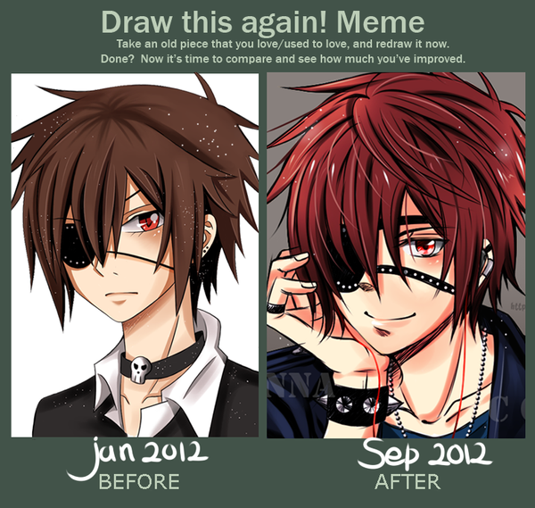
 Red-Priest-Usada — Draw it again - Bonds of Death
Published: 2013-01-03 20:09:48 +0000 UTC; Views: 92214; Favourites: 5714; Downloads: 622
Redirect to original
Description
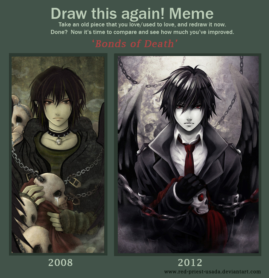
I planned to finish this meme some months ago but I couldn't make the new version look right. To be honest, I spent so many hours drawing and correcting the same parts that my eyes hurt now, seriously X______________X ;;;;.But back to the picture...
Improvement memes are very motivating and inspiring. I love looking at other people's entries. I decided to make a new version f my 'Bonds of Death' pic because I couldn't stand looking at this lame shading and clothes;;;; (not to mention lame skulls). Well, there's still a lot of things for me to learn and improve but I already started enjoying playing with light and colour. I need more practice of course. I just wish my bishies drawing skills improved faster :___:.
Meme base: [link]
Credits for
Related content


Comments: 382

Both are really awesome. But somehow the second one draws me in.I think maybe its because he has a very unshakable look in his eyes, as if he's completely fearless.plus, i think the colors suit the character, i mean he is the god of death, so the colors should not be brightly colored. I like the deeper red color in the fabric and tie, which, if im seeing correctly, has a bit of grey in it; it adds to the darker feel of the picture. Also, he somehow seems more alive in the second one that in the first one.Overall, the picture feels like, he's determined to do something, like perhaps get revenge.
👍: 0 ⏩: 0

I like the color scheme of the first one better, and the texture. But you've improved a lot
👍: 0 ⏩: 0


though there's more depth and skill in the second, I really like the first one for the style. Plus you changed the picture itself quite a bit ):
👍: 0 ⏩: 0

Both of these are fantastic! But all the while great improvement also! ^__^
👍: 0 ⏩: 0

Both versions are really nice, but the second one wins - he reminds me of Mikami from Death Note... Good job!
👍: 0 ⏩: 0

Nice work  (Smile)")
👍: 0 ⏩: 0

Wonderful! You improved so much. *Both versions are epic X3*
👍: 0 ⏩: 0

I parsonally like'd the first one batter. Both of them are preety awesome though!
👍: 0 ⏩: 0

Improvement? Yes!
How's you do it? What program and did you use tutorials or is it just practice?
👍: 0 ⏩: 1

The programs I used were Adobe Photoshop and PaintTool SAI. I studied a lot of tutorials about color and light theory and about clothes.
👍: 0 ⏩: 1
Ahh nice thank you ^_^
👍: 0 ⏩: 0

Oba świetne, moim zdaniem są od siebie o tyle różne, że trudno powiedzieć, które jest tak naprawdę lepsze
👍: 0 ⏩: 0

zajebiste poprostu ")
👍: 0 ⏩: 0

Widać dużą poprawę w umiejętnościach,obie prace są świetne.Jednak jest pewien problem. W starej pracy, płaskość rysunku,kształty czaszek nie przeszkadzają,ma to swój styl i jest ilustracyjne.Nie czepiałabym się niczego.Nowa praca choć zrobiona lepiej, to postawiła wyżej sobie poprzeczkę i wymagania. Jest bardziej przestrzenna i realistyczna,dlatego łatwiej o znalezienie rzeczy które wymagałyby dalszego dopracowania. Chodzi tu głównie o ciuchy lub o skrzydla które choć śliczne,to w porównaniu z włosami albo przestrzennoscią łańcuchów i mgły,wydają sie zbyt płaskie.tak samo choć ma piękne oczy i fajnie wycieniowane nos i usta,to zwłaszcza te drugie są zbyt nisko osadzone.
Podsumowując,bardzo mi sie podobają obie prace i podziwiam duużą poprawę. Ale sądze że nowy styl stawia przed Tobą poprostu większe wymagania.
👍: 0 ⏩: 1
Pięknie to ujęłaś i dzięki Ci Kochana za ten komentarz! Lepiej bym tego nie ujęła. Wszystkie Twoje cenne uwagi wezmę na przydadzą się przy dopracowaniu tego. Jeszcze raz bardzo dziękuję

👍: 0 ⏩: 1
Ale mi się zlepek słow zrobił 
👍: 0 ⏩: 0

Przeczytałam Twój wpis i uważam, że nie musisz nic poprawiać! Czytałam komentarze i nie zauważyłam żadnych uwag technicznych. Jak ktoś się pisał, że stary rysunek podobał się bardziej to albo nie uzasadniał albo było tak dlatego, że ta osoba osobiście preferowała kolory czy atmosferę starszej pracy. Moim zdaniem takie zestawienia powinno się oceniać tylko i wyłącznie pod kątem technicznym. A bardzo widać różnice! Czaszki nie mają tej 'rzęsy' i... nosa. W ogóle czym miała być ta 'rzęsa'? XD
Zauważyłam, że zawsze jest jakaś osoba, której bardziej się podoba stary rysunek, chyba, że tabelka wygląda tak: [link] [link] [link] i ludzie tylko żartują, ze stara praca lepsza.
Uważam, ze opinie na temat starego rysunku, że bardziej się podoba są tego samego typu jak ja bym napisała, że bym wolała by nowa wersja była z różowym brokatem, by była mniej mroczna. ;D
👍: 0 ⏩: 1
Oj weź, z tych rzęsek to mam do dziś jazdę- chyba nieumiejetnie wtedy sprobowałam im narysowac emocje czy coś w tym guście. Już nawet nie pamiętam 
Nie zamierzam dogadzać wszystkim bo się nawet nie da ale prawda jest taka, że mi samej w nowej pracy czegoś brakowało i przez te kilka miesięcy się z tym męczyłam. Próbuję dojść do pewnego poziomu, gdy będę względnie zadowolona. Natomiast bardzo ładnie problem nowszej pracy ujęła moja koleżanka w poście nad Tobą.
👍: 0 ⏩: 1
Ja bym ich pewnie nie zauważyła jakbyś nie napisała, ale jak już są...
Przeczytałam ten post i nie do końca się zgodzę... Szkoda, że jednak nie dogodzisz wszystkim, bo to znaczy, że nie będzie też mojego różowego brokatu...

")
👍: 0 ⏩: 1
Wybacz mi ten brokat proszę bo zaczynam się czuć winna
")
👍: 0 ⏩: 1

I have no idea what a meme is, but this looks awesome.
👍: 0 ⏩: 0


Both look really awesome, but I can see the improvement.
👍: 0 ⏩: 0

2008 - Really good,
2012 - Awesome.
👍: 0 ⏩: 0

O.O Light Yagami
And it looks awesome. I Love them Both.
👍: 0 ⏩: 0

Wnioski - przestałaś gustować w obojczykach i spiczastych uszach.
👍: 0 ⏩: 1
Spiczaste uszy zostały ale są bardziej ukryte we włosach. Natomiast zmieniła mi się koncepcja jego stroju i poszłam w mniej punkową wersję. Także czszki przestały byc emo i ronić łzy spod swoich dziwnych pojedynczych rzęsek
👍: 0 ⏩: 0


Amazing! It can only improve even more from here on out!
👍: 0 ⏩: 0

Both pieces are brilliant, but I adore the newer one <3 I overall prefer the style and feel of it. Seems darker to me.
👍: 0 ⏩: 0


I love both very much. But I find that the emotions conveyed are different. In the first it's darker and sadder because of the colors and the expressions (the guy and the crying skull). However I feel more of a dark redemption type of thing going in the second pic because of the light and the different emotions. Either way 2 amazing pieces. And I love the new clothes
👍: 0 ⏩: 1
Good point! I tried my best to make Thanantos look darker but at the same time I lost the emotion of sadness in the picture. I didn't realise it until I got so many comments with a wonderful feebdback on this matter.
👍: 0 ⏩: 1
The sadness wasn't lost but rather overpowered by redemption. It's still present just not as much. He looks darker but lighter at the same time. (don't know if that makes sense 
👍: 0 ⏩: 1
Ok. That's a little confusing
👍: 0 ⏩: 1
Ya just ignore that last comment

👍: 0 ⏩: 0

SUGOOOI! what improvement! The shading is really awesome in the new version!!
👍: 0 ⏩: 0

Nice, I can see the improvement. Good work.
👍: 0 ⏩: 0

The second is much better, great improvement,
However, in the old one it looks like the guy is using the red blanket in a way to stop it crying, but in the newer version their is no reason, as the skull, which is more realistic is no longer crying.
So, my advise is to make things look less realistic if you need to place the emotion, Though that's up to you.
👍: 0 ⏩: 1
Well, it was my aim to shade more realistic so I don't want to change it. However, I agree with you that the first one might have more emotion within. I will try to fix it in the new version so thank you very much for your help
👍: 0 ⏩: 0


I love how classy the second one is.
👍: 0 ⏩: 0

I think I simply prefer the color palette of the old one. It also seems more emotional, the boy's expression and the tears on the skull. The newer one does look cleaner, and it's better shaded, but I miss the emotion. It's just sort of blah without it.
👍: 0 ⏩: 1
Thank you. It's another opinion about the colour palette I received so far and I think that you're right.
👍: 0 ⏩: 0

Oh wow! Fantastic! You've made a lot of improvement, I like the old one, but the new one is SO GORGEOUS! A much crisper feel, improvements on shading, hair, and cloth, and a more intense gaze that's very captivating. Great job! I'd love to see it as it's own Deviation that I can favorite. ^_^
👍: 0 ⏩: 0
<= Prev | | Next =>