HOME | DD
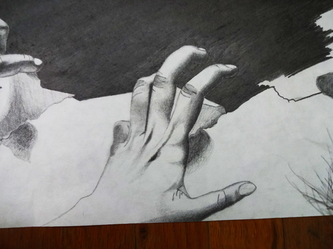
 Redtailed22 — Grasping - Contrasting Contour Hand Study, January

#arm #contor #contrast #countour #hand #hands #handsstudy #handstudy #hatch #hatching #pencil #shading #study #traditional #traditionalpencil #armstudy #artstudy #artstudyz #traditionalart #traditionaldrawing #traditionalmedia #traditionalartwork
Published: 2019-02-02 22:02:37 +0000 UTC; Views: 547; Favourites: 28; Downloads: 0
Redirect to original
Description
Wow this sounds so emo sorry xDJust something I did in school so I wanted to post :/
Related content
Comments: 10

Hey there, found your work through :devprojectcomment:


 but I still think you can maybe leave some spots a little lighter than others. Also you did a bold outline around the whole hand. You could maybe try to get different levels of darkness there too, because you usually don't really see the 'edge' of the hand on the side where the light is coming from. These are all tips for achieving a more realistic look on this, if you don't want that, then don't listen to me


 And the last thing that could perhaps be improved is that you outlined the hand without outlining the thumb for example. If you use these kind of lines I think it's better if you not only do the lines all the way outside, but also the lines within the hand, like the sides of the thumb. It also makes it look more realistic and a lot more threedimensional.
 So in conclusion, it is a really nice study, you did a great job! And these are just recommendations, if you want to make it more realistic


Awesome work!


👍: 0 ⏩: 2

I like your style of shading, patterns of long lines to help shape the hand. However, i feel your decisions of where to place your shading are odd, especially the one for the joint connecting the thumb to the palm. Also, to add to the long lines for shading, smaller, curved lines would help create a more round shape for the hand. Your limitation, i feel, is most evident in tbe creases and finer details of the the thumb. As it is, it seems crude.
👍: 0 ⏩: 0

Thanks for all the feedback! I really need it xD
I see what you mean with the wrist, and maybe next time I should add different values to the shadow. Thanks for the ideas!
<3
👍: 0 ⏩: 1

You're very welcome and good luck with your next piece! It's going to be at least as great as this one
👍: 0 ⏩: 1

That's actually a very cool shading style, nicely done
👍: 0 ⏩: 1

nooooooo problem, keep it up
👍: 0 ⏩: 0

I really like your HANDiwork here. Sorry couldn't help it. All joking aside though this is actually well done. While the finger to look slightly shorter than natural, it looks really good. Keep it up.
👍: 0 ⏩: 1

Eyy I see what you did there <3
Btw if the finger looks short I tried to foreshorten it, not going so well though xD
Thanks for the feedback! Will try and improve in the future
👍: 0 ⏩: 0


