HOME | DD
 Redtailed22 — Into The Spider-Verse - April
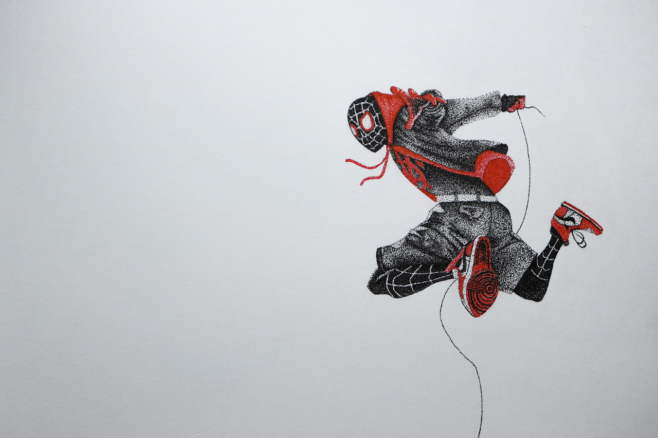
#miles #spider #spiderart #verse #milesmorales #spiderfanart #intothespiderversefanart #spiderman #spidermanspiderman #spidermanmarvel #spiderverse #intothespiderverse #spiderversefanart
Published: 2019-04-28 09:45:40 +0000 UTC; Views: 562; Favourites: 64; Downloads: 0
Redirect to original
Description
Well, here is a little something. Endgame was awesome, so i'm going to start something avengers themed. I should probably try to do more that 1 piece a month tho xDRelated content


Comments: 6

Oh yeah, totally! Avengers: Endgame was very satisfying! Spider-Verse's had one of the best art styles I've seen being implemented in an animated movie--probably my favorite style so far! Speaking of art styles, your pointillism is impressive!
One thing I'd like to point out is the lack of outlining on Miles' abdominal area, which makes that area seem flat instead of 3D. The flatness along with the outlining of some parts of his body don't really go well together. Generally, a consistent outline throughout the subject should look more appealing. And a background would have made the drawing a lot more appealing instead of a plain white backdrop.
I also wonder why the shading on Miles' left hand has a black tone unlike the shading implemented on his red garment. Maybe you went for a shading match with Miles' hand and his shoes, but the break of consistency brought by the fact that his red garment has a red tone for shading just doesn't feel right to me. I also think the spider design on his chest needs to have a slimmer, smaller, spray-painted appearance to fit what it looks like in the movie.
Another point I want to make is with his body position. His abdominal area seems to be facing strictly to the left, but the area around his thigh seems to be turned a little bit. Think about how his spinal area should look, from the top to the coccyx (tailbone).
The wrinkles on his shorts are done very impressively and doesn't seem 2D and flat, unlike Miles' head, which seems to lack shading.
Last thing I want to point out is how his right arm might need a little more value applied to it, since it looks faded.
Cheers!
👍: 0 ⏩: 1

Thanks! yeah, I agree I missed some points. Will try to do better next time
")
👍: 0 ⏩: 0

AhhHAjbvdgf I wanna see endgame so FRIKEN BAD! But I am still in love with the spider-verse movie the animation was so unique and overall the story was so amazing too <3 Speaking of amazing, wow this is amazing O:
I just can't love the detail you put into these enough from the bottom of the shoes to the shading in the jacket all very well executed!
1.) One thing I can say though, the hand facing the viewer (front arm) is kind of blending into the character too much. I had to search for a bit to find it so maybe try separating it w/ a highlight or move it over more so the reds don't overlap. (not to say you are going to redraw that) but just to keep in mind for other designs w/ overlapping colours.
I would love to see more Marvel themed drawings form you (: This one looks amazing that's for sure~
- ProjectComment
👍: 0 ⏩: 1
Thanks for the feedback! Gad you liked it
 (Smile)")
Yeah, I really should do some more Marvel themed art. I'm planning on drawing the original six avengers, but it's so hard to draw faces ugh xD
👍: 0 ⏩: 1
Haha true but at least a lot of them have masks?
:3
👍: 0 ⏩: 1
Too true, definitely going to start
👍: 0 ⏩: 0