HOME | DD
 RetSamys — Harmony
by
RetSamys — Harmony
by

#animated #animation #animator #balance #bamboo #challenge #circle #complement #complementary #contrary #digital #digitalart #duality #gif #gimp #group #harmony #inverted #mirrored #opposite #opposites #round #sign #symbol #symmetrical #symmetry #tablet #taiji #wacom #yang #yin #taijitu #animationdigital #dreamerswelcome #animatedgif #blackandwhite #blackwhite #drawingtablet #framebyframe #gifanimated #gifanimation #graphicstablet #harmonic #harmonie #harmonious #lightanddark #lightanddarkness #oppositesattract #wacomtablet #yinandyang #yinyang #digitalanimation #bamboowacom #wacombambootablet #animationgif #framebyframeanimation #animationanimated #groupchallenge
Published: 2014-10-22 18:33:40 +0000 UTC; Views: 7758; Favourites: 121; Downloads: 69
Redirect to original
Description
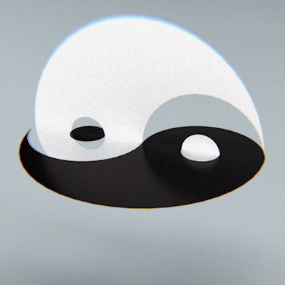
This is my entry for 's monthly challenge. This month, the theme was harmonious.
Aah, it feels good to animate again! But it takes so much time!
Drawn in the GIMP with my Wacom Bamboo tablet.
Free artwork! You may:
Share
Remix
and use this work (even commercially), under the following conditions:
Attribution (credit me)
Related content


Comments: 46

👍: 0 ⏩: 0

Hi! Simon from here!
Here's my thoughts on your work. I'll first try to tell you how this piece works for me. This is all my personal opinion, other people may react differently, I'm just trying to give you insight on how people like me understand your work.
To me, the yin-yang symbol mostly represents life and the world and how it is neither good nor bad, neither beautiful nor ugly, but a combination of both in an inseparable way. I admit that to me, it does not straight away evoke harmony rather than balance. The movement starts with two circles with a dot inside which really make me think of living cells. The constant bobbing movement really adds to my feeling that these are living cells.
Unlike cells, who tend to separate, these two entities embrace each other, without actually fusing, thus becoming something more harmonious, more complete, more beautiful than when they were separate. I think this expresses what harmony is in an excellent way; harmony is when multiple things come together to make something better, just as individual music notes or colours do not express much, but can create emotion when combined into a chord or a painting.
To me, harmony is also about a certain smoothness, a certain regularity, a certain softness of contrasts. This is very well achieved by the flawless animation which is very smooth, and by your choice of liquefying the objects. However, I would have taken the idea of the smoothness a step further, maybe by deciding against the constant bobbing of the shapes. While this makes your animation more lively, it kinda contradicts the zen symbolism and I don't feel it contributes to the harmony of the piece. I also agree with AlwaysBurningFire that this movement is slightly annoying. Another thing I would have done differently is that I would not have stopped the movement when the shapes meet and when they are fully separate. I think a continuous fluid movement would have expressed harmony better. A wild suggestion I have would be to make the two droplet shapes of the yin-yang symbol circle themselves once they meet and then separate in the same way they met, rather than have them pulled apart.
Anyway deep (or far-fetched: depends on your point of view) symbolism aside, I think the movement you created is very stylish.
From a technical point of view I have nothing to say really. The animation seems flawless to me. The illusion of movement is perfect and very fluid. I also really like that the lines are perfectly smooth and keep the exact same width throughout the whole animation. This gives the animation a very neat feeling. The only thing that could make it better would be taking the time to add extra frames.
Another thing you could work on: the title. I feel like you could have been less creative .
What is your idea of harmony? What do you want to tell your public? How do you want them to approach your art? These are the questions I would ask myself constantly.
Anyway, nice job! Hope I helped in any way. Feel free to ask me any questions.
Cheers!
👍: 0 ⏩: 1

This is wonderful. I always hear that art is in the eye of the beholder and that it transcends the artist, but it isn't all that common that someone tells me something about my work that I hadn't even begun to consider.
I am really bad at titles. Given how little it is discussed and how impactful a good title can be, I wonder if there is some way for me to learn that (without getting into clickbaiting territory).
Regarding the difference of harmony and balance... Well, it's fascinating, but I always confuse both concepts and aspects of the ideas... Balance is between two extremes and harmony is a... relationship? When things form a system together and coexist?
Which really fits your cell metaphor (which is ingenius, by the way, retrospectively, I called it "organic", but this is just amazing). Once separated, cells don't merge back together (except when they do because nature defies simplicity), but they do form a system together without destroying each other.
But same as you, I find the Yin-Yang symbol confusing regarding its symbolism, when it shows two opposing and contrasting forces. It takes a whole lot of thinking for me to realise that the circle is not just a matter of having a nice design, but that this circle is the system they form together!
However, I would have taken the idea of the smoothness a step further, maybe by deciding against the constant bobbing of the shapes. While this makes your animation more lively, it kinda contradicts the zen symbolism and I don't feel it contributes to the harmony of the piece. This is true, and it explains why most of the animations I have seen with this symbol are so incredibly sharp... when I created this, I didn't think too much about the symbolism (to be honest, I still think of the symbol as a nice design to look at and not as a representation of something greater) and I really had enough of those unorganic animations. I think.
But it's true that I could have made this smoother while keeping it organic. I don't think I'd ever go through the trouble.^^ I'm a very lazy animator and I don't like stepping out of my comfort zone too much (animation is so much of a pain in my time-ass already).
Extra frames!: 
Questions! I love questions in comments! I know they're meant for me and not for me to answer to you, but that doesn't mean I won't try to answer questions even if there aren't any.
What is your idea of harmony?Semantically, for me, it is not what it means according to dictionaries. It's the opposite of entropy. It is an end state in which everything is ordered. It doesn't make sense, I know.
What do you want to tell your public?I don't want to tell them anything! Is this bad? Does that make me incomplete as an artist? I just want to make things that are interesting. Is that where the distinction between artist and designer lies, if there is any?How do you want them to approach your art?In the wrongest way possible, perhaps.  (Smile)")
Again, not making much sense.

👍: 0 ⏩: 0

In my opinion, this is a wonderful piece to submit due to the "harmonious"-theme! It is like the symbol of harmony. And it was really cool that you chose to animate it the way you did! The way they just spin together into a perfect circle makes me see that the black and white colour just harmonize together. And when they start off being apart, it just strenghtens that good harmony-feeling. I don't know much about animation and how it works, but I think I have seen enough animated drawings to be able to tell you that this is what I call high skills of animating. REALLY well done there! And I bet it takes a lot of time, but this picture wouldn't be the same without the animation!
I can not come up with anything that I would wish to improve in this drawing ... It's just so good you know. But perhaps, this is just my opinion though, but perhaps you could have dropped the shivering in the animation right before the white and black parts slip? Because it is a bit annoying to watch the circle shiver, but it is not very bothersome either, but you do not have to change anything really. This is just such a simple and wonderful drawing\animation.
Hope to see more stuff from you in the future!
Comment brought to you by
👍: 0 ⏩: 1
Finally, I get to respond to this! Time is a precious, precious thing.
Thank you so much for the comment. I know it's been a while since you wrote it (look at that, 4 months ago!).
The "shivering" is pretty bothersome. It's both a result of choice of style and a result of lazy technique. See, if I intentionally add shivers, I don't have to pay attention to make everything perfectly smooth and wobble-free and that means I can animate a lot faster! Which is great, because it takes a lot of time. But I might have been a bit too lazy at times. Instead of making a smoother transition between wobbles, I made a simple repetition of very little shivering, making it look all jittery and uneasy.
Given how easy this would be to fix, I could simply find my original file and change it up... Which gives you an impression of how lazy I am, because I already know I won't do it unless there's extra motivation involved. Grmbl. But hey, I might pay more attention to this in the future, when I animate in this style again.
Thanks again!
👍: 0 ⏩: 0

Thank you! Yeah, I like just adding a lot of frames to my animations to make them seem smooth. Works for me. ")
")
👍: 0 ⏩: 1

Aw. So are you, for commenting!
👍: 0 ⏩: 0
And you are now cool! Thank you.
👍: 0 ⏩: 1

of course this is awesome
👍: 0 ⏩: 0

Thanks. I like how it came out.
👍: 0 ⏩: 1

Thank you. Part of the smoothness is what is called "smear animation". Of course, the wobbling makes it kind of liquid looking, but adding a kind of motion blur makes it much easier to the eye as well! I need, need, need to learn how to do smears a lot more.
👍: 0 ⏩: 0
Thank you! (I'm almost sure that I have seen a similar animation somewhere, so I assume it's not all that original.)
👍: 0 ⏩: 1

still it is your work in here
👍: 0 ⏩: 1
Thank you! It could have been much smoother. And I certainly don't like the look of some frames, could be a lot more organic. But yeah, it looks cool. I like it!
👍: 0 ⏩: 1

Your welcome !
Yea, it certainly does! c:
_
i feel bad we haven't talked much since you
were teaching me to code journals xDx
👍: 0 ⏩: 1
Oh, don't feel bad. That's my fault. I usually don't really connect well with others on the internet. Especially if it's as task-driven as teaching someone how to code Journals. (By the way, I don't remember if we finished everything you needed to know. If not, just let me know how I can help you.)
👍: 0 ⏩: 1
Oh, I see- i guess school gets pretty tiring so when I get
home I normally just end up falling asleep xD
but now it's the holidays i'll be able to get more things
done and talk to more people c:
I can't remember either x'D
well I have a winter drawing that
I haven't finished but i'd like to use as a journal skin
when i'm done with it i'd just like to know
how to be able to change the picture from the old one ?
👍: 0 ⏩: 1
I know exactly how that feels.
Of course. You know where to find me.
👍: 0 ⏩: 0

I really love this. it says SO much. it is complex yet simple.
👍: 0 ⏩: 1
Thank you! I didn't mean it to say anything, it was just a fun animation to make. But if this has some meaning to you, you're very welcome.
👍: 0 ⏩: 1
(chuckles) yeah i guess it does have some meaning to me.
👍: 0 ⏩: 0
👍: 0 ⏩: 1
Welcome welcome welcome
👍: 0 ⏩: 0

Thanks! Heh, animating is a good job. ^^
👍: 0 ⏩: 0
Aw, you think so? I still think there could be more frames in-between...
Well, considering I did everything wrong, it is pretty fluid. You see, I should have used keyframes to plan the animation out first and then make the animations from one keyframe to the next. But that's less fun and I also like the way it turns into something more random than some idea I can sketch out.
What I did was leave the basic taijitu symbol in the background to have a rough reference where everything should move to and every time, I mirrored every frame (vertically and horizontally) to see if the symmetry wouldn't overlap. Once this was OK, I tried to first move the white and black shape away from the center, then I used the "eye" dot in the shapes to mark the basic motions. After getting to the smaller circles, it was only a matter of circling it towards where I wanted it to be.
So, that helped. I also tried to make small steps to make it more fluid and I tried to roughly measure some distances from frame to frame to create the illusion of acceleration (small jump-jump - big jump - - bigger jump - - - jump-small jump). Usually, I use up to three previous frames to see how the acceleration progresses, for normal movements, I only need one or two previous frames.
I'm still figuring out frame-by-frame animation.
👍: 0 ⏩: 1

I'm trying to learn frame by frame, and the hardest thing for me is the flow of it all.
Thank you for sharing your experience, the illusion of acceleration thing is specially cool
👍: 0 ⏩: 0

Thank you. I'm glad you like it!
👍: 0 ⏩: 1

Thank you! It's a bit more stutter-y than I wanted it to be, but I am a bit proud of the finished product.
👍: 0 ⏩: 0

