HOME | DD
 revrendwilliam — Eye of the Time

Published: 2005-02-16 05:04:12 +0000 UTC; Views: 688; Favourites: 18; Downloads: 85
Redirect to original
Description
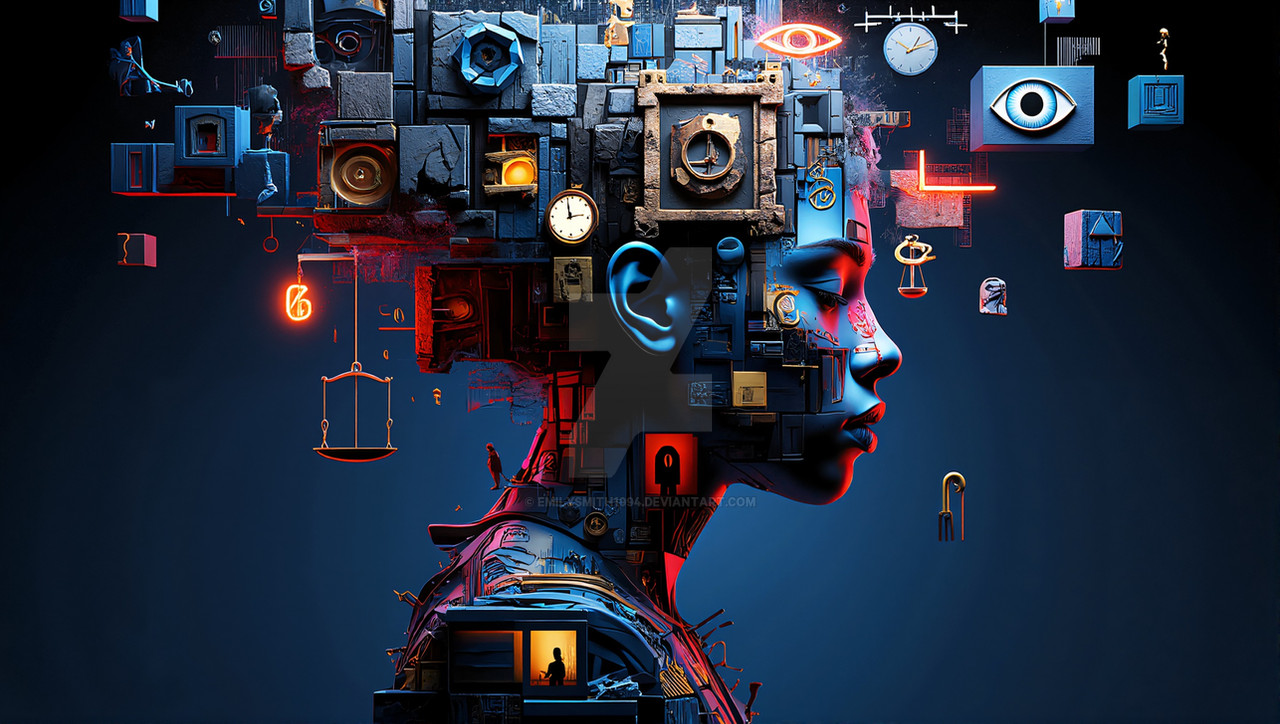
Eye Of TimeThought about this one for a few days now decided to do it finally instead of sit on my a$$ and surf and chat.
Thanks:
stocks from SXC
I am a huge H.R. Giger fan(atic), if you see several of his works esp. the Passage, he would take a subject or subject matter and alter it to his liking so you may see 4 passages but all are different , so in my continued study of layers,masks,blending options I am doing the same at least on this one...it is way different than Something in my Eye but the same subject matter the eye.
Visit the dark artists
Kick A$$ Artists
NEOSYNTHESIS
Related content


Comments: 17


This deviation as been chosen as a feature of the week
on "Word-worth-1000-pics"
You've been found from the word: " time "
Congrats
👍: 0 ⏩: 1
you're welcome
 (Smile)")
👍: 0 ⏩: 0


thank you very much i appreciate you taking the time to comment.
👍: 0 ⏩: 0

nice idea, and a very good implementation.
i especially like the placement of the cogs in the eye, and the substitute of the iris.
only glitch i see is the different hand texture : the colours just don't match the whole scheme.
good work, altogether.
")
👍: 0 ⏩: 1
thanks for the kind words.....i wanted the texture in the hands to sorta frame the image
👍: 0 ⏩: 0


👍: 0 ⏩: 0

this looks pretty cool, if you ask me.
i look forward to seeing more from you, and seeing your progress!
👍: 0 ⏩: 1
thanks for the words
👍: 0 ⏩: 0

Great deviation
the concept and the little pieces of mechanics forming the iris and all is really well done
my only complain would be about that mechanical piece which looks a bit flat, it dosn't really
reflect the surface of an eye imo, perhaps a touch of gradient would add that aspect.
Other than that, there's simply nothing to add imo, its a really good work
 (Wink)")
👍: 0 ⏩: 1
thanks for the hints gotta try it
👍: 0 ⏩: 0

this is a very well done mature work. i especially like the highlights in and around the eye itself- just right! would make a good album cover for an industrial band.
👍: 0 ⏩: 1
thanks Bark means a lot to get such great comments
👍: 0 ⏩: 0
