HOME | DD
 RiEile — -Dark Spring-
by
RiEile — -Dark Spring-
by
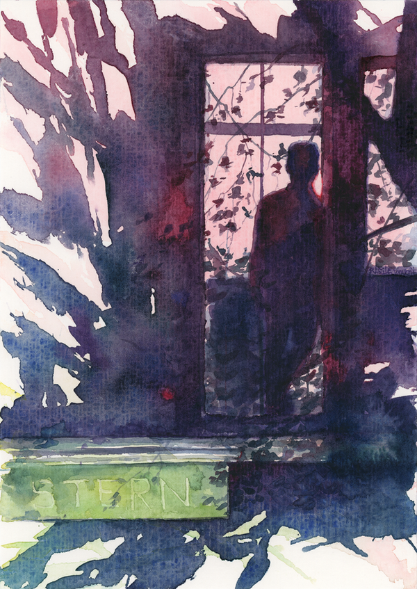
#cherry #pink #purple #sakura #spring #watercolor #window #balcony
Published: 2017-05-28 16:46:02 +0000 UTC; Views: 1736; Favourites: 218; Downloads: 18
Redirect to original
Description
A quick experiment with a spray bottle.A double for
Watercolor, 17x24 cm
Related content


Comments: 23

This looks amazing. I love the contrast int his piece.
👍: 0 ⏩: 0


Hello, I'm from ProjectComment .
Spray bottle experiment? Well the final image certainly looks nice. I like how you got this here. Not everything is colored by the color in your page. You left it alone, it’s almost as if there’s a tree covering over the area where the person is standing, as if shading them in darkness. The lighting in the window and doorway makes it look as if there’s a screen in there, pink, letting in the light and making them nothing more than a dark shadow. I do like the step there with STERN as the lettering, it looks almost brick like.
There’s nothing wrong that I see so far with your drawing, or anything that needs fixing. It’s obvious you know what you’re doing here. However I would like to see a signature in your drawing, even if it’s small or placed directly by the corner that way people know who did it if they so happened to cross it on Google. Wouldn’t hurt to do that.
There’s nothing much else that I can see viewing at it. You’ve certainly done a great job on this. It’s very colorful for a water color painting. Shades of pink mixed with white of the paper, and the overall blues do make it an interesting effect.
Instead of using one color, you used multiple colors which sort of helps you out there as it doesn’t’ look plane, but be very vibrant. The reds and purples within the shades near the person make it look as if some light is getting through, and the blues and purples (and some greens I take it) make it appear cool, as if the shadow there is blocking most of the light.
Overall you’ve done a great job on this picture. It looks amazing. I’m wondering if the spray bottle experiment created that running color that I see in the arts of the picture, or made it rather soft and spread out naturally. Could you please tell us more about this spray bottle, it might interest other watercolor artists as well.
Great job on this, and amazing work. Keep the art coming. 
 (Smile)")
👍: 0 ⏩: 1

Thank you for commenting!
Actually, I saw some youtube video about sprayer backgrounds, when you make it spew water rather than khm... mist(?) and spray it over the paper, adding color into the water and letting it bleed. However, results vary and mine is very different from the video: the artist used a huge piece of paper and a rather weak sprayer, and the background was more delicate, while I tried a strong sprayer on a tiny piece of paper and things got VERY wet. But I got a nice effect of flower buds on the background, hence the name
There is actually a signature on the right on the bottom of the window frame (Wink)")
👍: 0 ⏩: 1
You're Welcome.
Ah really. That's amazing right there, but I guess the results lent themselves into an extraordinary picture in the end though. It must be a trial and error thing, or more experimenting is needed.
Ah very inconspicuous. Doesn't pop out from the background at all, nice.
👍: 0 ⏩: 0

This is a beautiful piece. You’ve got all these lovely, soft colors with a good, strong shadow behind them. I like that in those shadows, you can see the more delicate shadows of the individual leaves and twigs. The bit of detailing over the ‘R’ and nudging the ‘E’ is a particularly nice touch. It's a small detail, but it lends a very nice effect.
I do think that you could have outlined the silhouette of the lower body better - made it a bit darker to define it against the shadow of the balcony, and made some the colors of the shadows more consistent. I’m referring to the blotchy effect that’s exhibited in the left side of the door frame: some colors are darker, some are ligher with no real pattern. It makes the wall look puffy, which I’m not entirely sure is what you want. Then again, the painting is a bit abstract, so I’m not entirely sure it’s a wall I’m looking at, so feel free to ignore me.
The white foreground does throw me off a bit, since I feel that the shadows should be long enough to extend there, due to the light source being, I assume, fairly low in the sky (really like that flare of red on the right of the silhouette, by the way, it shows off where the light source is and gives an example of sub surface scattering on the skin). I think a darker foreground would be nice.
Overall, you’ve done a wonderful job with this painting. I love your choice of colors, and the jagged edges of the balcony. It’s kind of like looking at a ruin. There’s something a little tragic about it, and makes me wonder if there’s anything else left in the world you’ve depicted. Keep up the good work, man.
👍: 0 ⏩: 1
Thank you for commenting!
I guess my abstract painting style here has obscured what actually was there in the first place: the light comes from within the room. I see your point about the white parts of the background. I was trying to paint abstract 'flowers' for the background to show that it is actually spring...) Too many ideas and too weird a realisation.
But I am very glad you see ruins there, it means that I have conveyed what I meant
👍: 0 ⏩: 0

Love this! The lines and colors are so beautiful!
👍: 0 ⏩: 0


I love it. Just open an Instagram account if you haven't one yet, you'll become popular very fast.
👍: 0 ⏩: 1
Thank you
👍: 0 ⏩: 1
Haha, in any case good watercolor skills never go unnoticed.
👍: 0 ⏩: 0


All of your art pieces are so great! Good job on this.
👍: 0 ⏩: 0


