HOME | DD
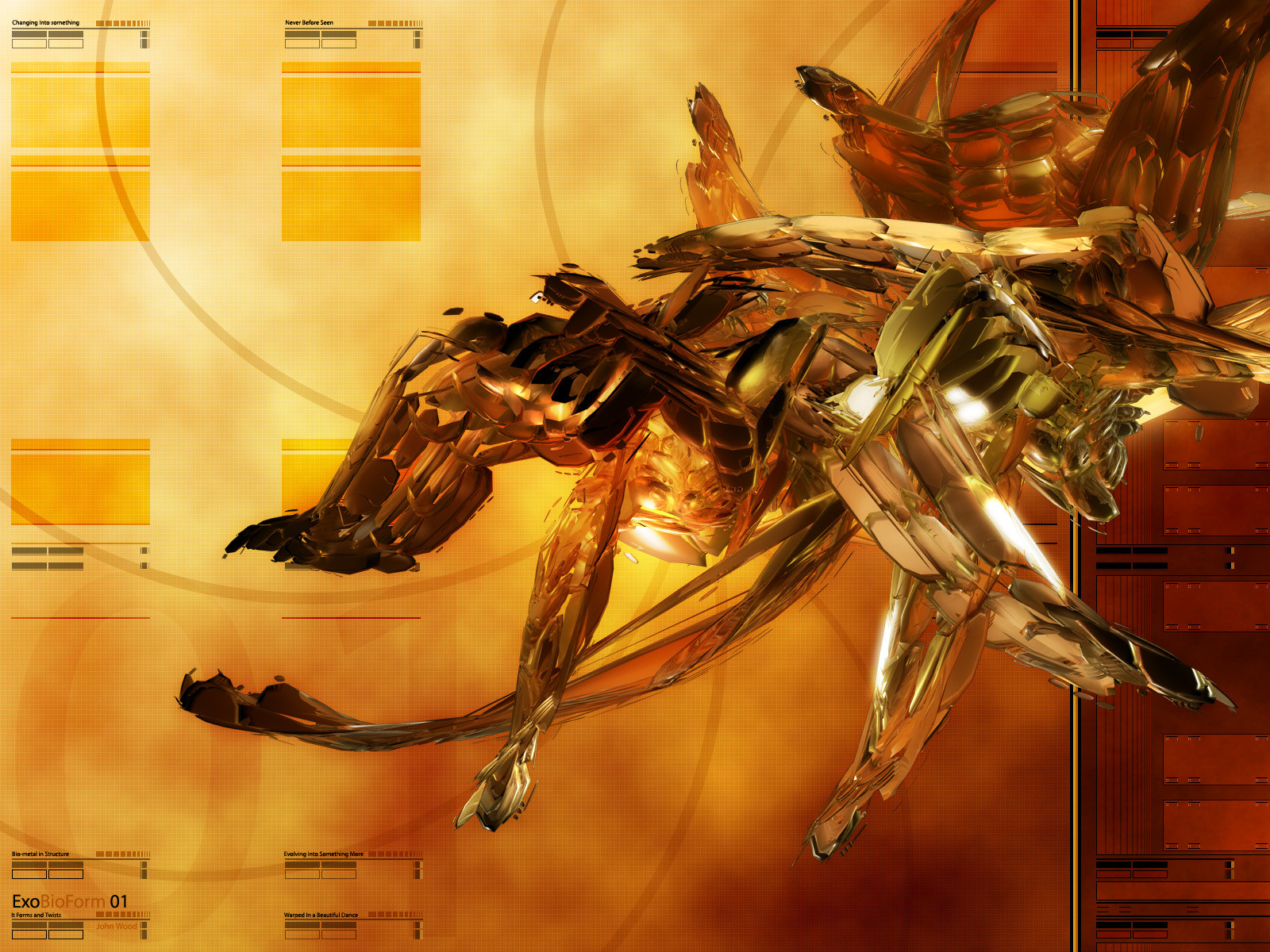
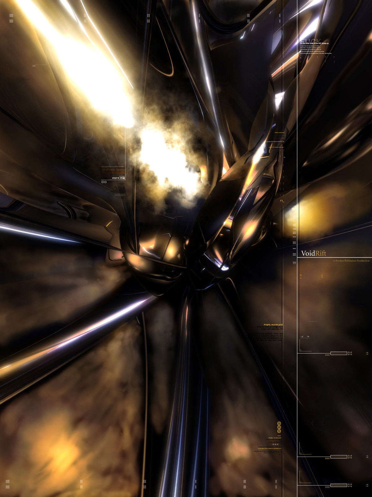
 riftfusion — ExoForm 01
Published: 2004-06-21 18:42:58 +0000 UTC; Views: 11513; Favourites: 122; Downloads: 14798
Redirect to original
Description
Just working out a few ideas on this piece. The colors came out smoking though. Which is what I really wanted for this piece. As well as working on a little 2d placement as well.Related content


Comments: 101


Yea!!. That's it!. Great render, colors, & all the rest. It looks like a sunrise in different abstract world.

👍: 0 ⏩: 0


Awesome render, cool tech, great colors. nice theme, what more could you ask for? +fav, you rock.
👍: 0 ⏩: 0

Love the colors , reminds of the nice hot summer days, i like this piece. nice 2d you got in there
+fav
👍: 0 ⏩: 0


Incredible man, the colors are really really awesome, great stuff.
")
👍: 0 ⏩: 0


Mint pic man you never cease to amaze me with your work. Totally shiney!
👍: 0 ⏩: 0


its definitely crazy looking - reminds me of a scorpion............................... on speed. lol. nice work, colors are nice.
👍: 0 ⏩: 0

Really nice pic well which program did u use and could u do an tutorial or something like this really wanna get better but donnow how so try some tuts ^^ hope u can help me luke3e
👍: 0 ⏩: 0


I like this so much, great tones and flow, the lines and layout are wonderful.
👍: 0 ⏩: 0


I haven't got a CLUE what the hell that thing is, but with the colors it really turns out nice 
👍: 0 ⏩: 0

very nice 3d work... i like the 3d part - doesn't look like all the other stuff around  (Smile)")
👍: 0 ⏩: 1

Thanks a bunch for the great comment. I feel the same way toward it. Trying something different then everything out there. Always nice to see someone who is like minded.
👍: 0 ⏩: 0

awesome render composing.
really nice concept.-
Fav.-
👍: 0 ⏩: 0

Thats a killer render. I love the orange. Great work!
👍: 0 ⏩: 0

badass render... it's kinda mech-looking to me..
great coloring work, and i love the grid on the background
not 100% on that 2D though... kinda repetitive or maybe just needs to be more opaque..
nice job tho, man.
mP
👍: 0 ⏩: 0

")

I cant really see what the object is but it looks like some kinda Funky-Mech dude.
Wicked pic!
👍: 0 ⏩: 0

amazing render! very unique, the color combo is also pretty sweet
👍: 0 ⏩: 0

I love that picture! How the colors all blend! Very pretty! Nice job!
👍: 0 ⏩: 0

concept and line art is awesome but dont like the compation or the render
it like stairs... 90 degree angles every where
in my opinion, it would look great if it flowed
👍: 0 ⏩: 0

Nice work, I was wondering what program you used to create this image with?
👍: 0 ⏩: 0
Fricken solid render man, your pieces never cease to amaze me. Must have taken ages to render that puppy, all shiney.... mmm shiney.
👍: 0 ⏩: 0


Digging this.
As I said in my comment to ~visuasys , I think this piece clearly radiates your personal style. I recognize it in the background, the 2d, the render and most of all, the 'feeling' of the image. When I saw it first, I was sure it was yours because it just shouts your name.
I really like the 2d. It's fresh, has a bit of a cubical theme, which I like since everything appears to get round these days and it contrasts nicely with the pretty 'round' material the render is using  (Wink)")
I don't like the render itself, though. Looks a bit out of shape, the general "model" looks a bit like it's a low-poly version - I don't know what program you are using, but I'd advise using nurbs for such models (I am now just assuming that this is a model with a material). The rest is fine
👍: 0 ⏩: 0

The render is nice, yes cool material and such.
But the 2D, sorry but it looks like the 2D of a noob.
The antilias overall on the 2D really does not fit at all, the 2D is in some cases to big, and the standard typeface 'arial?,verdana?' really you should fix your 2D, Get some inspiration in other who have nice idea's with 2D, don't care if you copy it kinda, but you mix it with your own.
I am sure you 2D will look much better.
👍: 0 ⏩: 2
I do appreciate a little insight into what others think. As far it being n00b is concerned, that seems a bit harsh. Granted, it is unlike other 2d out there. I don't set out to make my art look like anyone else's. So I did use some different kinds of 2d elements. As far as a style is concerned, I really don't try and fall into a certain style. I made the wall for people to enjoy. While at the same time working out my own ideas on compostion and layout. I always enjoy seeing what other have to say about my pieces. I like feedback and what people think.
👍: 0 ⏩: 0
I don't agree.
Why? Stylism. People have styles, and the "style" of Riftfusion is, to me, closer to the "viperv6" style than the "dC" style you are referring to. You can say people should use red oil paint, but it's no use if it's a water painting. I think you haven't considered that this artist has a real unique style, he's not trying to achieve a "goal", he's making what he likes. Not what people like. And that's what art is all about. It might look like noob 2d to you, but I don't think it is.
👍: 0 ⏩: 1
You are going way to far in it, and please I don't want an asnwer from you but from Riftfusion, acutally I could better say "Fuck off" but I won't.
And don't know his goal, I don't know his style, I won't go father to search his style because I saw much in this image that's says enough from me.
I am giving him tips if he want's to do something about his 2D.
And I am not talking about the dC style, I think dC is your goal to get in or something, I really am not talking about dC, because dC have a lag of inspiration aswell.
Seriously.
Although he says something about his 2D in his descp.
👍: 0 ⏩: 1
I'm just using my constutional rights
👍: 0 ⏩: 0


OK. My views here are pretty much personal taste. So bear with me
I personally can't find a flow in this piece. I find that the render, the background and its colours and the 2D all seem to work on their own.
The render is nice, I like the shaping and everything, but it doesn't seem to be joined to the rest of the image. But thats not much of a problem.
The main thing I don't like is the 2D.. I don't like the repeditiveness of it and I don't like how strong and contrasting it all is too the rest of the piece. It also lacks flow alot.. all the bits of 2D are very self contained and seem like little pieces of their own. If you know what I mean.
This piece is nice, but its not really "turning me on" so to speak
Keep up the good work.
👍: 0 ⏩: 0

this is the riftfusion that i know...extremly hot pics...with awesome 2D
👍: 0 ⏩: 0


nice work m8! Like the colors and the nice render as ever also the 2d is nice!
👍: 0 ⏩: 0


Nice wall I think it look a lil' bit like a "insect". Thank you for my new Desktop... 
👍: 0 ⏩: 0
| Next =>