HOME | DD
 Rin-Uzuki — FF7 - Print WIP - group

Published: 2014-02-28 18:19:35 +0000 UTC; Views: 838; Favourites: 26; Downloads: 0
Redirect to original
Description
June let me borrow her Winsor and Newton paints to paint this, and this is how they look, pretty much straight up, with no adjustments! They're really really vivid and even though they're pricy, I've really fallen in love with this palette and hope to pick up some for myself soon. (Wink)")
But! We unexpectedly got a table at SakuraCon 2014, which is at the end of April, so I'm putting together some art for prints real quick, in between school work. Once we send off the orders for prints, probably in three weeks max, I'll get back to commissions! <3
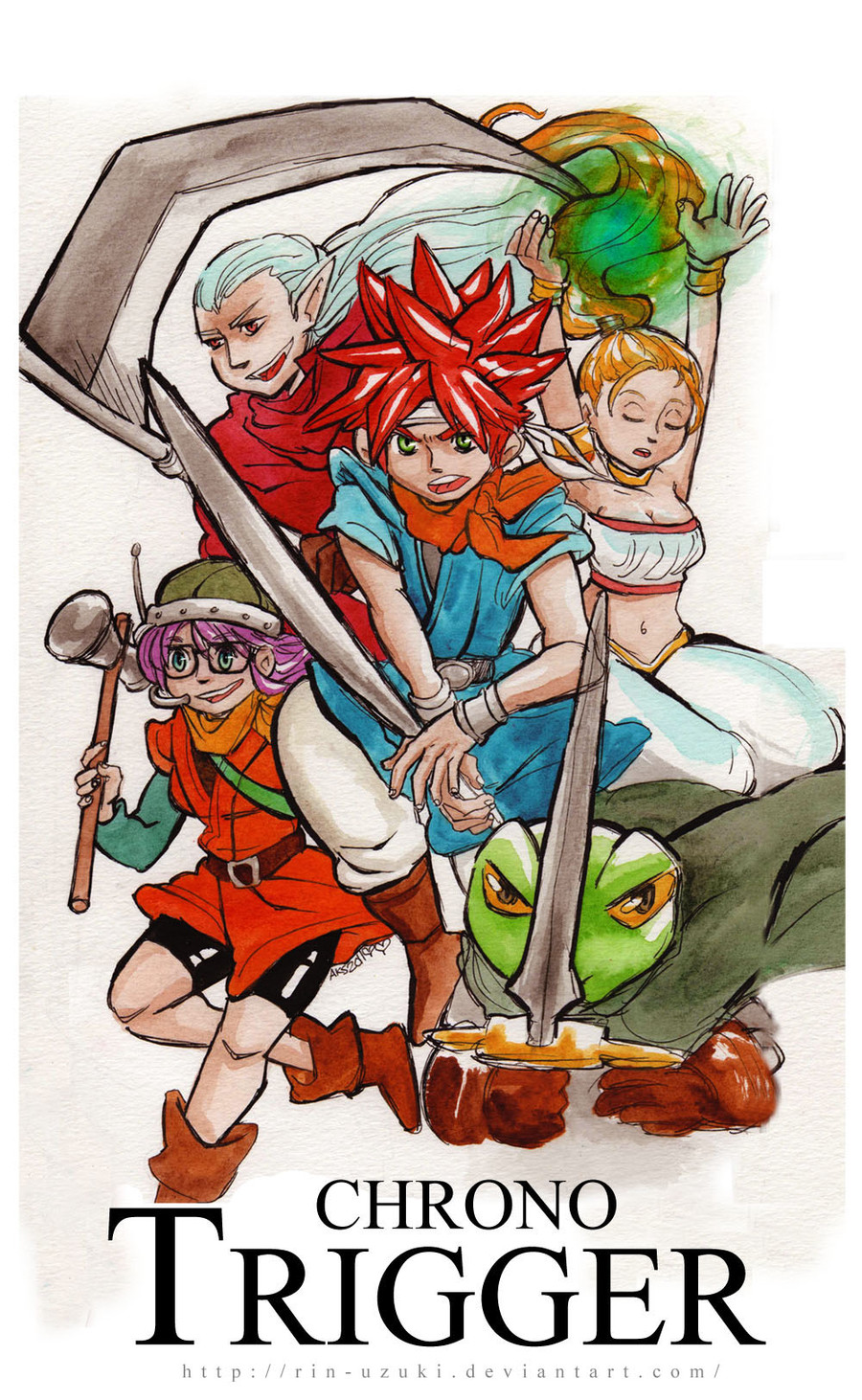
What do you guys think of this one? Cid's missing...
")
I thought maybe I could have him be in the Highwind, up there, but I think compositionally it doesn't really balance out.
Hoping to offer full prints and postcard sized prints of this!
There's also a bit more at the bottom that got cut off, but I wanted to give everyone a sneak peek.
...Matt also tells me the meteor is red, haha. I totally thought it was green. I think I still want to paint it green digitally, 'cuz unless I make it pink or something, there's gonna be too much red here... (a really faded red?)
Related content


Comments: 38


thank you so much! I hope the print version will turn out well.
👍: 0 ⏩: 1

W&N paints are one of the most vivid I know. A lot of good artists here on dA use those, so I remembered the brand. They have different quality series of different price. Never tried them, though, cause they aren't widely sold anywhere around and are even more expensive because of shipping.
I personally use paints from St.Petersburg (cheaper version, "Sonnet": nevskayapalitra.ru/en_products… lighter colours are not heavily pigmented, so I sometimes have to use a few layers for the especially strong colour. It makes the drawing look heavier than watercoloured work is supposed to look. That recent Rose commission is made exactly that way.). There's also super-expensive pro series "White Nights": somecallmebeth.com/st-petersbu… I have a few pans of those, too, and they look significantly different in some techniques but absolutely the same when I use them in my usual way (plainly colouring the illustrations). I believe they must be more expensive than W&N at your place though they supposedly have the same quality. Professional and semi-professional paints are awesome to use. But when you have bursting inspiration, the mediums fall back. I still remember drawing full-sized illustrations with developed background on a4 printing paper with cheapest honey-based watercolours available and feeling happy. Now I have nice paper and paints but rarely draw in colour. Those are paradoxes of human life and self-management. *wise llama drinking tea face*
👍: 0 ⏩: 1
ahahaha, paradoxes indeed!
ooh... so you use some tube watercolors? I've never ever managed to get used to those, its always been pans for me... but I do like the cheap gouche that comes in tubes very much. <3 I'd like to experiment with it more! I've got some wood I want to paint on, too... ahh, so much to do in this world! heheh.
👍: 0 ⏩: 2
Wood is a fine thing to use with gouache. I always had gouache in small cans btw...
I've got a lot of different stuff to experiment with but I mostly end up stocking it somewhere a few days after I get it... uhhh, so, good luck
👍: 0 ⏩: 1
thank you, Road! I'll take it. I think a painting is just what I need right now. Somehow though, I need to 'recharge' to the point where I can get enough energy to put some of it into art, and if I can do that, then that art may recharge me fully...
sorry, totally thinking out loud here.
What sorts of materials are you hoping to experiment with, Road?
👍: 0 ⏩: 1
I've got different types of cardboard, "designer" one (with pattern), decorative, plain, then some decorative semi-transparent paper, pastel paper (which can still be used for painting) of different colours and texture. It was all bought for some purpose or brought in as someone's else leftovers, except of pastel paper which I bought for long-planned works and ended up not doing them at all.
I remeber it being like this one: art-market.com.ua/media/catalo…
but grey, so it could've give an effect of thick twilight. Maybe. Maybe gouache or thick honey-based kids watercolours are more suited for a dark tone of paper.
👍: 0 ⏩: 0
Nope, mine are in pans, too. Although there paint series come in tubes, too, I use those small cute pans: nevskayapalitra.ru/content/fil…
Tubes give you a lot of pain...er...paint coming out compared to the tiny amounts I usually use. (It's surely because of that shy way pf taking paint I'm having really light colouring with those Sonnet ones, I just can't dare to slap my brush into the wet pan and dig in it. Normal people use palettes and I don't even do that most of the time. But the tones are a bit earthy and dull anyway.)
👍: 0 ⏩: 1
heheh. do normal people use palettes? I'm not that 'clean'... I mix everything up like mad.
(though not so mad everything turns completely brown...
👍: 0 ⏩: 1
I mix colours right in the pan, in the corners of it. It's not really controllable, but I still believe it economies me paint compared to bringing a lot of it to a palette and dissolving it there so that there's still extra paint after I finish... But if I ever will draw something big, I'll try using an empty palette pan (or, more likely, a bottle lid in this role).
I always or almost always see palettes on pros tables when I'm watching some tutorials, but since their one drawing costs as much as my whole box of watercolours, I don't bother to use this as an advice. Yet.
👍: 0 ⏩: 0

aaaaah want more group pictures *____*
it's so warm, and i really like, that even marlene is here!
and i like it that the meteor is green. it works better here that a red one, because of the atmosphere! i dunno how to explain, but i like it ///D
tifa and nanaki look so fantastic here, and i really like barrets glimp (?).
i think even cid is missing here, the picture is more than perfect to me. wanna listen to ff7 music now ´w`
👍: 0 ⏩: 1
I really love Barret and Marlene! They're so cute... I'm a total sucker for dad-daughters in movies and games. =w=
heheh, do you really like the green meteor? My friend complained about it so much (he called it the green meatball meteor) that I tried to change it to red for one version of the prints. I agree the meatball didn't look good, but I also thought the green was okay. Like the lifestream, yeah?
hoho, Cid's just hiding... he's standing behind everyone. Yeah.
And huzzah for FF7 music!
I played some more FF9 today and the music is sooo great! (except the airship music
👍: 0 ⏩: 1
ah and the story of barret and marlene is so sad!!! ;A;
oh, so you have another version now with the red meteor? O:
i really like your cid argument!! bought! (can i even say that? ///D)
👍: 0 ⏩: 1
you can say you bought my argument! I'm glad I could sell it to you.
The story of Marlene's dad may be sad, but I feel like Barret is such a caring father... that their story is a happy one! It's the same with Aeris's mum, yeah?
I really want to replay Dragon Quest 8... that game always makes me think of you, heheh.
👍: 0 ⏩: 0

The composition looks really good. *v*
Group shots always look hard to do but I think you pulled it off well.
👍: 0 ⏩: 1
heheh, thank you! I didn't recognize you at first, on account of your new avatar.
My esteemed collegue says I should either change the color of the meteor or get rid of it, though... (apparently it's only ever red in the game, except for once in the opening when it's green... hmm.)
👍: 0 ⏩: 0

D'awww, Cid is my fave T_T This is great, though!
👍: 0 ⏩: 1
Cid's great, isn't he? I think I can squeeze him in there next to vincent... if I just stop forgetting ?
👍: 0 ⏩: 0

That's brilliant!
Lovely composition, great pose on Tifa, Barrett looks so cool & moody

👍: 0 ⏩: 1
Thanks, Kit! Barret's my favorite here too! I want to draw more of that guy!
👍: 0 ⏩: 0


I mean to fit him in, but now it's scanned high res and all... he may be forgotten until the end... maybe he's off having a cuppa goddamn tea!
👍: 0 ⏩: 0

 (Smile)")
heheh, you think so? Thanks, Masa!
I still haven't added Cid, whoops...
👍: 0 ⏩: 1

heheh, he could go in the highwind. Or I could shove him in tiny by Vincent. Which do you like better?
(and warning?)
👍: 0 ⏩: 1

haha, a menace!
My favourite, in design, was always Aeris, I liked so much Sefirot and Yuffie too
But if you look at the background of the character, I think Cloud really rocks it, and Cid is cool too.
Others like Cait Sith or Yuffie have so less background in comparison.
👍: 0 ⏩: 1
I've always loved Tifa as a strong fighting woman! But I pretty much love all the FF7 characters, it's like I grew up with them. Barret's great, too. Biggs, Wedge and Jessie... ahh, poor AVALANCHE!
Sephiroth is one FF villian I actually do find compelling. (As opposed to, say, Kuja in FF9, who's fine and a good 'bad guy', but whose story I don't care about much.)
Cloud's background with Zack and Soldier and all is pretty good, I agree! Takes some puzzling out.
Yeah, Yuffie's a bit more of a silly character--I like her because her wackiness reminds me of the lovely comedy of the older games. You know?
How about vincent?
👍: 0 ⏩: 1
Vincent is cool, but they used him so few, he even isnt a obligatory character!
That Hojo and Lucrecia story was nice, and you only know about it at the end, and that scene wasnt enough
I think Sefirot is not really a villian, I mean, Shinra is! He is only a victim, gone crazy.
Tifa at the begining seems to be a character with less personality, but gets more interesting over time, at the end of the game she has a really interesting background, and I even think she was a bitch for not telling the truth at all, haha, but I sopose she had her motives.
Ah, my english sucks, I need to improve it xD
👍: 0 ⏩: 0
by the way, THATS FUCKING COOL! xD
👍: 0 ⏩: 0

Oooh...! It's looking great! You draw Cait Sith so cute! (ha ha, I can see I already want both your FFVII pictures...well, if I get the postcard size it'll be easier to find somewhere to display them in my room, ha ha)
👍: 0 ⏩: 1
Thank you again, Suzume! Cait Sith was really fun to draw! I was kinda happy to just get the cat in there, since the mog is so bulky and not terribly fun to draw. ")
I was thinking $5 for big prints and $4 for little ones (postcards) to start out with. What do you think of those prices? Would it be better if the postcards were lower, like $3?
👍: 0 ⏩: 1
Ha ha, well, I think the cat's the more important part anyway.
I don't have a lot of experience pricing things, but $5 for the big prints and $4 for the little ones sounds okay to me. I mean, going by the criteria of I would pay those prices!

👍: 0 ⏩: 1
right on! Thanks for your feedback, Suzume!
👍: 0 ⏩: 1
No problem! You're welcome!
👍: 0 ⏩: 0