HOME | DD
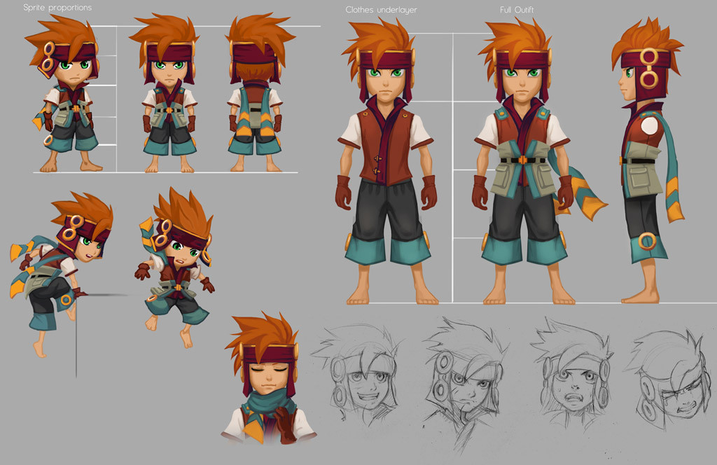
 Risachantag — Character Painting Tutorial Part 2

#character #color #light #painting #photoshop #tutorial
Published: 2015-08-26 15:43:39 +0000 UTC; Views: 15785; Favourites: 498; Downloads: 143
Redirect to original
Description
Part 1, 3 & 4Here's part 2. Shading the character will have to wait until the next part, as a little theory on light and colour seemed more important to come first. If you'd like more detail on how light and colour work, I recommend the Gnomon workshop: www.thegnomonworkshop.com/stor…
Again, if you have any questions, feel free to ask.
Related content


Comments: 16

👍: 0 ⏩: 0


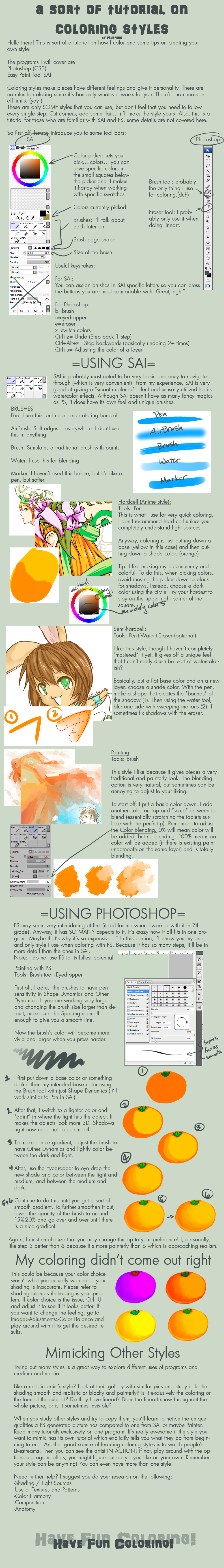
This is really great, I love the added note about shifting saturation along with value for better darkening tones. I've seen that experimentally, it's nice to see it in a tutorial.
Also, do you have any trick or technique on keeping track of all the layers? I lost count of the time I was so into the art I found out I have been drawing on the wrong layer for quite some time.
 (Smile)")
👍: 0 ⏩: 1

Sure, I have a couple of tips to do with layers: Firstly, always label your layers. If you have a ton of layers (like I often do), make folders for your layers.
Also, if you get used to the workflow of locking opacity when working on a layer, then a neat side effect is that you won't end up affecting the wrong layer.
👍: 0 ⏩: 0

... thats where i've been going wrong... i've not been using ambvient lighting *facepalms*
Then again i've never really been one for backgrounds so hrm... i guess i'll have to wait and see on this one...
👍: 0 ⏩: 0

Tip 7 how to use the color palette is extremly helpfull! Thank you

👍: 0 ⏩: 0

This is the best explanation of light source I've ever seen. Granted I haven't gone in search of information but your presentation is simple and to the point that I have no need for anything else. Well done.
👍: 0 ⏩: 0

Awesome! I need the next part! Thank u for sharing! *.*
👍: 0 ⏩: 0

what you say about the bouncing light that takes the color of the environment is new to me, I didn´t knew that!
you are right it gives more realistic look
and by the way, the titlee of this step must be lineart to coloring, not to shading
👍: 0 ⏩: 0

This is very informative. Popped up in "undiscovered" so I'm going to look into this tutorial. Good work.
👍: 0 ⏩: 0

With which brush and at what hardness did you make your colour palette?
👍: 0 ⏩: 1
That's a regular round brush, with hardness set to both opacity and brush size. I'm not using any particularly special brushes for this piece.
👍: 0 ⏩: 1
Thank you for answering
are you using a pressure setting on a tablet? I can never get that looser water-colour look when I'm colouring in photoshop
👍: 0 ⏩: 1
There's a couple of things you can do if you want a softer transition with opacity. Having your brush both on opacity and flow jitter to pressure sensitivity will make it softer. Otherwise if your tablet's sensitivity is the problem, you can adjust the pressure settings ('tip feel') of your tablet. I usually set mine down a notch, but you can adjust it however you like.
👍: 0 ⏩: 1
fantastic! Thank you so much
")
👍: 0 ⏩: 0