HOME | DD
 roach2018 — You Made Me

Published: 2002-03-17 10:40:08 +0000 UTC; Views: 537; Favourites: 1; Downloads: 29
Redirect to original
Description
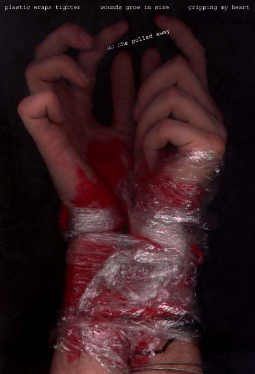
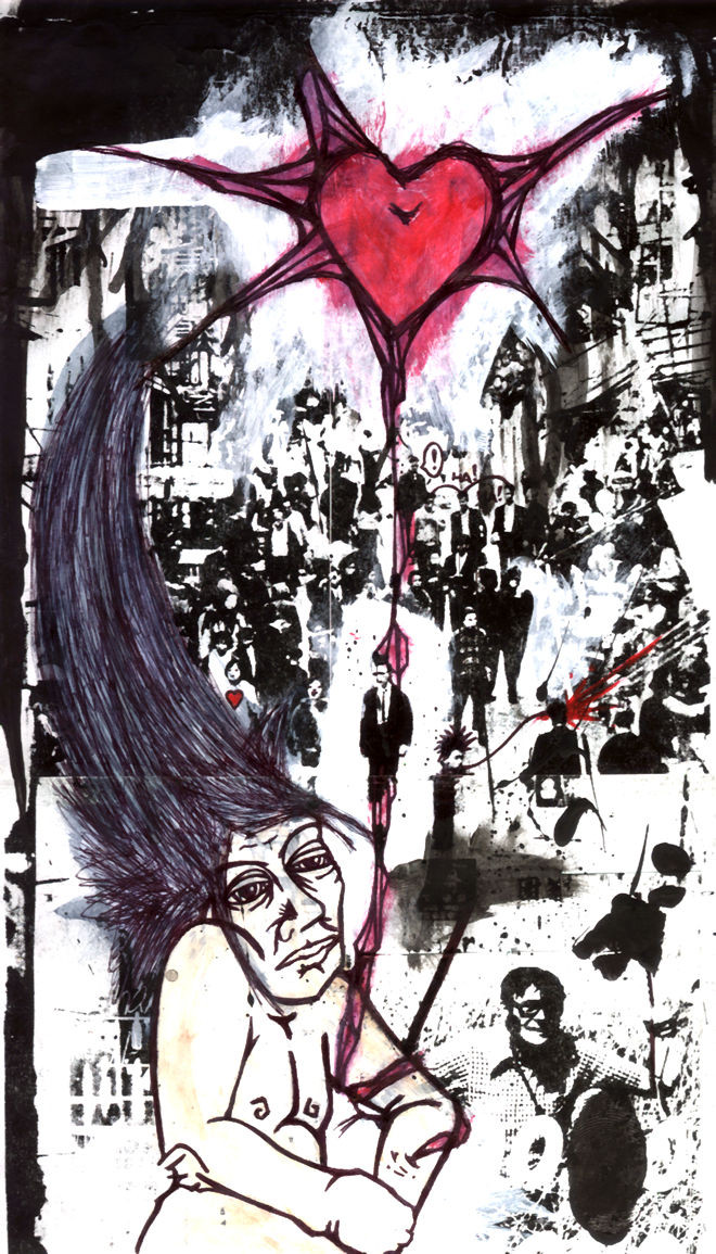
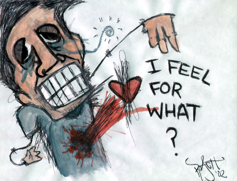
This was a colab. i did with a fellow Raster member for Chapter 001 [link]The full title is "You made me as fucked up as you are!" and is ment to be very harsh and discusting to the viewers eyes.
Roach:Acrylic
Phuror: Digital
Related content


Comments: 12


Please excuse my other comment i was quite pissed off at the moment and im sorry for taking it out on ur picture.
it is a quite interesting one at that
sorry once again.. =/
👍: 0 ⏩: 0


Heh.. that little support prong on the left reminded me of Dali too
Well, I reckon you achieved what you were shooting for.. it is pretty vulgar. But.. it's done with flair
That stipply, spongy sorta texture on the skin, and the reddish hues remind me of a rash.. makes it all the more harder to look at.
Wasn't sure if I liked the background at first.. but I think it works well. The only thing I don't really like about this is the choice of font for the text... doesn't fit at all and just looks wrong IMO. I think a grungy one woulda fit better.
Great work though..
-----
~fuzzydemon
I gotta get a bike and I gotta paint it red
👍: 0 ⏩: 0

amazing...
-----
[ - sarah
http://www.violet-ray.net
👍: 0 ⏩: 0


Really an amazing piece.. like your painting style.. once something that i haven't seen over and over again ! bravo
-----
°thats me in the spotlight losing my religion°
👍: 0 ⏩: 0


wow, that IS harsh and disgusting but I like it, very interesting design, I see your point.
👍: 0 ⏩: 0

to that end, i would say it's quite succesful... hehe... nice technique tho...
gg
👍: 0 ⏩: 0