HOME | DD
 Rob-Cavanna — Famine WS -Color Study
Published: 2010-02-05 04:59:14 +0000 UTC; Views: 3631; Favourites: 52; Downloads: 0
Redirect to original
Description
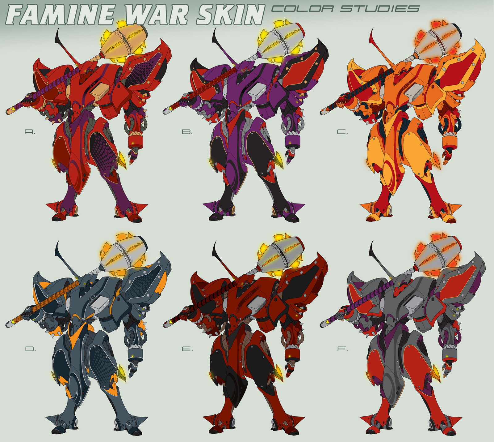
Original War Skin concept by Mike Charles from his Knights of the Last Order story. Original sketch and vehicle info here: [link]Line Art: [link]
"A" close up: [link]
Flat color study before rendering shadows and highlights. (Eventually headed for scraps).
Please pick a favorite and leave a comment. Your opinions are much appreciated! FYI, this Warskin is piloted by this very bad dude: [link]
Related content


Comments: 33


I totally go for d and e, those are some wicked colours.
👍: 0 ⏩: 1

Thanks, Millie. Yeah, still gotta finish this, don't I?
E wins because it's the most evil + MC liked it best. But D is also solid and may be used elsewhere.
👍: 0 ⏩: 0

The President has been kidnapped by mechs. Are you a bad enough dude to pilot a Famine warskin?
Oooh, aaah, they're too cool. I'd go for E, being the most evil-looking (Darth Maul color scheme and all) but the knight-in-armor D is pretty sweet too. I'm not as keen on the bright colors, but for some reason I imagine it'd look good in iridescent greens and blues (probably because of that awesome beetley horn).
👍: 0 ⏩: 1

According to the creator's MO, I thinks it's less 80s video game, and more Stargate/Dune + mecha. My first impression at least.
By this point, E is pretty much the guaranteed winner. But thanks for sealing the deal on that!  - :D")
Totally feel you on the beetle thing. I have to hold back on certain base colors tho, because I imagine them as being reserved for others in the series. Agree that bright colors were all wrong. Heavy-looking mechs need darker colors, it seems.
👍: 0 ⏩: 1
Oh, pity. Still would look good on the NES though.
Well, some large mechs could have judicious paint applications, possibly to demoralize the enemy (Curtiss Kittyhawks come to mind). But otherwise, yeah, more muted colors are generally best.
👍: 0 ⏩: 0

Knights! That's what this mech reminds me much of. Or better yet, generals in Fire Emblem. ^^
👍: 0 ⏩: 1
That sounds good to me!

👍: 0 ⏩: 0

Man, this is a tough one...My immediate impression is that I prefer the top row (ABC) to the bottom three, I think because the brighter/more saturated colors just seem more consistent to me with the spiky, stylized designs. These mechs have a kind of aggression to them that I just think works better with a more vivid rather than a duller color scheme. Of those three...Man, I think C is probably my favorite. Yep, I like the brightest of them all! I guess the only part of that that doesn't add up for me is that I don't generally associate bright, vivid colors with the idea of "famine." But I'm not sure how important the names are to the overall allegory/concept here. Anyway, my two cents--that and a buck-seventy will get you a cup of coffe at 7-11!
👍: 0 ⏩: 1
You're the first advocate for C! Honestly, I almost didn't include that one. I chose that palette to compliment the whole heat and flame-weapon thing (going by Mike's vehicle specs) but as you say, it doesn't smack of evil and bad things. While doing these I kept reflecting on what you mentioned a while ago --about how larger, heavier mechs ought to have darker colors, and vice-versa. Felt those sentiments echoed while I was doing these. The very dark red of E just seems the meanest to me and best suited to his bulky look. But going by MCs comments, I may go w/ a E-B hybrid.
There is another Warskin named 'inferno' that the C scheme could get resurrected for. So, good to know the bright color route wasn't a total fail. In a way, even the unchosen options can perform a useful role. Like w/ all those bipeds color studies -can always go back and pick up pieces for future stuff. (One of the unused martian camos there got adapted for the gunship). It's also kind of my hope that these studies could useful for other folks too. Always enjoy seeing other mech artists do this sort of thing. From that angle I feel a bit less nuts for always going overboard!!
Doesn't make sense to do studies like this for every single mech project. Just warming up I guess.... Trying to sort out a basic design philosophy before tackling the series. Establishing a 'look'.
SO all input is very much appreciated!!
👍: 0 ⏩: 1
Ah-ha, I *knew* there had to be a "combustion/immolation-themed" mech in there somewhere!
Maybe that's why I intuitively went for C, I knew it would be a strong color scheme for ONE of these mechs, and I liked it too much not to advocate for it. Yeah, you're right on, I think a hybrid of those other two would work better for this one. --Realized also that some of that subliminal impression of "racing mech" probably carried over from the first (the "hero's") War Skin design for me, and that may have also skewed my choice towards C. The checkered graphics, racing strip and graphic decal element rendition of the text all probably reinforced that association for me. Yeah, I'm positive, now that I think about it.
I love seeing all your different color variants, and it did occur to me earlier that some of the variants you came up with for the Desert Biped might work just as nicely for this one! Some of those "night/space/stealth" schemes especially.
As I always say, I know whatever choice you make will render up nicely. The design itself and the various color possibilities you've already drafted are just too strong too fail. Glad my input is appreciated, even if it may sometimes be at odds with the consensus (and even *common* sense!)

 (Smile) - :)")
👍: 0 ⏩: 0

And just add tassles if it needs to be more flamboyant.  - =P")
👍: 0 ⏩: 1
How about some Mardi-Gras beads? Then he could get this one to flash him: [link] 
👍: 0 ⏩: 1

E. Definitely E. That thing reeks of "I'm going to smash your brains in and swim in your blood".
Nice work, dude!
👍: 0 ⏩: 1
E is looking to take the prize so far. This dude seems to wear darker colors best.
Thanks, Damien!
👍: 0 ⏩: 1
Always here to help, my good man.
👍: 0 ⏩: 0


Thanks, Tom! Heat + Flame weapons are involved, so red makes sense.

👍: 0 ⏩: 1
Thanks, Mike! My concern about B is that it looks too much like an Evangelion...
What I like about E is that it's the most sinister... super-evil! 
 - :P")
👍: 0 ⏩: 1

b, just a little like eva, but not enough to cause any major concern. and i have to agree with u on e, on both counts.
👍: 0 ⏩: 0

right... im pickin D & E. i think they work the best for me...
👍: 0 ⏩: 1
Thanks, man!! I think D is very eye-catching, but maybe not evil enough?

👍: 0 ⏩: 1
hehe, easily rectified by the lighting and the materials... if you make the armour a really slick and shiny black and have the lighting from underneath.. could look pretty evil...
👍: 0 ⏩: 0


Or E or F >.< . .. mostly D

👍: 0 ⏩: 0