HOME | DD
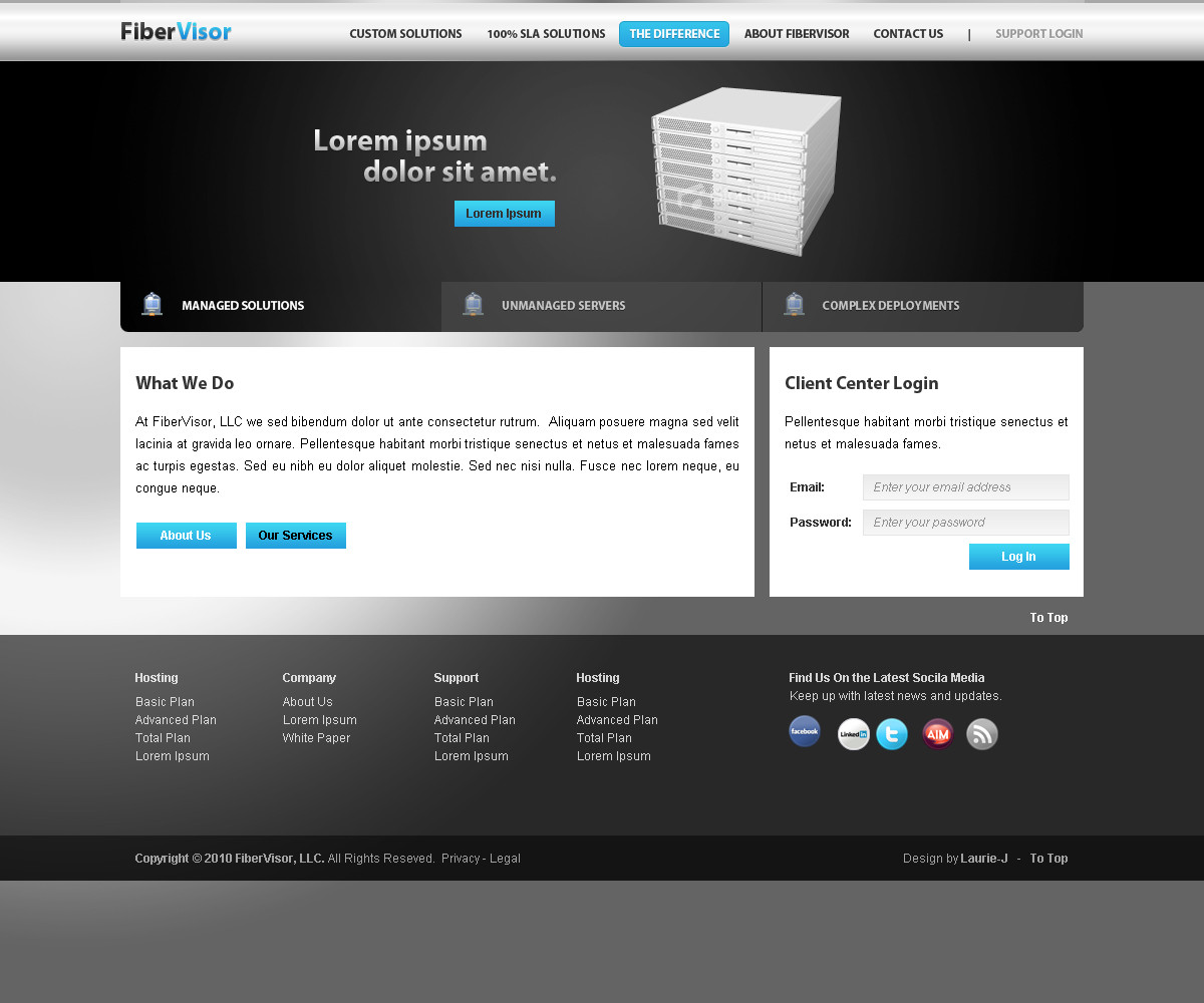
 Robke22 — Hosting Layout - V1

Published: 2011-01-04 12:52:54 +0000 UTC; Views: 5403; Favourites: 28; Downloads: 303
Redirect to original
Description
Layout made for a contest (Smile)") Pretty glad with the result, except for the footer (which i'll probably edit in V2, if necessary).
Pretty glad with the result, except for the footer (which i'll probably edit in V2, if necessary). Tell me what you think and if you like it,

")
Time spent: +- 4 hours
Related content


Comments: 9


very nice gradients used.. pretty kool look has been achieved...hats off
👍: 0 ⏩: 0
the gradients used are good and effective.. i like it
👍: 0 ⏩: 0

")


Light blue on white doesn't quite fly, imo. Plus it looks like the light blue is highlighted, so the more important part of the line, which it is not. Know what I mean?
Sorry for nitpicking there, but that's all I could disagree with. I like the colors, buttons, header, header image, everything. It's all good!
👍: 0 ⏩: 0


Thanks
👍: 0 ⏩: 0