HOME | DD
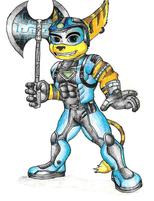
 RocketLombax — Rendered Rocket

Published: 2005-11-06 04:49:51 +0000 UTC; Views: 880; Favourites: 10; Downloads: 36
Redirect to original
Description
Well I know it doesn't look that good but I like the way it turned out. I've never tried this before so don't be too critical about it. This would probably look better if you zoom in.Related content


Comments: 25

OoO (speachless for about an hour) I've NEVER seen R&C fanart like that! AWESOME, RADICAL, GNARLY even!
👍: 0 ⏩: 1

Thanks. It's ok but I can do better no since I've gotten better with photoshop.
👍: 0 ⏩: 0
oh yea you do realise the rocket text dos kinda look like our school team logo different text and color why not just re-name him ronny?? then i can light him up and see if he flies--fer those that DONT know i HATE our school team mascot actually nowdays all but the fact were in class and have great teachers ill have ta post more on my jurnal soon title would be somethin like betrayal?????????
👍: 0 ⏩: 1
Actually it is meant to resemble the Ratchet and Clank logo.
👍: 0 ⏩: 1
ahh still reminds me of the rockets that I HATE!!!!!!!!
👍: 0 ⏩: 1
yea our team sucks worse than skunks stink and about 50x worse than the stink of cat liter after about a month plus do you know how may of those jocks a want me b think they own me or c think there better than me?????????????? WHY WOULDNT I HAVE ISSUES?????????????????? plus i have another reason these days the betrayal that sdsm put me thru i STILL think they shoulda saved that buildin even the part with tiles from it is mostly fake so that must mean education is fake and thus worthless or that our school that was built on radioactive ground is fake or well you tell me kid im shure you know where im gooin here
👍: 0 ⏩: 0
couldja ya print off a copy or ask the libary person ive known fer along while if you could make a copy?? i dont really wanna do this blind tho while watchin a body buildin thing on discovery science couldnt hurt--advantage of satelitte!!!!!!!!
👍: 0 ⏩: 1
I could probably print it at home and give it to you.
👍: 0 ⏩: 1
libary after school? you know me also can we shift to trade so i can have more fun you choose which of my creatures all i ask is different pose past that have fun
👍: 0 ⏩: 1
vould be try WILL BE ive got some fun stuff fer ya to play with i know you can have fun with it and plus you can improve with chicks while im startin on guys
man NOTE TO SELF: whilr rehursin choregraphy by my comp do it UNDER the light thats gonna get broken one of these days outherwise and even then wierd stuff happenns
👍: 0 ⏩: 1
I can draw girls already.
👍: 0 ⏩: 1
thats why i said improve while i learn
👍: 0 ⏩: 0

Rocket= KICK. ASS.
Title= PERFECT
Copy-Paste Job+Computer Shading= ... bleh.
Everything else is good, but the shading you added after you copied and pasted Rocket isn't too great. You need to work on that. Other than that, this picture is awesome.
👍: 0 ⏩: 1
It wasn't copied and pasted, anyway, is it the thin white border around Rocket that is the problem?
👍: 0 ⏩: 1
Well... you know what I mean.
Yeah. The border is part of it, but it's not too bad. It's not that big a deal. It's more of just the perspective. Rocket just seems a little 2 dimensional when superimposed on a 3D computer-generated background. The biggest problem is probably the lack of shading. You really need to do more shading, regardless, but especially when doing a piece like this with mixed media. IDK, it could be the border, too, but it's hard to tell. The only way to know for sure is through experimentation.
Also, the colors are way too bright to fit the background. Maybe you could experiment with darker mediums, and possibly a photoshop filter. It'll fit a lot better.
Don't get me wrong, though. It's a good drawing. It just doesn't fit the digital background. Way too cartoony.
👍: 0 ⏩: 1
Well, I could easily get rid of the border and also darken the color but the shading will take some time.
👍: 0 ⏩: 1
Yeah. I know. Just try more shading on your next drawing. Usually your first instinct as what to do with the shadows is right.
👍: 0 ⏩: 0
clear use opf paint and could be fixed up but its ok
👍: 0 ⏩: 1

Code 2.
That bottom part, where he's standing, is just too edgy at the cliff, or whatever it is that's furthest back. You may want to make it look a little more sketchy 'n dusty.
👍: 0 ⏩: 1
