HOME | DD
 RonJackSilver4816 — Dedede's Design Evolution
#designevolution #kirbytripledeluxe #kirbysblowoutblast #awfulredesign #kingdedededesign #ronjacksilver4816 #2023 #kingdedede #sidebyside #kirbyfanart #redesigncharacter #nintendoheroes #kirbyvillains #kirbynintendo #nintendovillains #kirbysreturntodreamland #ibispaintx #kirbyheroes #kirbyplanetrobobot #kirbystarallies #kirbyandtheforgottenland #kirbyfanart2023 #kirbysreturntodreamlanddeluxe #2023artwork
Published: 2023-03-04 20:22:43 +0000 UTC; Views: 3764; Favourites: 17; Downloads: 1
Redirect to original
Description
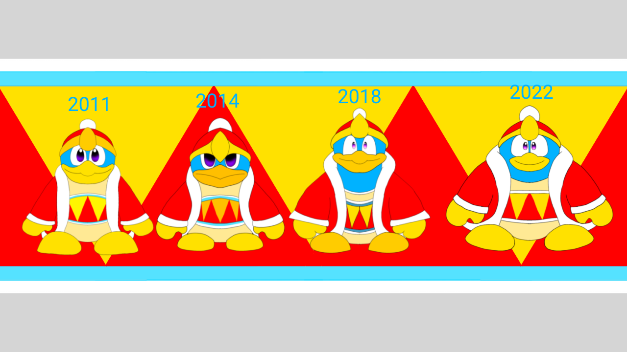
Ah yes, King Dedede. A character so iconic that many consider him the main villain. Others consider him to be the other hero of the franchise. And others consider his design to just be a bit too inconsistent.Dedede's design is just super odd each time it gets changed. It seems that HAL just has trouble finding the perfect Dedede design and just tweak it each game so it fits the king penguin perfectly. And throughout the 2010s and even today, Dedede just can't seem to escape redesign just as much as he can't escape being possessed once every game. So today, I've come to point out all of the design differences that made Dedede into the penguin he is today.
2011 Dedede: Clearly, you can see the inspiration behind this design. This is based on his design from the old GBA and DS games, but just put into a 3D model. It's basically fine for a Dedede design considering that this is the direction the designs that will be moving forward.
2014 Dedede: Ok, I have mixed feelings about this. One, Triple Deluxe was my first Kirby game so it was nice to be introduced to the gameplay of the series. Two, why did they redesign him to be like this? This honestly feels like a downgrade from the Return to Dream Land design, and it shows. For one, just look at his face! They literally spaced his eyes further apart, his pupils are larger, his beak is different, and it looks like he's always frowning! Seriously, they made his crown look too big. And what's even worse is that they spaced the eyes apart! Why?! Was it because they were too close?! I know that they fixed this slightly in Blowout Blast by fixing his facial structure, but still. Looks pretty bad.
2018 Dedede: Alright. I gotta admit: this is probably my favorite design for Dedede. I think it has something to do with the fact that it's mostly based on his appearance in Super Smash Bros., and there's a lot I could say about the design: he's taller, his proportions are smoother, his eyes are closer together and pupils aren't as huge as they were, the crown doesn't cover most of his eyes, and his beak is back to normal! All and all, this is by far the best Dedede design, given how the HAL team probably responded to the previous Dedede design. (ech!)
2022 Dedede: Alright, second best design in my book. This recently appeared to redesign King Dedede in Forgotten Land, and it seems to be his current design to go forward. What's especially shocking is that it's based off of his Kirby 64 look, with the inclusion of the yukata, different proportions, and a tendency to smile more often. (seriously, Dedede in 64 rarely ever smiled) Before I was pretty averse to the design, but after a while I got used to it because it basically works super well with Forgo Dedede. Honestly, I'm gonna miss the Star Allies design, but this one will do for now.
And now for a random tier list from worst to best:
1. Star Allies Dedede, it's the best design by far and I don't know why they wanted to change it.
2. Forgotten Land Dedede, it's still great, but looks a bit chubby (but hey, that's normal for Dedede)
3. Return to Dream Land Dedede, it's fine considering that it's based off of his GBA and DS sprites at least.
4. Triple Deluxe Dedede, I hate this design now with almost every fibre of my being and wish HAL hadn't used this design.
King Dedede (c) Nintendo/HAL
Related content


Comments: 2

👍: 1 ⏩: 0

👍: 1 ⏩: 0