HOME | DD
 Ruskul — Kaipunk

Published: 2011-01-03 22:30:59 +0000 UTC; Views: 582; Favourites: 13; Downloads: 9
Redirect to original
Description
so... I sketched this a month or so ago... then made it up the other day... I've been trying to come up with ways of approaching art that has more style and is uniquely my own- for the last 3 years. I feel many of the things I am learning are Beginning to show...Here's my philosophy -
******
(This is an approach to art that focuses on individual expression and perspective and emphasizes this over all other considerations. It is a way to stay true to your self independent of the world. YES... it is another humanistic philosophy... On a side note, however, In the world of commercial art you WILL most likely have to make compromises- unless you yourself manage to become art director... and even then)
1... It's best not to be looking at other peoples art while making your own (unless the goal is to imitate in some fashion for one reason or the other - no matter how tempting it is to reference them. if you need reference go outside and photo the world yourself - don't Google it (unless there's no other way).
2... draw in a way that flows. If you are making an attempt to fit within a style or have to excessively rework something you have already drawn, then you are failing to be true to your own style. Let what comes come naturally. Do not force anything. Though I do think tedious exercises that enhance technique and skill are important for the development of ones body of art- don't let these exercises define what you will draw. If you find doing art is tedious then explore other options and methods. Find what flows and go with it.
3... DO NOT WORRY what others will think. Here on DA I have found that I while I have learned much - I have lost much. My art was guided in a direction that is now hard to overcome. Every time you make an attempt to please a particular audience you make it that much harder develop a group that appreciates your art for it's representation of your perspective and not the expectations of the viewers.
*************
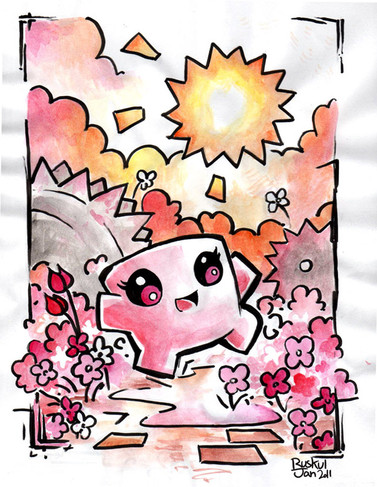
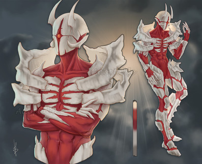
Pigma brush pen, water color.
time= 3(ish) hours
comments welcome. -btw- the purpose of this piece was to explore a new method of inking and coloring. The content is from a collection of sketches exploring different and yet familiar ways of dressing... I hope you like the shirt


 I'm making one for myself... some day
sorry for the novel
Related content
Comments: 8

Although I think that it's helpful to see what other illustrator are doing, I agree that if you're looking at someone else's work too much while working on a project, it can influence you too much.
I like the style of the drawing, especially the lines. Nice use of negative space for creating form. But I feel like her head doesn't really match her body.
👍: 0 ⏩: 0

Really like this style... not sure if it's new or just something you re-vamping but I like it 
All in all good job!
~Jin
👍: 0 ⏩: 0

oya ... any expertise in the world of water color and how to avoid wrinkles would be just swell... thanks good bye
👍: 0 ⏩: 3

eh russ, just fyi, I may be mistaken but normal paper is not wrinkle resistant
👍: 0 ⏩: 0

If you use 300lb watercolor paper it'll significantly reduce the risk of wrinkling (although it costs quite a bit more than lighter weight papers, too). I also tape mine down to a board when I paint. You can also wet the paper first and then tape it down, so that when it dries it stretches taught and is less likely to warp and wrinkle.
👍: 0 ⏩: 0

Use a good weight and quality of cold pressed paper, perhaps?
👍: 0 ⏩: 0
