HOME | DD
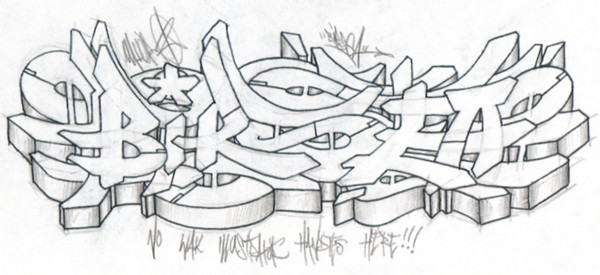
 rustymarc — BIRSEA - Battle sketch
Published: 2005-02-20 05:23:09 +0000 UTC; Views: 2014; Favourites: 21; Downloads: 218
Redirect to original
Description
Not for battlez.Long story short, a guy calls me out on OHH, we pick three letters each (BIR were my three) and we rock b/w sketches.
They're not due for a couple days and he hasn't made a showing yet.
I know, i know, the EA transition really isn't throwing down with the rest of the piece but i got a bit bored/tired and my sense of flow broke down a bit.
Related content


Comments: 14


i guess i can see your "breakdown" lol but personally i really dig the letters AND the flow. good stuff for sure.
👍: 0 ⏩: 0


The S is pretty beautiful. I like how it has depth. My only crit is that the style in the BIR is fairly different than the E and the A.
Great piece though.
👍: 0 ⏩: 0

i just think the bottom part of the E is a little wrid besides that dope sketch.
👍: 0 ⏩: 0


Dope letters and form. This shit is tight, but I just ain\'t feeling that E. It\'s almost the biggest letter in the piece so it throws off the flow, bringing more attention to that spot. Other than that the other kid better come correct, he has some good comp.
👍: 0 ⏩: 0

im feeling the R n the S, esp the S seeing as its my fav letter n u did a hectic job of it. dope work
👍: 0 ⏩: 0

Damn, Rusty... that S is so chilled out it\'s heart is about to stop. Really, I\'ve got nothin\' for ya as far as crit, besides maybe leaning the A a little bit more right to give the E more breathing room and help the flow, but you already pointed it out pretty much. Bangup job.
👍: 0 ⏩: 0


pretty sweet..specially that B..nice to see some of your pieces...i dont see to many...but when i do...they burn!
👍: 0 ⏩: 0