HOME | DD
 rustymarc — MAKE - This is a TEST

Published: 2004-07-05 08:13:48 +0000 UTC; Views: 1264; Favourites: 18; Downloads: 316
Redirect to original
Description
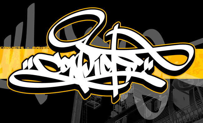
Yeah. Stage somethingorother in the 13 step design process - the mockup. Playing around with some layout, background choices, added a handstyle, screen and photo of yours truly to the mix.I'd greatly appreciate any input into the composition of this peice, as to where to take things, any additions or changes you think i should make here.
Throw me a bone, peoples.
Related content


Comments: 32

ok, feelin much betta this morning, have some more ideas...
the tag in the bg, fade transparency on its ass from left to right, fully vis on the left completely invis on the right..
(layers pallete, select the tag layer, on the bottom of the pallete is a button of a square with a circle, (click it) it applies a trans map to the layer which you can play with as much as you like cos if you remove the trans map, all is normal. to do this select grad fill, select the trans map, do the grad fill, tadaa!!!)
this should stop the tag layer fighting for precedence over the main piece and the minimal bg.
also the wall bit of the bg is very slightly out of colour range for the rest of the picture in general, its too far in thte purple, pull it back to the sky blue colour.
there u go. tol ya I'd give it a second look
")
👍: 0 ⏩: 1

Never done this trans layer thing before. Applied the layer mask and did a gradient over it, but nothing happened?
Went to the handstyle layer.
Clicked the little button you described.
Selected the layer mask
Got my gradient fill tool (i never use this thing)
Click dragged across the screen and...nothing?
👍: 0 ⏩: 1
hmn, had a bit of a play, the only thing that might bugger it up is if you havent flattened the styles the tag is composed of.
ie, if the tag has a drop shadow to make the 3d, create a new blank layer under or over it and with either the tag layer or the new blank layer selected click the empty box next to the eye on the other layer to put the chain on and the click the little circle with the arrow facing right next to to the paths tab and select 'merged linked'
then give the trans map a try on the flattened tag layer...
👍: 0 ⏩: 0


the tag in the background is maybe a little too much. nd the red borders shouldn't be transparent. Thats just my opinion. Still love this one anyway
Try spraying this ..
👍: 0 ⏩: 1
Sometimes i think the tag is excessive, sometimes not. I'll have to release a version without it though at some point.
As to making the red screen opaque..i tried it, but it kept overriding the half-tone feel of the peice, making the rest of it look almost...bland.
👍: 0 ⏩: 1
Yeh, that was just my opinion. You know it best. good luck in the future
👍: 0 ⏩: 0

you bitch!...ur too good....i like the style...also the colors are cool too...very clean too
👍: 0 ⏩: 0

I have no idea where to go with it after this, it just looks so damn cool.
👍: 0 ⏩: 0

Even though it's a wildstyle, the fill and red keyline thing give it a more minamalist feel. So IMO, the tag in the background gives it a few too many layers with things going on and it feels rather overwhelming. I do like how you're looking towards the piece in your picture, helping to lead the eye to the graff instead of elsewhere. This is kinda tricky though... because I'm trying to figure out if I'd prefer to see you go with a U shape of leading the eye around since you have that empty white in the midde. OR if you should use the red to give it diagonal movement following your eyes. I'm kinda stuck as to what you oughtta do. But I do know I'm not feelin' the tag being behind it to be honest.
👍: 0 ⏩: 1
Looking at it now, i agree that i've executed the BG handstyle pretty badly. I'm about to submit another version with a larger, more oriented-around-this-peice handstyle and some small layout changes. Give that a look-see and tell me what you think.
👍: 0 ⏩: 0


composition thought... try not to center the piece, it should be on the left or right, but bottom third is cool as fuck.
I'd go with left to counter the photo, that way your covering the main thirds whilst leaving the top left clear and clean, and aslo creating a triangle, which is always a good thing.
as a final thought, I take it the reason you put the photo over the background piece was to emulate you painting it? if so make it waaaaaaaaaay larger so it fills the wall and you can only see a 1/4 of it, and perspectively warp it to fit the wall angle.. (but you probably were gonna do that anyway... so I'll just shut the fuck up now... yeah.)
that said, +fav mate, solid work.... win the prize, prove the point.

👍: 0 ⏩: 1
Thanks for the awesome input. I'm gonna take your advice and shift the peice to the left for starters. The background 'peice' is actually just a handstee, and i wasn't really trying to create the effect that i was painting it, opting instead for a bit of 'i'm a tuff cunt with a spray can' effect just to go with the general idea of the overall peice. i think i'm going to re-do that and make it a tad larger to give it more presence.
👍: 0 ⏩: 0

not bad at all marc.
ill fav it
i like it that much dude.
👍: 0 ⏩: 0

that is tight mate.....i like a lot......especially the way its layed out and the colors are dope....
👍: 0 ⏩: 0

fuck yes. That looks nutts.
I love the secrecy and mystery behind respirator masks. I might have to wear one next time during sexual intercourse. That'd freak my partner out.
👍: 0 ⏩: 0
blanket [2004-07-05 08:25:43 +0000 UTC]
heheheh.... font...
i dunno, i like it how it is, but i'm only really half here today, since you infected me with that cough thing i'm only half here
👍: 0 ⏩: 0

man, i thought the plain stuff u had before was sick... but this........... THIS!!!! ....it's awesome man!!!!!!!!!!!
👍: 0 ⏩: 0

the graffiti is definately top notch, definately VERY cool looking. the blue/red contrast is a cool idea too.
for a cool minimalistic wallpaper, i would just take out your image and the image of the wall in the background and just keep the very beautiful graffiti and the red highlights and center it with a band of the same hue of red. that would be fuckin phenomenal
👍: 0 ⏩: 1
Good to know my blue/red doesn't go unappreciated...it's always hell hard to get the two colours to work together with any sort of unity.
As to making a minimalist wallpaper...it's easy enough to do, and i'll probably drop one in the near future using this peice. I like the idea of another vertical red band..i'll definately incorporate that.
Thanks for the awesome input.
👍: 0 ⏩: 2
Okay, add this to some of what I was saying. I like Mors3y's idea of shifting it, I think it'd really make the diagonal eye movement idea bangin'.
👍: 0 ⏩: 0

Love the colors and the composition as such. Whats that font and where can i get it?. Thanks.
-Cky
👍: 0 ⏩: 1
Font? Mate, it's all hand done.
👍: 0 ⏩: 1
Cool. Sorry about that then, my mistake  (Smile)")
-Cky
👍: 0 ⏩: 0