HOME | DD
 RyanOttley — buffalotaur

Published: 2013-10-21 21:23:58 +0000 UTC; Views: 50504; Favourites: 1798; Downloads: 683
Redirect to original
Description
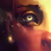
Variant cover for Manifest Destiny, Skybound/Image comics.Related content


Comments: 140

👍: 0 ⏩: 0

Awesome drawing. Sorta reminds me of that Thor vs Hulk drawing by Joe Mad
👍: 0 ⏩: 0


I think her confidence might have exceeded reality. That monster is menacing. Wonderful contrast of the dark beast v the almost entirely white woman. Excellent illustration.
👍: 0 ⏩: 0


Well Damn! Imagine if the Pioneers found these instead of regular Buffalo
👍: 0 ⏩: 0

Killer! Are you into Virgil Finlay at all? your hatching is insane!
👍: 0 ⏩: 0

This is simply amazing. Absouletly no words ")
👍: 0 ⏩: 0


Sweet drawing. A bit of Frazetta style going on. Love it.
👍: 0 ⏩: 0


omg.... omg... omg.... You can just feel the weight of the muscle, the speed of the character shaking the earth and the chisled weapons ready to bite into the opposing character... DAMN GOOD!
👍: 0 ⏩: 0


This shows how brave this woman really is!
👍: 0 ⏩: 0

This is insane!so much energy on this piece! thanks for posting.
👍: 0 ⏩: 0


F WORD!!!!!! Wow Ryan! That's some power right there!
👍: 0 ⏩: 1


great work!


👍: 0 ⏩: 0


I really love the personality of your lines. What inking techniques/tools are you using?
👍: 0 ⏩: 0


Rethinking about picking up that 1st issue now. Nice work.
👍: 0 ⏩: 0


Why not compose it so the the inks stand on their own merit?
Here, because of the tonal scheme (gray-on-gray, or white-on-white) the girl blends into the buffalotaur, instead of standing out against it, which she would do if you framed her with contrasting tones. Sure, the colorist will do that, now. However, I am curious why you didn't take charge?
While the different parts are drawn nicely, especially the female figure and top half of the creature, the compression of space in the arrangement from this angle conceals much within the boundaries of the creature's silhouette, the silhouette itself becoming ambiguous on lower left side. Between that and the lack of contrast to separate the girl, it doesn't pass the postage stamp test. (i.e. when reduced to 1"x2" or, about the size of a postage stamp. one should be able to get the gist of it.)
(Please don't confuse my thinking about the drawing critically as lack of appreciation. Just the opposite. Had it not caught my attention in a good way, I would never have thought to consider it, carefully.  (Smile)")
👍: 0 ⏩: 1

I admit I'm not the best at spotting blacks, still something I'm learning. I thought about adding more blacks to help her pop but thought it wouldn't look as good that way, and it'd look better if the colorist separated the two with color.
👍: 0 ⏩: 1
| Next =>