HOME | DD
 ryky — GRASS - easy tutorial

Published: 2013-09-08 14:33:55 +0000 UTC; Views: 169159; Favourites: 10584; Downloads: 3657
Redirect to original
Description
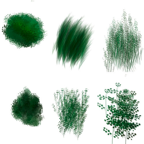
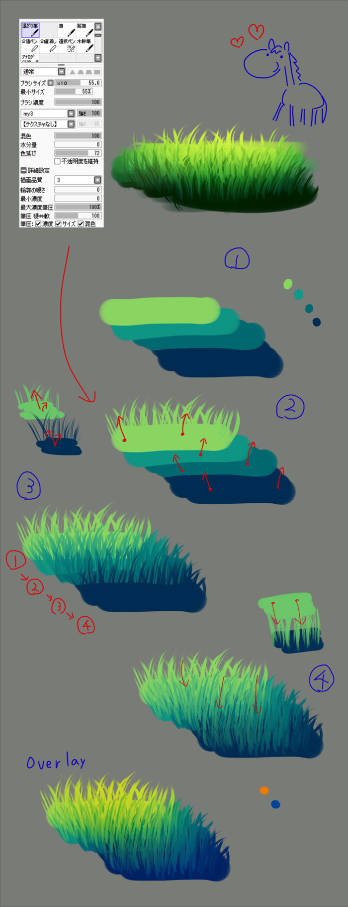
BECOME MY PATRON ON PATREON www.patreon.com/rykyDone in Paint tool SAI
 please zoom it for full size
 1. I use only one brush for this (top right)
2. last step i edit color in "filter" - "brightness and contrast"
3. Everything is on ONE layer
Thank you

 My newest works
 Related content


Comments: 157


thanks for the tutorial. its rely awesome.its useful for my new project thanks again
👍: 0 ⏩: 0


Can I ask why you chose to use one layer? I'd think you'd loose some of the finer controls. Just asking. (I like the job though, well done.)
👍: 0 ⏩: 1

With the brush took it only blends if it's on the same layer. Otherwise it looks.. well, like it's on different layers lol
👍: 0 ⏩: 0

Shit.....I can't even get my real grass to look like that.
👍: 0 ⏩: 0


Thanks for sharing your techniques! I'm new to sai so this is really useful
👍: 0 ⏩: 0

Thank you so much, I have been looking for a tutorial to bring out blades of grass in my backgrounds.
👍: 0 ⏩: 0

Omg i tried this and it works really good! because im usually TERRIBLE at doing detailed grass but i did this once and it turned amazing.
")
👍: 0 ⏩: 0

I think I like the third and fourth images the most. I guess I just don't like seeing attention-getting grass. ^_^" I think the way you did the blades look nice. Maybe I'll try looking at this later and try to get some grass to look that way. I tend to find trouble in imitating grass and tree styles, though, so I'm not sure. But it will probably help that you've broken it down some.
👍: 0 ⏩: 1

I'd say it depends on the style of the rest of the image. Personally I like the 5th the best, but perhaps a toned-down version of the last one would be even better  (Smile)")
👍: 0 ⏩: 2
Exactly, but also the color scheme of the last one changes to an entirely new green base, one that looks much more suitable for carrtonish art.
👍: 0 ⏩: 0
Yeah, it would depend on the amount of detail in the picture and on what the focus is on. The earlier stages would better match the type of stuff I draw, and, for the most part, I would think grass should be almost invisible, but the later stages would probably look good in a very detailed picture and/or one focusing on grass or things in the grass.
👍: 0 ⏩: 0


the 2 process before the last one looks more realistic then the last process tbo
👍: 0 ⏩: 0

The thickness of the grass looks great and all. My only suggestion is that it looks a bit too saturated of a green so it looks almost unnatural.
👍: 0 ⏩: 1

Yeah my thoughts exactly xD
👍: 0 ⏩: 0

Tanks!!! with this i can do it better :3
👍: 0 ⏩: 0

really only i layer ")
👍: 0 ⏩: 0

Ah ok brillo y contraste?? ummmmm excelente tutorial.
👍: 0 ⏩: 0


Thanks for the description.
👍: 0 ⏩: 0


very nice.
Good excuse for me to practice with Sai. I don't use it enough.
👍: 0 ⏩: 0

thanks for all your tutorials it really helps me alot
👍: 0 ⏩: 0


This is lovely, and I love the bright look of the last step.
👍: 0 ⏩: 0


Thank you so much for this! Very helpful *__*
👍: 0 ⏩: 0

so beautiful and helpful *___* thank you very much for the tutorial!!
👍: 0 ⏩: 0


I like it! And if I want a less saturated/cartoony look, I can stop at step 5 also!
👍: 0 ⏩: 0

")

It's so amazing and kind if you to take your time and share all this knowledge. Thank you so much for these amazing tutorials and the time you take to help everyone grow and bloom into the artist they want to be.
👍: 0 ⏩: 0

This is perfect!It's exactly what I've been looking for. Oh and just so you know, I finally got a SAI license just because of your work
👍: 0 ⏩: 0


You're welcome!
God bless you!
👍: 0 ⏩: 0

Looks very easy, thank you for including the explanation in description and on image!
👍: 0 ⏩: 1

<= Prev | | Next =>