HOME | DD
 s3ss3nt — bOT.cellular

Published: 2004-04-17 21:48:15 +0000 UTC; Views: 343; Favourites: 7; Downloads: 145
Redirect to original
Description
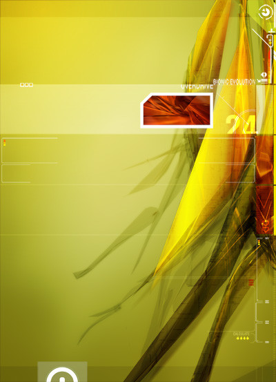
Some rainy day pixel playing, .. originally done with a red robotbloodcell with grey toned background,,. I thought I'd give it a green remix for some different flavor.Just testing robot blood samples.
 (Wink)")
I wanted to spend more time to make the 2d more of a "bio-read-out" interface but I accidentily saved anfter collapsing the layers and then closed PS,.... farkin' A. :S
Related content


Comments: 12


dizzam! this is great...looks like your into the 3d apps now eh? c4d?
👍: 0 ⏩: 0


ah well..even without the 2d that you wanted to have in their
that is still badass
i luv the overall balance of thsi piece
sometimes in a render.... i think too much is just that... too much
...but you got a knack for some wicked flows
nicely done my friend
who knew robots blood could be this interesting
keep em comin bro !!!!
👍: 0 ⏩: 0

freakin nice one bro :]
this piece is kinda simple and minimal, but at the same time its complex...
the pixel stretch on the top right spot was a very smart choice..it looks great there.
the green theme is outstanding..the object tone harmonized with the negative space tone in a perfect way :]
as for the 2d, im lovin some of its elements, but if i were you, i would have placed te image name typo on the left lower corner, where it has that big round edged rectangular...i would change the typo color too..i think its too strong in comparation with the rest of the piece...other then that, its superb :]


👍: 0 ⏩: 0

Some of your best work to date br0. Ok lets see 
 (Smile)")

👍: 0 ⏩: 0

that's one hot piece... the render down should be more ... well.... clear... i think so.. ")

👍: 0 ⏩: 0

w000t the green is sweet in this one bro!!!
Im realing feeling this one...its like some space station getting ready to be ripped to shreds by the forces of the outer rhealm of this hidden world!!!
Awesome work bro...sorry for late replies.
Been super busy with school...but now the exam is over!!!w000t!
Great job bro.
👍: 0 ⏩: 0

oh wow sessent thats hot. whatever ya used there makes the image looks like its wet and dripping...that is soo creative and beautiful !
👍: 0 ⏩: 0