HOME | DD
 saebin — Trust? - Colored

Published: 2004-02-12 04:13:05 +0000 UTC; Views: 219; Favourites: 1; Downloads: 56
Redirect to original
Description
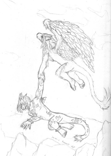
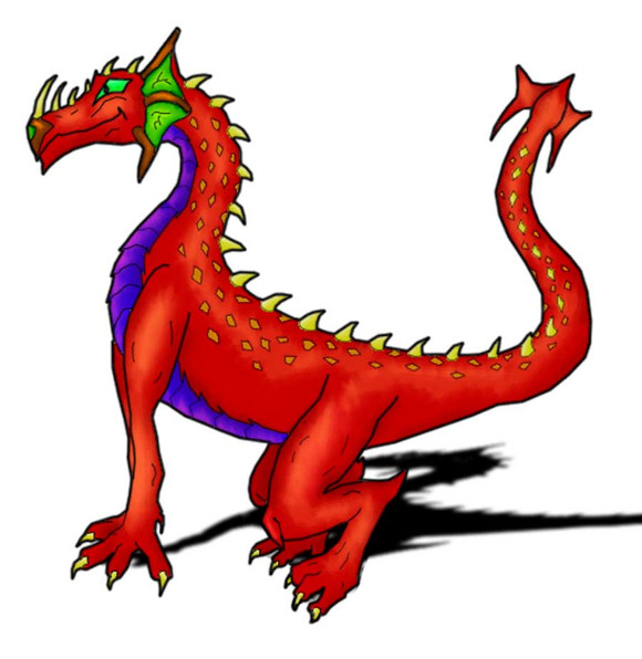
Well, finally finished this pic. I think the coloring is pretty good (compared to my others anyways) even tho I still wanted to get more detail and a more 3d look...but nonetheless here it is


 Comments/critiques wanted!
Related content
Comments: 21

Hm... the mountain/cliff they're standing on look a little too bright and white to me. The sun is setting/dawning, shadows would be darker, light mostly touching the edges of surfaces. I disagree with ~Oca 's previous comment of shading the rims of the arms and legs darker... if I understood that correctly, that is [I read it as a suggestion of placing darker shadows near the outlines of the figures]. Your shading on the figures looks okay in my opinion, taking into account where the sun is, just a little light/faded.
The trees in the far side seem to be more or less uniform in size [those closer to the horizon, farther away from us, don't seem smaller than those closer], there doesn't seem to be a vanishing point, which may seem to defy the illusion of depth and distance.
The dragon is quite detailed though, I especially like the scalework and I like the linework of rock surface in the foreground despite saying that it looks too brightly/sparsely colored/shaded in this scene.
👍: 0 ⏩: 1

The rocks definately dont quite fit color wise...and as for the vanishing point...I have not worked with a landscape design like this before and was not sure how to get the whole depth down. I river is off too... Thanks for the constructive comment though!
👍: 0 ⏩: 0

nice work. the detail is great. keep up the good work
👍: 0 ⏩: 0

You know what? We're studying ancient Rome in World History, and this kinda reminds me of the Roman works! I like!
👍: 0 ⏩: 0

man, this is great! I love it! I knew ya would do a good coloring job n this!
👍: 0 ⏩: 1

gatchin, is right...it has room to improve but I am done with this pic 
👍: 0 ⏩: 0

im not gonna lie (because im quite drunk at the moment) i dont think this looks good, in fact it dosent look very good at all, however i do think you have the potential to pull off some quality work, so keep working at it.
👍: 0 ⏩: 1

it is not good compared to what? my other works? Or the people on here who have 60k+ page views? I know it sucks compared to them...that is why I have more then a few pics because I plan to get better 
👍: 0 ⏩: 1

nah no offence intended, i was in a rather negative mood at the time so i wasnt holding any punches. it will be good to see your work getting better over time, so i will keep checking out your gallery.
👍: 0 ⏩: 0

That's pretty good ^^ I like the messy lineart style ^^ the textures r very good too ^^ though there is a bit of a lack of shading in some areas
👍: 0 ⏩: 1

hehe, the "messy lineart" was cause I didn't want to ink it 

👍: 0 ⏩: 1

Well, the BG is fine methinks, but the actual chars don't really looks 3d 
👍: 0 ⏩: 0

uh...seriously? If so I would have no idea what it is worth
👍: 0 ⏩: 0

...Are those breasts I see? 
I think you could thicken the lines a bit more, especially the terrain lines.
👍: 0 ⏩: 0

Hmm, that's real nice. 
👍: 0 ⏩: 1

hmmm, i didn't keep track of that...but I am guessing....around 6 hours but it feels like more then that
👍: 0 ⏩: 1

Damn. I need more patience to work on coloring like you. O_o()
👍: 0 ⏩: 0

ooohh, nicely done ya! umm mebe if u put a little more shading emphasis on rounded shapes like legs and arms it what give it more depth ya. and also some more shading in the recesses of the face, make it a little more dynamic. ummm what else ??..the river in the back ground would be great if it was flatter sort of a narrower vanishing point if u know what i mean.. hahah but hey im no expert, i hope u dont mind me saying so. i like it though looks like its got a medievil tapestry look about it ya!
👍: 0 ⏩: 1

any critiques are good ones...(well most of the time) I usually dont go back and edit "finished" pieces but instead incorporate the ideas in my new pics 
👍: 0 ⏩: 1

thats the best way to do it ya. having comparisons is geat. no worries, thank u for not being put out by my words..!!
👍: 0 ⏩: 0
