HOME | DD
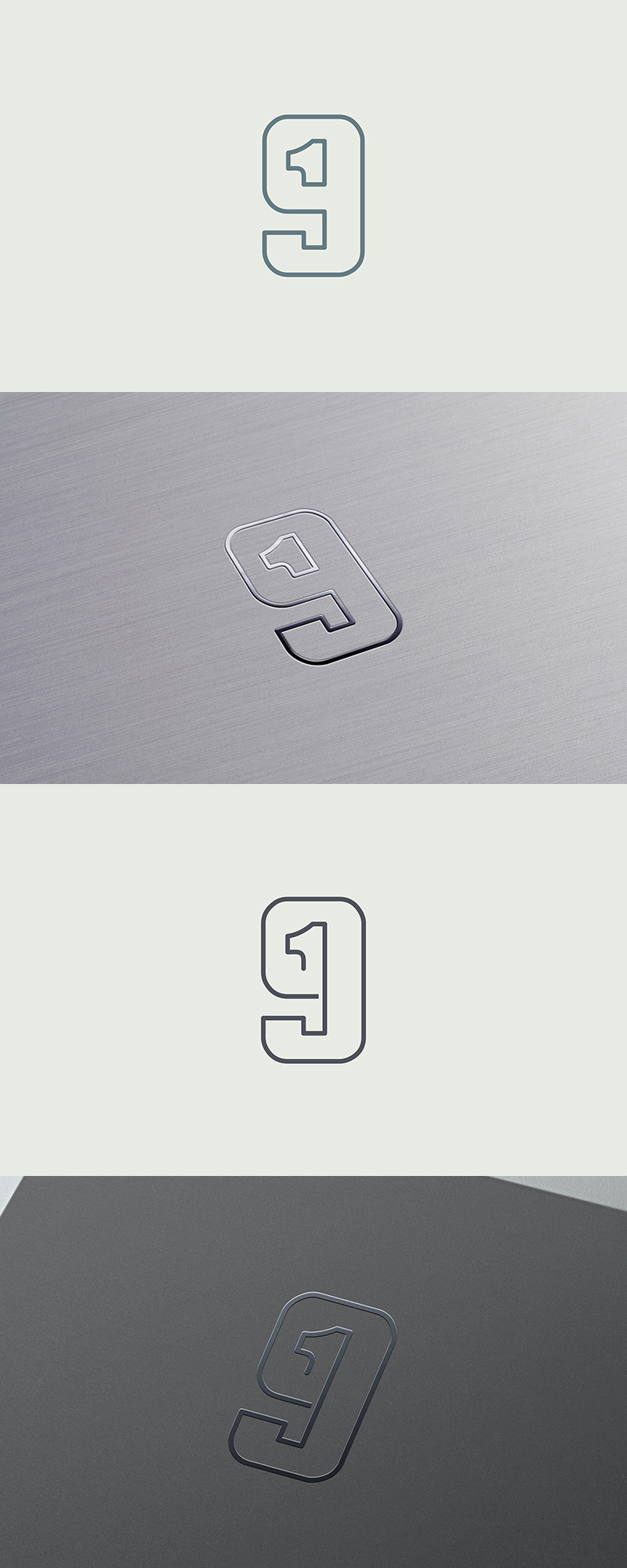
 samadarag — Nineteen Monogram
by-nc-nd
samadarag — Nineteen Monogram
by-nc-nd
Published: 2014-05-27 10:17:10 +0000 UTC; Views: 2349; Favourites: 24; Downloads: 0
Redirect to original
Description
An additional concept for the same project here, samadarag.deviantart.com/art/N…More on Behance,
www.behance.net/gallery/171968…
Related content


Comments: 9

If I may ask, how do you go about creating the metallic effect in the second image?
👍: 0 ⏩: 1

That's a logo presentation mock-up done in Photoshop.
👍: 0 ⏩: 0
Thank you NicolasVisceglio , ownness , grazrootz , wuestenbrand , magnoid and ahsanpervaiz ! Appreciate your feedback!
👍: 0 ⏩: 0

It looks nice, clean lines, simple,
but I agree that the "9" pops out first, and takes up more of the space, so to me this seems more like 91 instead of 19
👍: 0 ⏩: 1

I agree with magnoid view, but it is a great concept, you can do the same with a fat 1
👍: 0 ⏩: 0

 (Smile)")

don't listen to the guy above, that mark is strong and cleverly done.
👍: 0 ⏩: 0

Awesome! This is what i was talking about Here . Well done!
👍: 0 ⏩: 0

Is beautiful., but it looks like 91, and is too pretentious.
👍: 0 ⏩: 0